Concept
The form layouts feature enables to design forms and data display screens that you can map to document properties. Read more about layouts. Forms configured on this feature can be referenced in various places:
- On other layouts (the one you define directly on the document type)
- From a layout widget
- From a toggleable form widget
- Directly in your own XHTML templates, if you are a Nuxeo Platform developer
Pre-Requisites
Form Layout Creation
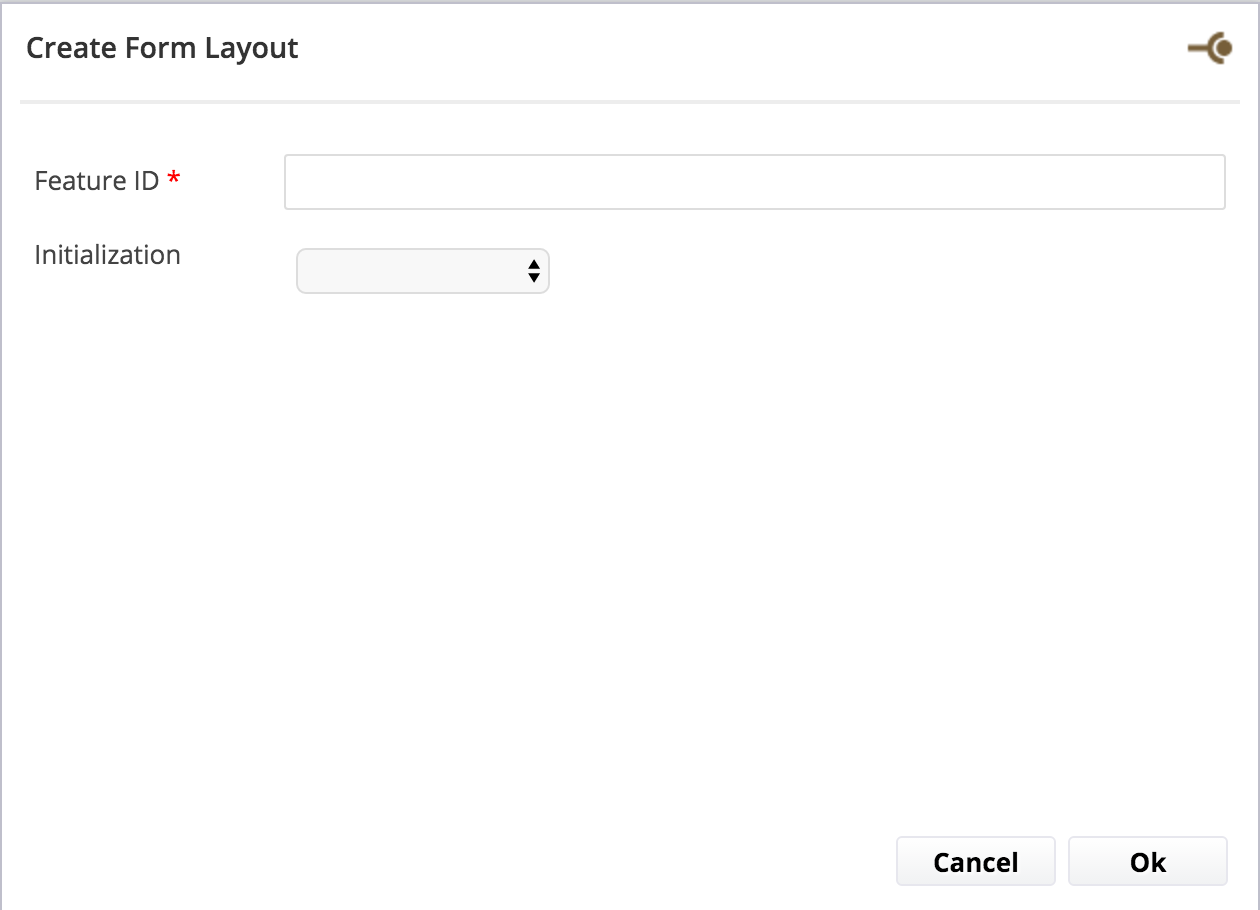
- Feature ID: Technical id of the feature.
Creation Layout Tab
The Creation Layout is displayed just when the document is created in Nuxeo, after having clicked on the New button and selected the document type.
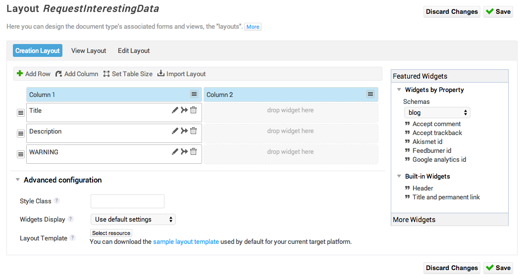
The right part of the screen is called the "widgets palette". The middle is the "layout" (the data grid or form). You can pick up widgets on the right, drop them on the layout, and then edit the properties of the widget (they are documented inline).
The Layout
Grid actions
- Add Row: The action to add a new row on the listing. The data and form components will be displayed following the grid. You can also add a row in a specific place by right-clicking.
- Add Column: The action to add a column. You can also add a column in a specific place with the right-click.
- Set Table Size: Specify rows and columns number.
Using this feature will overwrite what has already been configured.
- Import Layout: Enables to literally "copy/paste" the configuration you did for other layouts (Edit, or View or Header). You want to use this to gain time.
To Nuxeo Platform developersContrary to what can be done at lower level with the layout framework, you need to redefine the layout for each mode (Nuxeo Studio actually doesn't leverage the layout mode). This was done for purpose of simplicity. In the future we might propose a solution that enables to also leverage layout modes.
 : Enables to move, insert or delete columns and rows.
 : Enables to edit a widget and configure it.
 : Enables to merge with the cell to the left or right.
 : Enables to remove the widget.
Advanced Configuration options
- Style class: You can specify a class that will be applied to all the area surrounding the form. You can either use an existing class that you will find on the style guide or contribute your own class on the Theme feature.
- Widget Display: You can control whether you want the form label just on top of the input or on the left, or to remove the display of the labels.
- Layout Template: It is an advanced option, for Nuxeo Platform developers. The widgets are displayed using an XHTML template (JSF Facelets template). You can upload your own templates if you want to do some deeper changes on the way the data/the fields are displayed. We propose you to download the default one used so as not to start from zero.
If you use a custom layout template, you will then have to maintain this template when upgrading the Nuxeo Platform version and make sure it is still compatible.
The Widgets Palette
- Widgets by Property: You can browse the schemas (default ones and the ones you configured in the Studio project) and then choose a specific property. That way, the widget will be automatically mapped to the property you chose, and Studio will suggest only the widget types (calendar, lists, etc.) that can work with the property you selected.
- Widgets by Type (under More Widgets): You can browse all the existing widget types. You will then have to map the widget to a property, by browsing the schemas and properties. This is a good way for handling the display of only a sub-property of a complex property.
For Nuxeo Platform developersThere is currently no widget type registry for uploading custom widget types. But you can use the generic widget to specify a widget type that you contributed in another plug-in.
- Built-in Widgets: Built-in widgets are widgets where you don't have to configure neither the document property mapping, nor the widget-type.
- Advanced Widgets:
- Container: The container widget enables to add a visual wrapper around a set of widgets. If you drop a container widget, you will have several options for controlling whether the wrapper should be foldable, folded or not, should have a title, ... Then you will be able, inside the container, to edit a grid with the widgets you want to display.
- Layout: The layout widget can be used to reference a complete layout definition. All the widgets that were defined in the referenced layout will be displayed where you drop the widget.
- Template: The template widget is the most permissive widget: you choose the property (or properties) to which you want to bind it, you choose the XHTML (JSF Facelet) you want to use, and you can value the properties that your template expect. Custom templates can be uploaded in the resources feature. For more information, you can refer to the documentation about custom widget templates.
- Container: The container widget enables to add a visual wrapper around a set of widgets. If you drop a container widget, you will have several options for controlling whether the wrapper should be foldable, folded or not, should have a title, ... Then you will be able, inside the container, to edit a grid with the widgets you want to display.
Configuring Widget Properties
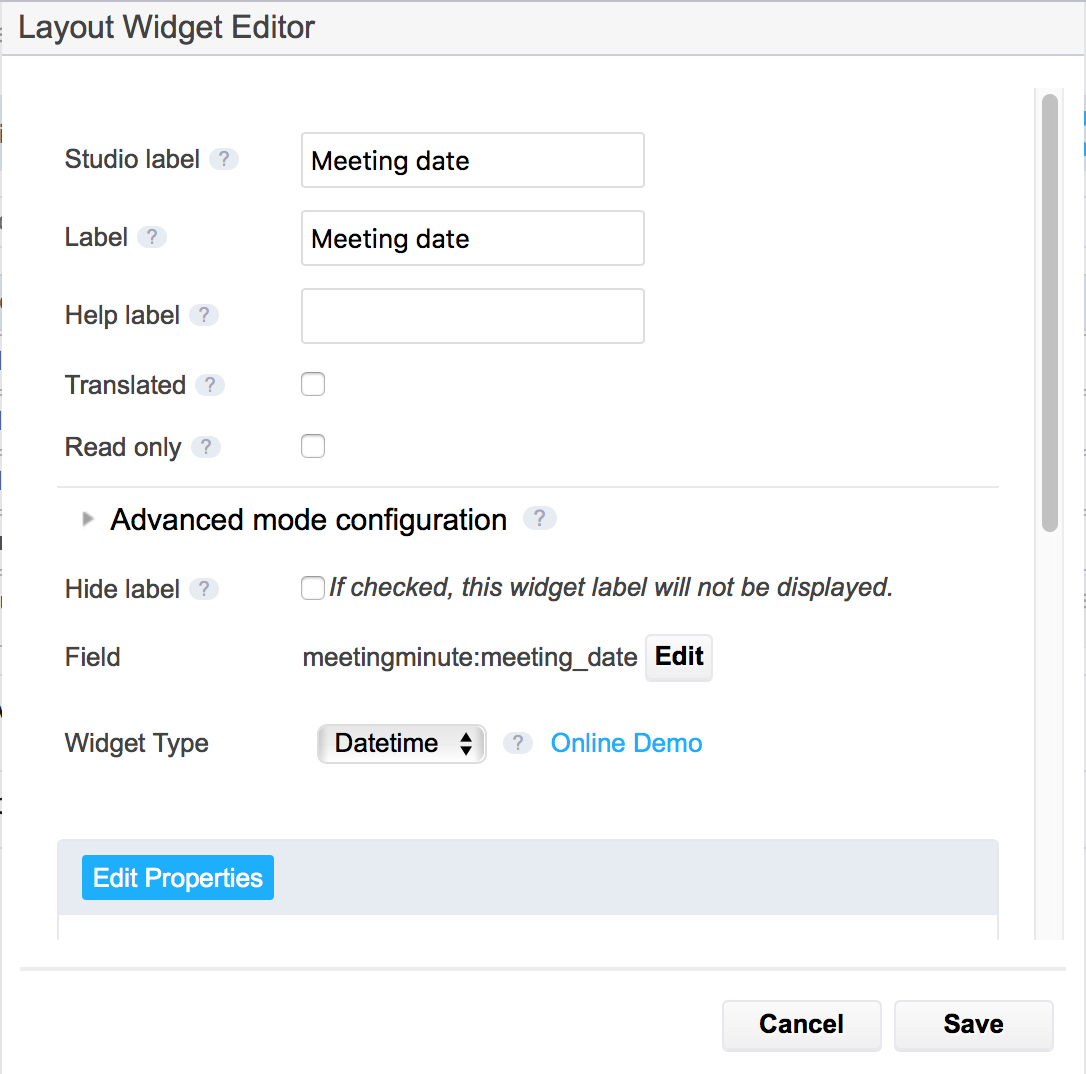
When you dropped a widget, you will be able to configure the properties of your widget, the field mapping, the widget type, as well as some custom properties if you want. Just let your mouse on the question mark icon to see what the property is about.
There are a few important and generic things to know about this screen:
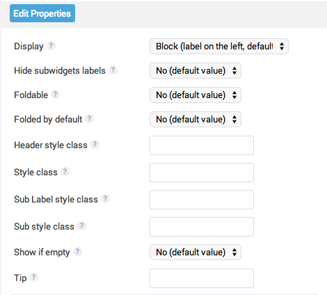
- Advanced mode configuration: Enables to display conditionally a field, and to decide whether the data is just displayed or can be edited. Conditions might be user properties, document properties or anything contextual. For more information about the display mode, see the page How to Control the Display Mode of a Widget.
- Edit properties vs view properties: If you entered an advanced mode configuration expression, you will have both view and edit tabs for configuring widget properties. Indeed, it is usually not the same options that are to be configured.
- Widget property override using custom properties: You can use an EL to configure the built-in properties like "Required", etc., as long as the property you want to use is in context and the expression is valid. You just need to contribute the id of the property and the EL expression you want to use with brackets
#{}.
Configuring Widgets of a Complex Property
If the property is complex, you will have to configure several widgets (as there are several sub properties). That's why there is one more icon on the widget representation in the grid:

Clicking on the icon  , you will be displayed the following screen:
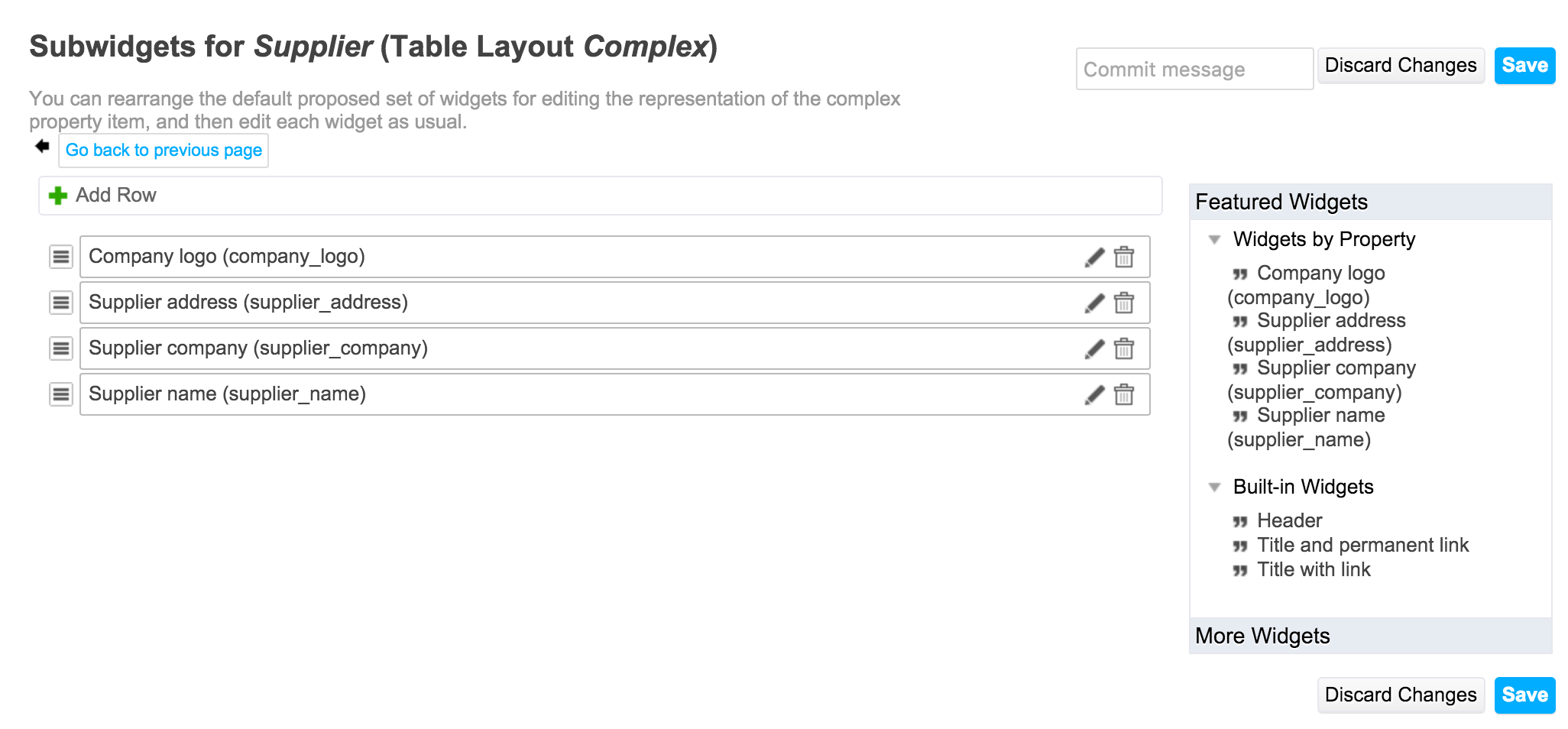
By default, Studio will organize all the sub properties with a simple input text widget or a date, or anything, depending on the sub-property type. But you can re-arrange the widgets, or delete them and pickup again the sub-property on the widgets palette on the right, and also insert some build-in widgets, like a header that produces a separation, or a template widget, etc.
Edition and View Tabs
Once you configured the form for the creation view, you can do it for the the Edition and View (read-only) modes, following the same instructions than on the Creation Layout tab.