After having created your own document type you will probably want to create your own search.
Learn how to create a new search screen with an icon in the left menu. The search will be compose of a full text search, a search by date range, a search by owners and finally by tags.
Prerequisites
- A Contract document type created in Nuxeo Modeler
- Make sure that the Nuxeo Web UI addon is installed on your instance.
Once you are all set, you can navigate to Nuxeo Studio to start creating your search.
Create a Page Provider
The first step is to create a page provider in Studio Modeler.
In Configuration, go to Page Providers, click on New and name it Search.
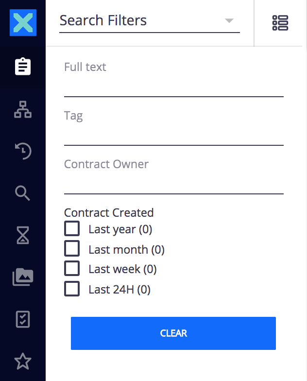
The full text search:
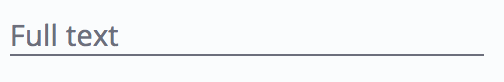
- Next to Predicates click on Add. A popup window appears.
- Click on Edit binding and select
schema:system>fulltext. - Save your changes.
The search by date range:
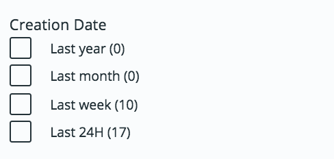
- Next to Aggregates click on Add. A popup window appears.
- Fill the popup window like this:
Aggregate Type Date Range Field dc:created Date Ranges - Label:
Last yearFrom:now-1yTo:now-1M - Label:
Last monthFrom:now-1MTo:now-7d - Label:
Last weekFrom:now-7dTo:now-24H - Label:
Last 24hFrom:now-24HTo:now
- Label:
The search by tags:
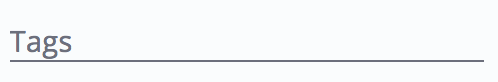
- Add another new Predicates.
- Click on Edit binding and select
schema:system>tag[].
The search by owner of the contract:
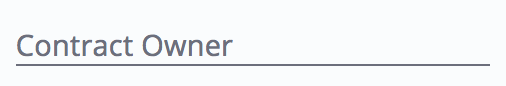
- Add another new Predicates.
- Click on Edit binding and select
schema:contract>owner. - Save your changes.
Now, click on Configure layouts in Designer at the top-right of your screen. You are now in Studio Designer, where you can configure the layouts of your Search.
Create a Search Layout
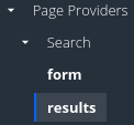
In the Studio Designer, you are now in the UI tab, under Layouts > Page Providers. You will find the page provider created previously.
Two layouts are available. Let's edit the form layout first.
- Click on form, then Configure. The form layout is now displayed in bold. On the right, in the properties catalog, the elements that we defined in Studio are displayed.
- Click on the System Fulltext element on the main view, you can edit the label in the left catalog to display
Full text. You can do the same with the other elements.
Let's configure the results layout now.
- On the left menu, click on results, then Configure.
- It automatically creates the result view by default (grid and table). Leave it like this and click on Save.
You now need to add your labels to your translations file to display them correctly in the UI. To do so:
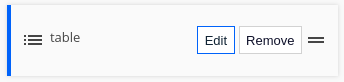
- Click on the UI table.
- Click on Translations.
- Use the default
messages.jsonor create your own language. - Create a new entry in the JSON file with key
label.ui.aggregate.<label>and the label as value. Here it's:{ "label.ui.aggregate.from_now-1y_to_now-1M":"Last year", "label.ui.aggregate.from_now-1M_to_now-7d":"Last month", "label.ui.aggregate.from_now-7d_to_now-24H":"Last week", "label.ui.aggregate.from_now-24H_to_now":"Last 24H" }
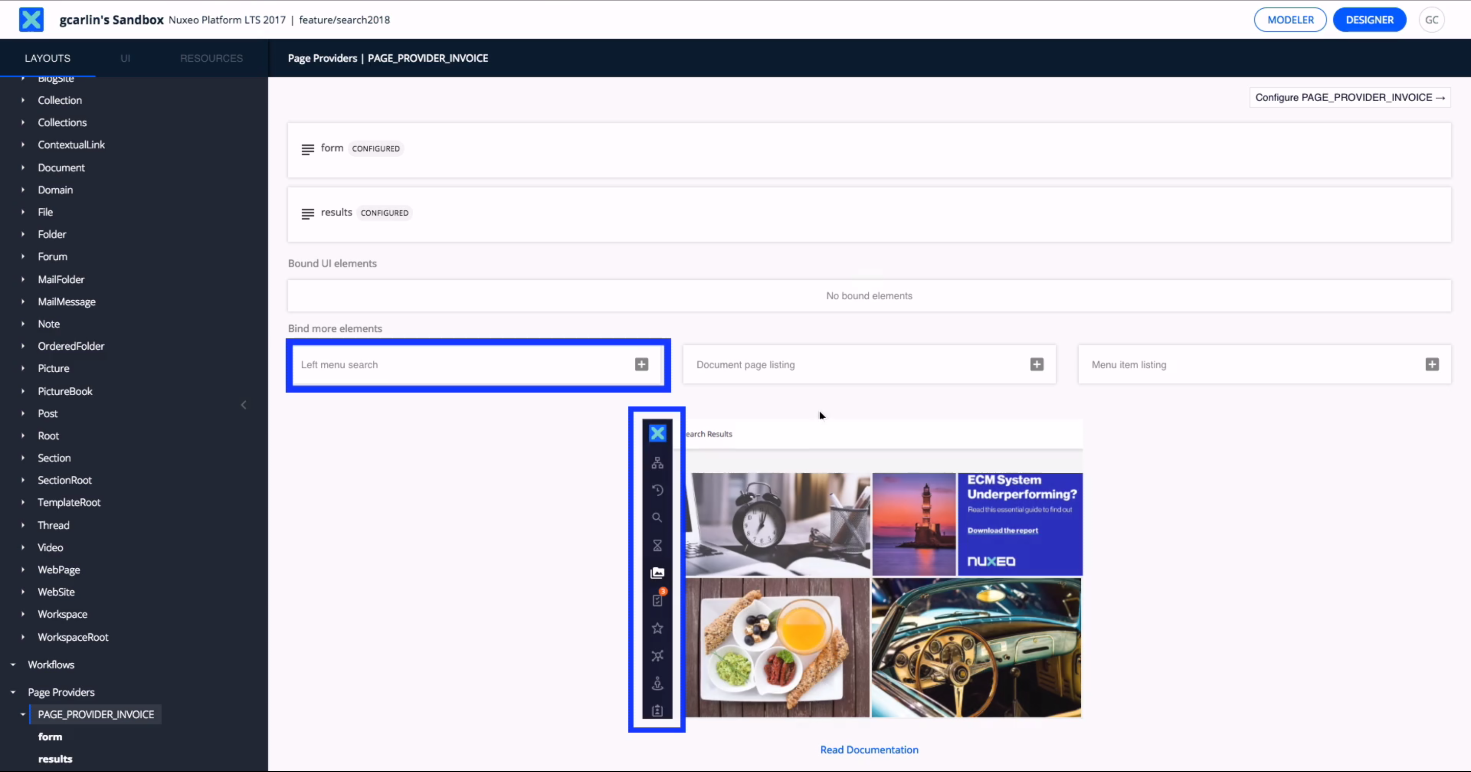
Create a New Drawer Item
The next step is to add a button in the drawer menu to display the search screen.
- Go back to your
Searchpage provider, in Modeler. - In the Bind more elements section, select Drawer item search to create your menu item.
- Fill in the page like this:
- Name: Contract
- Available: enabled
- Label:
Contracts - Icon:
icons:assignment - provider:
Search - schemas:
dublincore,contract - search-name:
search
- Click on Show Advanced Options:
- auto: enabled
- Save your changes, deploy your Studio project on your instance and you're done :)
Going Further
Visually Configure Table Results Layout
In Studio Designer's layout tab:
- Go back to your Search page provider results layout configuration.
- Edit the table layout configuration.
- You will be taken to the element's configuration. From there, click on the Switch to Table Editor icon at the bottom of the page.

You are now in the table editor.
Each result column is shown with the corresponding field and element. Clicking on an element will display its properties on the right side of the screen so that you can configure it.

More columns can be added using drag and drop from the catalog on the right side of the screen. For each column, the label can be edited directly and translated by entering the [[i18n('your.translation.key')]] pattern.
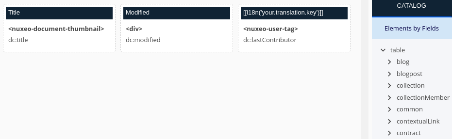
Columns can be reordered by drag and dropping them around.
Finally, when hovering on a column, you can use additional icons to configure them:
 The arrows icon toggles the possibility to sort results using this column.
 The eye icon toggles the default visibility of the column. If you make it optional, it won't appear by default but can be made visible by users in Web UI. When made visible, it will be placed exactly where you put it in your configuration.
 The trash icon deletes the column.
When you are finished, click on Save work in progress at the top right of the screen.
Technical Overview
Overriding Existing Nuxeo Web UI Search
Nuxeo Web UI comes with the Default Search and Expired Search both plugged on server side page providers default_search and expired_search by default.
| Default search | Expired search |
|---|---|
|
|
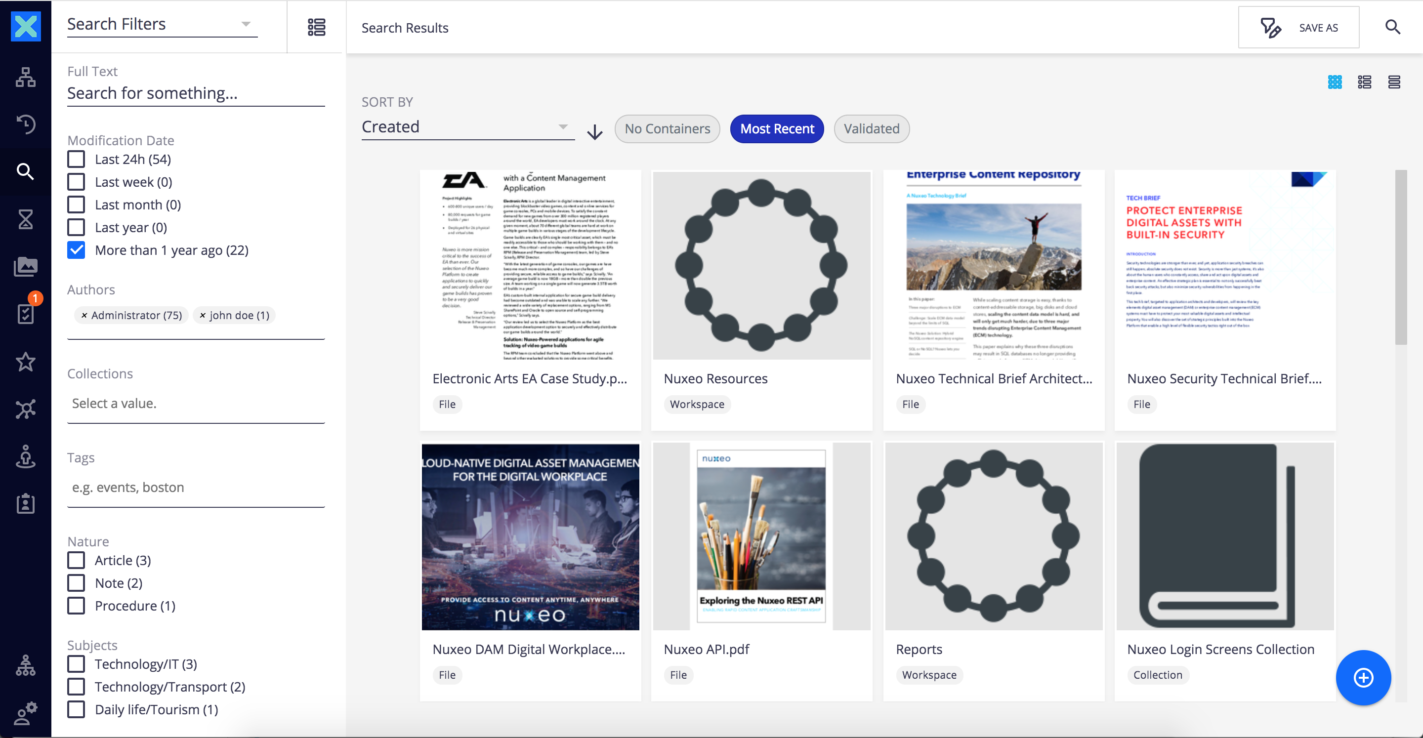
Within the Web UI, a search is composed of 2 main parts:
- the search form displayed on the left in the drawer panel.
- the search result panel displayed on the right in the main content.
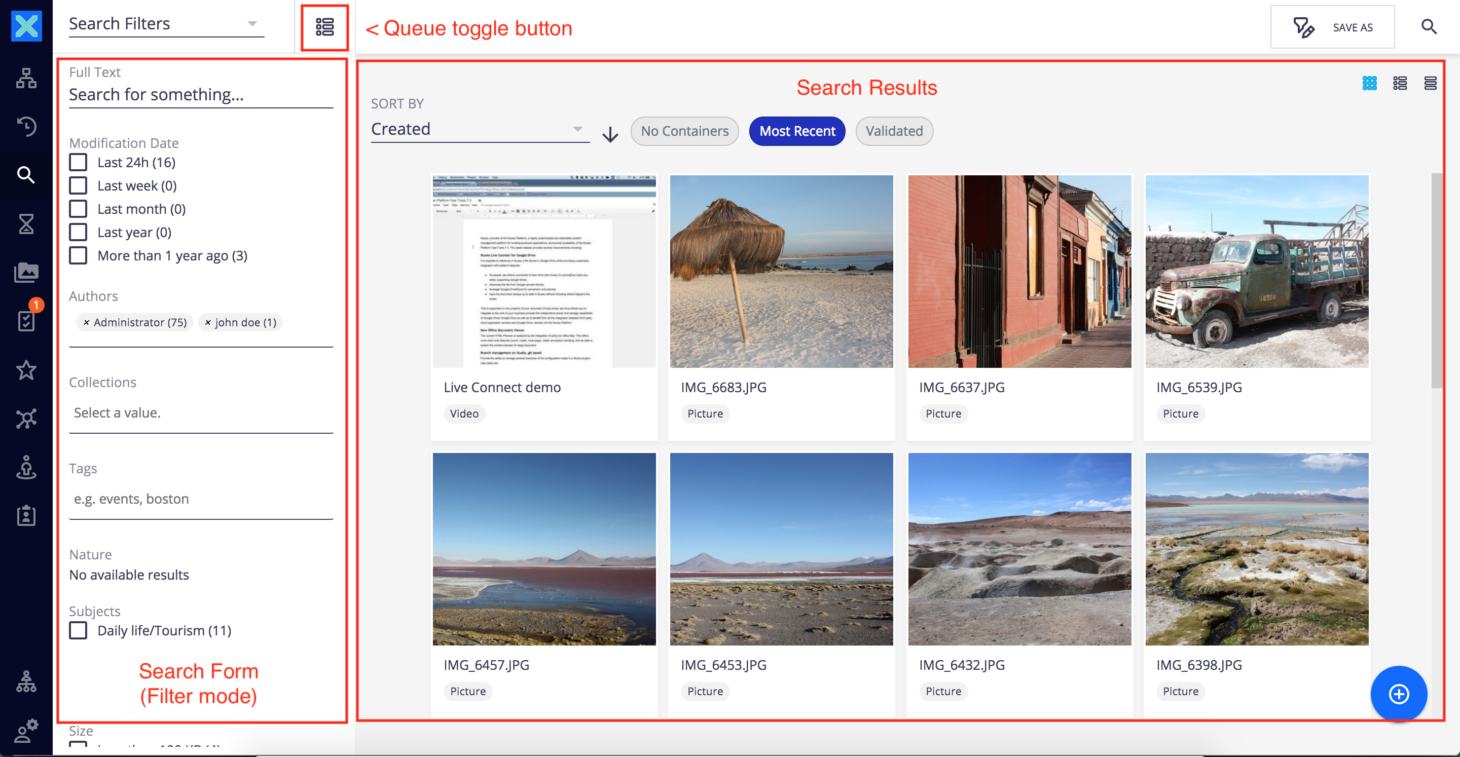
The search form itself has 2 rendering modes:
filter modewhere you can set filter and criteria. Each time a filter changes, it updates the results displayed in the main container.queue modewhere search results are displayed with a vertical scroll (like in the expired search screenshot above).
A toggle button allows you to switch between filter mode and queue mode.
The search form is a dynamically loaded element. For instance, nuxeo-default-search-form.html and nuxeo-default-search-results.html contribute to the Default Search form and results layouts and the nuxeo-expired-search-form.html and nuxeo-expired-search-results.html contribute to the Expired Search form and results layouts.
$NUXEO_SERVER/nxserver/nuxeo.war/ui% tree
.
├── document
│   ├── ...
├── elements.html
├── favicon.ico
├── i18n
│   ├── ...
├── images
│   ...
├── index.jsp
├── manifest.json
├── nuxeo-admin
│   ├── ...
├── nuxeo-dam
│   ├── ...
├── nuxeo-drive
│   ├── ...
├── nuxeo-home.html
├── nuxeo-liveconnect
│   ├── ...
├── nuxeo-user-group-management
│   ├── ...
├── search
│   ├── nuxeo-saved-search-actions.html
│   ├── nuxeo-search-form.html
│   ├── default
│   │   ├── nuxeo-default-search-form.html
│   │   ├── nuxeo-default-search-results.html
│   ├── expired
│   │   ├── nuxeo-expired-search-form.html
│   │   ├── nuxeo-expired-search-results.html
├── ...
...
Referring to Web UI deployment documentation, you can override these nuxeo-default-search.html and nuxeo-expired-search-form.html in order to customize the Default Search and Expired Search filter form. To do so, your own marketplace must deploy and override the proper HTML files in $NUXEO_SERVER/nxserver/nuxeo.war/ui/search.
Add New Searches
You can insert a new search in the left drawer menu the same exact way you insert any slot contribution to it, by using the DRAWER_ITEMS slot.
The DAM Example
The Nuxeo DAM addon defines its own Asset Search with the following:
<nuxeo-slot-content name="damSearchMenuButtons" slot="DRAWER_ITEMS" order="45">
  <template>
    <nuxeo-menu-icon id="assetsSearchButton" name="assetsSearch" icon="icons:perm-media" label="dam.assets.heading">
    </nuxeo-menu-icon>
  </template>
</nuxeo-slot-content>
And the corresponding DRAWER_PAGE slot, containing a nuxeo-search-form element.
<nuxeo-slot-content name="damSearchMenuButtons" slot="DRAWER_PAGES">
  <template>
    <nuxeo-search-form name="assetsSearch" search-name="assets" auto display-auto-control
                       provider="assets_search"
                       schemas="dublincore,common,uid,thumbnail"></nuxeo-search-form>
  </template>
</nuxeo-slot-content>
Here are some explanations about nuxeo-menu-icon and nuxeo-search-form properties:
name="assets"
The nameproperty links the nuxeo-menu-iconto the nuxeo-search-form, so that clicking the former will trigger the latter to show.
search-name="assets"
The search-name property defines the name of the search and it is used to support the for the dynamic loading of the search-form as follows:
Navigating to /search/assets will display the search form and search results defined by nuxeo-assets-search-form.html and nuxeo-assets-search-results.html. This is only possible because they follow the following convention:
- they are both located on the
$NUXEO_SERVER/nxserver/nuxeo.war/ui/search/assetswhich has the same name as thesearch-nameproperty - the name of nuxeo-assets-search-form.html and nuxeo-assets-search-results.html are in the form
nuxeo-{searchName}-search-form.htmlandnuxeo-{searchName}-search-results.htmlrespectively where{searchName}isassets, matching thesearch-nameproperty of thenuxeo-search-formelement, and are both placed on theassetsdirectory mentioned above.
search-name="assets"
Please refer to the Web UI routing documentation for further details.
icon="icons:perm-media"
defines the icons to be displayed in the left drawer menu.
label="dam.assets.heading"
is the key label to be retrieved from i18n resources to be used as tooltip in the left drawer menu.
Meaningful Properties When Defining Your Own Search
As just explained, to create a search, you just need to deploy a new nuxeo-{searchName}-search.html element in your $NUXEO_SERVER/nxserver/nuxeo.war/ui/search/{searchName} directory and add it as a slot contribution using the nuxeo-search-form element. However, it is important that these elements provide the proper information to perform the search.
| Property | Description | Example |
|---|---|---|
| provider | The name of the page provider to be used, defined server side. | default_search page provider |
| schemas | A comma-separated value list of schema names to be fetched when loading documents retrieved by the search. | schemas needed for default search |
| queue | Boolean property. If true, then the queue will be displayed by default instead of search filters. | expired_search displays a queue by default |
| auto | Boolean property. If true, automatically executes the search each time a param is changed. |
auto search |
| label | String property. The key to the i18n label to be shown as the search title |
expiredSearch.expiredDocuments search |
| search-name | String property. The name of the search layout, as explained above | expired name-search |