Layouts are used to display a document's metadata in different use cases. It's basically a group of widgets and specifies how these widgets are assembled and displayed.
A given document type can have multiple layouts: a create and edit layout to set its schema fields when creating or editing the document, a view layout to simply display field values and any other layouts according to the application(s) where these are used. In our previous metamodel driven UI, these were known as modes and a single layout definition could be rendered in different modes.
In this tutorial you will learn how to create a document type layout with Studio Designer from a document type created in Studio Modeler and how to add a icon to it.
Prerequisites
- Make sure that the Nuxeo Web UI addon is installed on your instance.
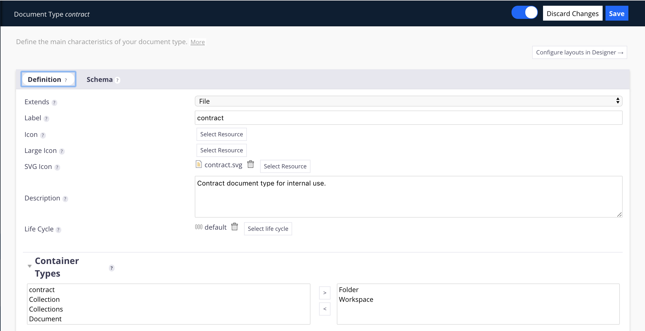
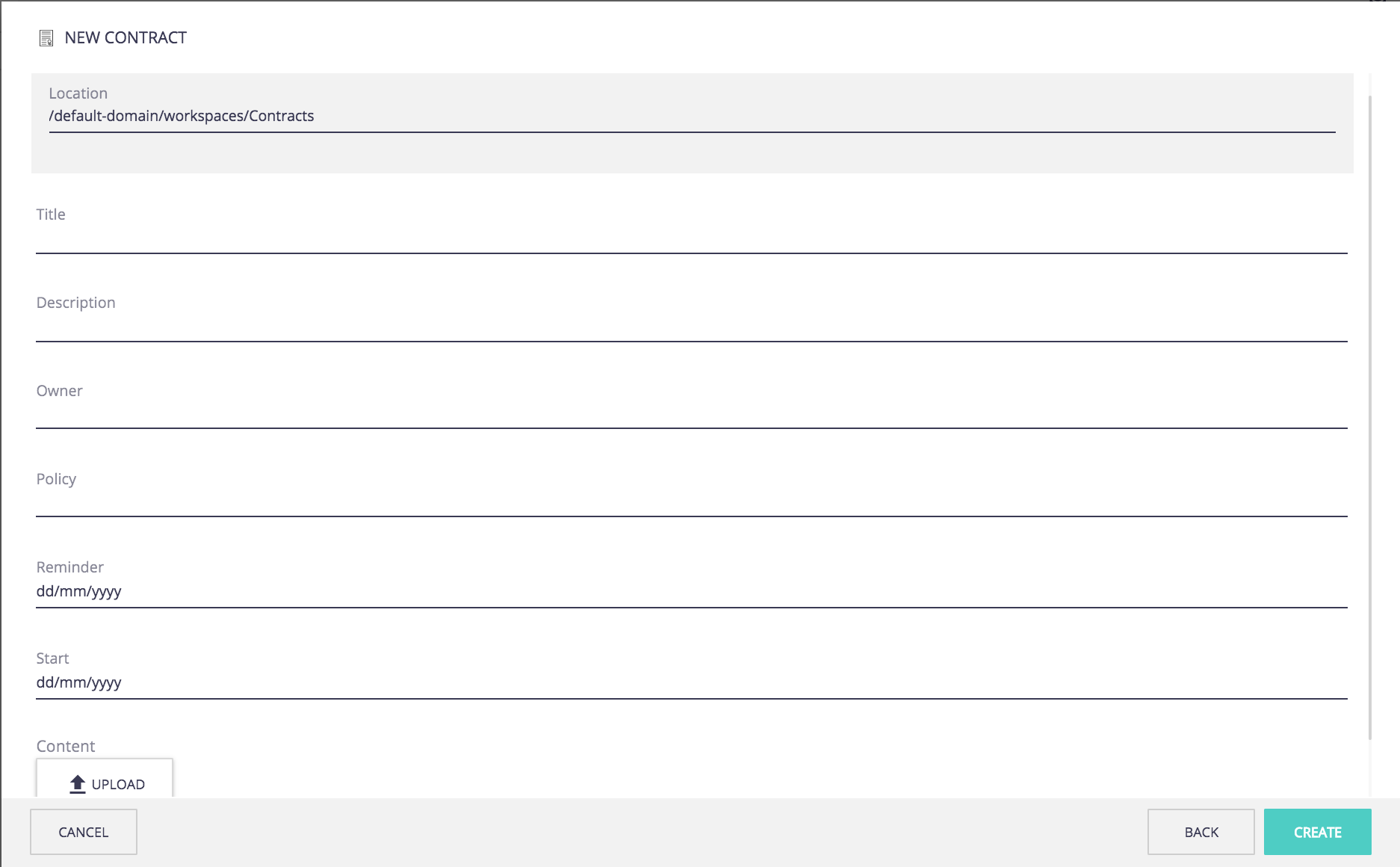
Create a Contract Document Type
Here we want to create a custom document type named "Contract" that will hold specific metadata related to the notion of a contract: contract owner, starting date, policy.
- In Studio Modeler, under Configuration, click on the Content Model section, then Document Types. Click on the New button.
Fill in the creation form as follows and click on Next:
- ID: Contract
- Extends: File
- Label: Contract
- Description: Contract document type for internal use.
Your document type is created.
- Fill in the Definition tab:
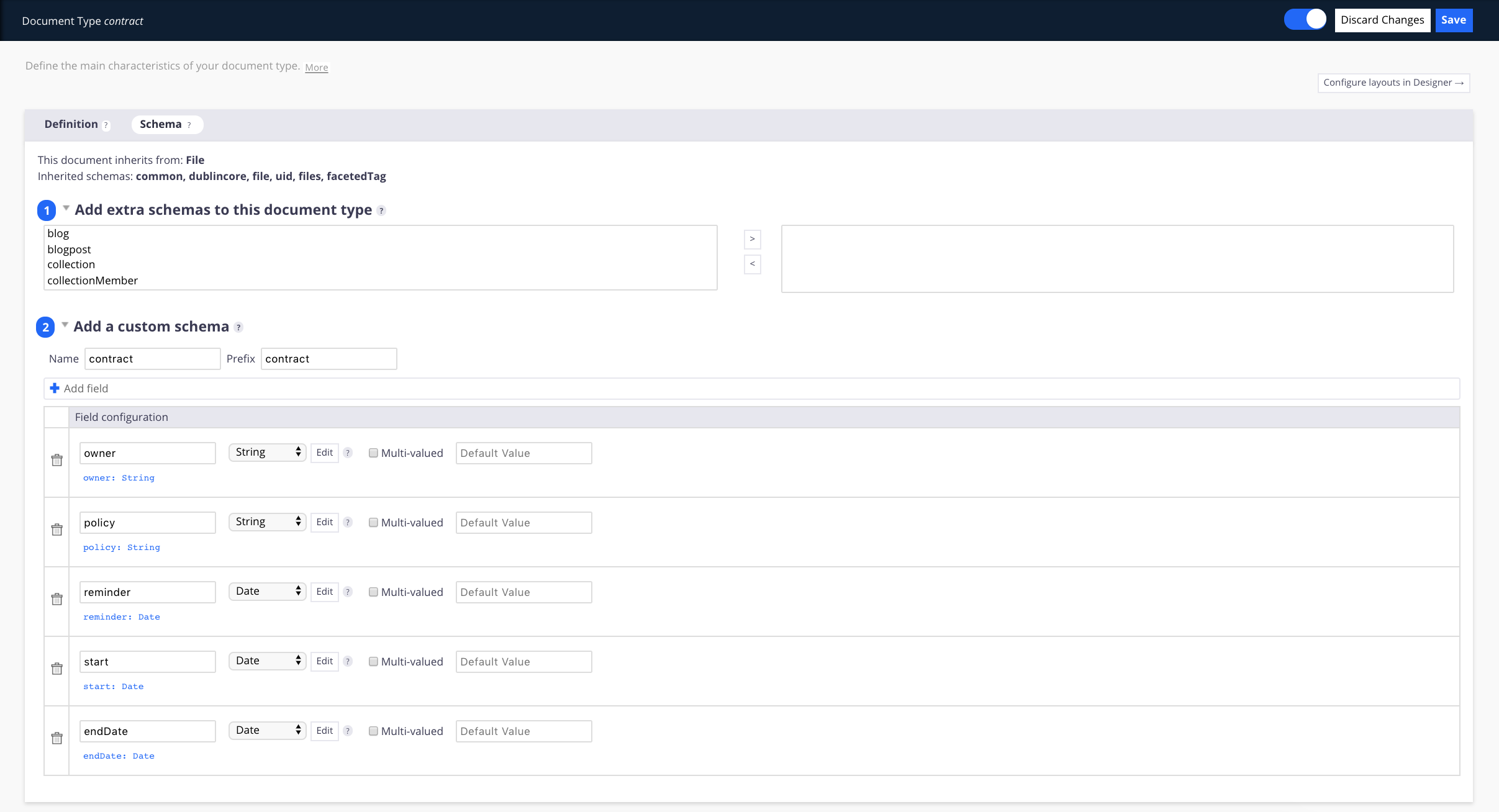
- Fill in the Schema tab with the following metadata:
Once you are all set, you can navigate to the Studio Designer to customize your layouts, click on Configure layouts in Designer button at the top of the page.
Create a New Layout
- In Studio Designer, go to UI > Layouts.
- Under Local Types you will find your
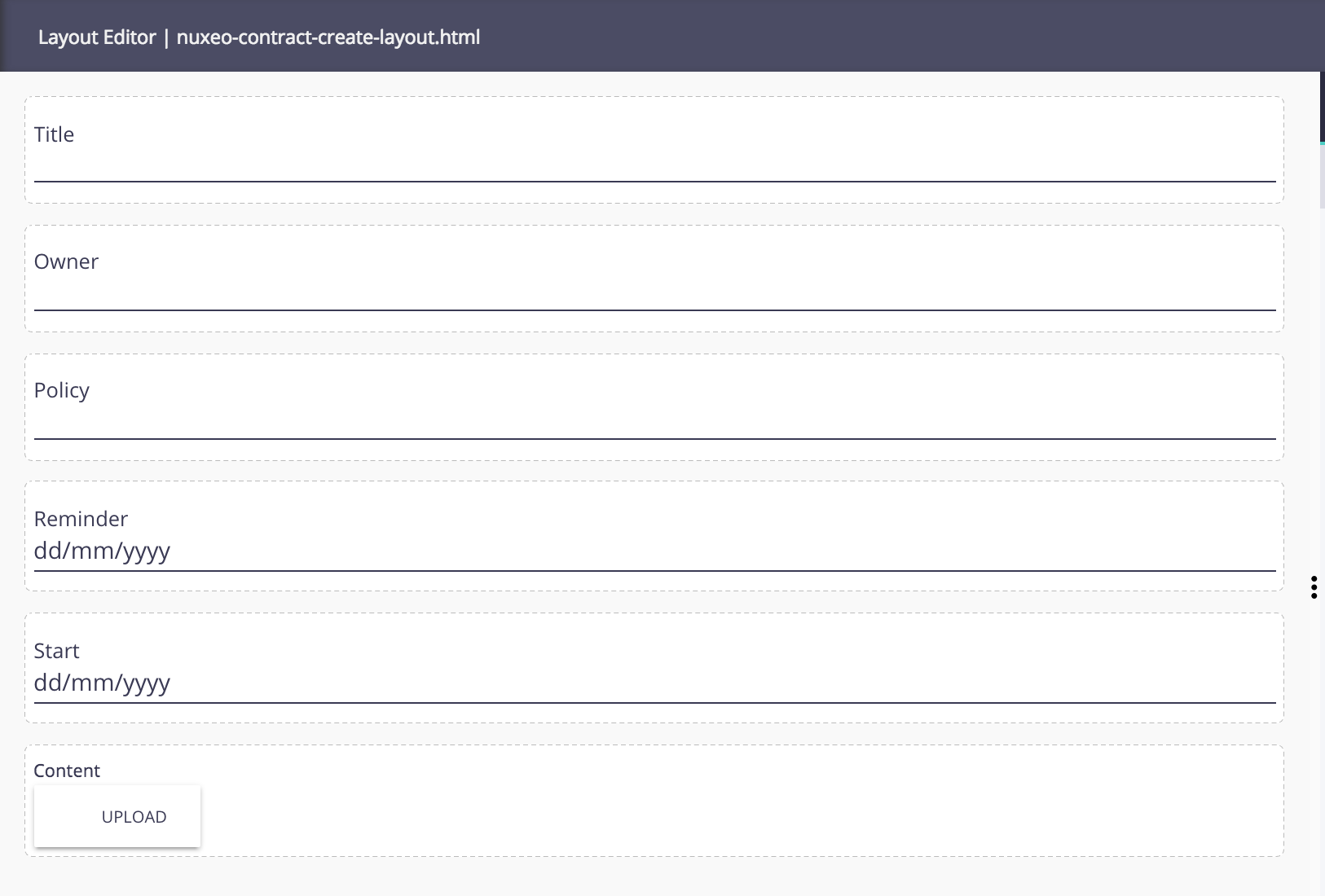
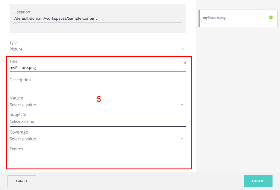
Contractdocument type. - Five layouts are available for the customization. Let's start with the Create layout: Click on the CUSTOMIZE button in the editor.
It automatically creates the
nuxeo-contract-create-layout.htmlfile, scaffolding:- The title and description fields
- Every custom schema property linked to the document type
- In the catalog properties on the left, select File > content:blob > view and drag and drop the element in the main view.
- Click on Save.
When customizing a document type, you need to create all layouts in the Studio Designer in order to display the relevant properties.
- Click on the Edit layout and then on the CUSTOMIZE button.
- Modify and/or delete fields as you wish them to be displayed when editing your document and click on Save.
- Do the same two last steps with the Metadata and View layouts and don't forget to save.
You now have an upload button on your document layout. - At the top right-hand corner of the Studio Designer, switch the editor to code editor. You are now in the HTML mode of the Studio Designer and you can see the element that you just drag and dropped on the other editor.
- Find the description's element and delete it.
Click on Save to keep your changes.
You should end up with something like this:
Configure Labels
When configuring a document type, a label is required. If you do not create a translation file, Studio uses this label as a fallback option to show your users something clearer.
If you create a translation file for your document type labels by uploading the corresponding files in Designer's UI tab, they override the configuration made in the label field.
To do so:
- Go to the UI table, click on Translations;
- Use the default
messages.jsonor create your own language; - Create a new entry in the JSON file with key
label.document.type.<document type name>and the document type name as value.
Here it is"label.document.type.contract":"Contract"; - Save your changes.
You now have a document type ready to be used on your Web UI interface, the last thing that you need is an icon to easily find your document type in your instance.
Create a Document Type Icon
To do so, you need to go on the Resources tab.
- Click on the UI folder.
- Click on the Create button, select a folder and name it images.
- In this Images folder, create a
doctypesfolder. - In the doctypes click on the Upload button and select your image.
You have to respect the following folder structure, and name the icon as your document type in lowercase in order to display the icon.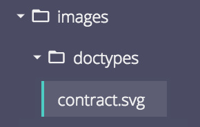 Your image needs to be in .svg format.
You can now deploy your project and see what it looks like!
Technical Overview
In Nuxeo Web UI, these different layout/mode combinations have been materialized into individual elements, meaning each layout element is bound to a given document type and built for a specific use case. This enables developers to leverage any custom elements they see fit when building their layouts with explicit binding between fields and elements properties - thus doing without the mode handling widget abstraction.
By simply following a convention that maps a document type to a set of pre-defined element names, according to the different use cases (modes), our application can dynamically load and instantiate the appropriate element for a given document.
Regions of the UI which require customizable document layouts rely on custom container elements to handle the loading and instantiation of the appropriate layout elements for the given use case, for instance the default tab has two customizable regions by default:
- the
viewlayout which usually displays an inline preview of the document and - the
metadatalayout which displays the document's metadata.
Each of these regions is defined by a generic layout container element which will import and render the specific layout element for the given document type, in this case nuxeo-document-view will rely on nuxeo-<doctype>-view-layoutand nuxeo-document-metadata will use nuxeo-<doctype>-metadata-layout, where <doctype> is the lower case document type (i.e. folder, note, picture, etc.).
These specific document layout elements are loaded by convention from a /nuxeo.war/ui/document/<doctype> folder and the element naming convention adopted is nuxeo-<doctype>-<mode>-layout.html where mode describes the use case and matches the layout name (i.e. create, view , edit, import, etc):
/ui
  └──── document
    ├─── <doctype>
    |  ├── nuxeo-<doctype>-<layout>-layout.html
    │  └── ...
    └── ...
The following table lists layout elements used by Nuxeo Web UI:
| Element | Layout | |
|---|---|---|
| 1. nuxeo-document-view | nuxeo-{doctype}-view-layout |
|
| 2. nuxeo-document-metadata | nuxeo-{doctype}-metadata-layout |
|
| 3. nuxeo-document-edit | nuxeo-{doctype}-edit-layout |
|
| 4. nuxeo-document-create | nuxeo-{doctype}-create-layout |
|
| 5. nuxeo-document-import | nuxeo-{doctype}-import-layout |
|
When instantiating and stamping these layout elements, a document property will be set to the current document and the layout is expected to update accordingly. The importing and stamping of these elements, executed by container, is simply:
this.importHref(this.resolveUrl(layout + '.html'), function() {
  // create the element
  var el = document.createElement(layout);
  // append it to the parent
  this.appendChild(el);
  // setup data binding
  el.document = this.document;
},
By building these elements with Polymer, developers can simply declare this document property and rely on native data binding support to bind document fields to the the template.
Since these document layouts are regular custom elements, developers have no limitations whatsoever in terms of HTML template, CSS styling or JS logics and are free to leverage any third party libraries or elements when building their own.
Layouts created and managed by Nuxeo Studio however will rely on introspection of the HTML and JS in order to provide validation and tooling support and will include some extra metadata, in the form of HTML attributes and/or JSDoc annotations.
The following is a sample definition of what an edit layout element for a MyDoc document type would look like, including Nuxeo Studio generated metadata:
<dom-module id="nuxeo-mydoc-edit-layout">
  <template>
    <!-- Custom CSS -->
    <style>
      *[role=widget] {
        padding: 5px;
      }
    </style>

    <!-- A paper-input widget bound to 'dc:title' -->
    <paper-input role="widget" value="{{document.properties.dc:title}}" label="Title"></paper-input>

    <!-- An input of type date bound to 'my:date' -->
    <div role="widget" class="item">
      <label>My date</label>
      <input type="date" value="[[document.properties.my:date]]">
    </div>

    <!-- Any HTML -->
    <img src="assets/imgs/logo.png">

  </template>

  <script>
    Polymer({
      is: 'nuxeo-mydoc-edit-layout',
      properties: {
        /**
         * You can use either @schema or @doctype annotation in your model.
         * Use to provide validation and auto completion of document properties.
         * @doctype MyDoc
         */
        document: {
          type: Object
        }
      }
    });
  </script>
</dom-module>
Customizing Document Creation
When contributing document types, there are two more contributions that have to be made in order for them to be properly displayed in the document creation wizard: add a custom icon and a custom label for each type.
The icon must be contributed to /nuxeo.war/ui/images/doctypes, named after the format {doctype}.svg. Labels must be added to the message files under the format label.document.type.{doctype}. In both cases, doctype must be the lower case doctype id.
You can prevent a doctype from being created via document creation wizard by adding to it the HiddenInCreation facet.
Doctypes can also be prevented from being imported even if they can be created, through the window.nuxeo.importBlacklist
array, which holds all the doctypes that cannot be created. You can simply add or override this array to fit your needs.
One could prevent the Workspace, Folder, OrderedFolder and Collection doctypes from being imported on the Web UI
by deploying the following as a WebResource:
window.nuxeo.importBlacklist = [
 'Workspace', 'Folder', 'OrderedFolder', 'Collection'
];