Concept
Read more about documents, properties and schemas in the Essential Nuxeo Platform Terminology.
Creating a Document Type
To create a document type, click on button "New".
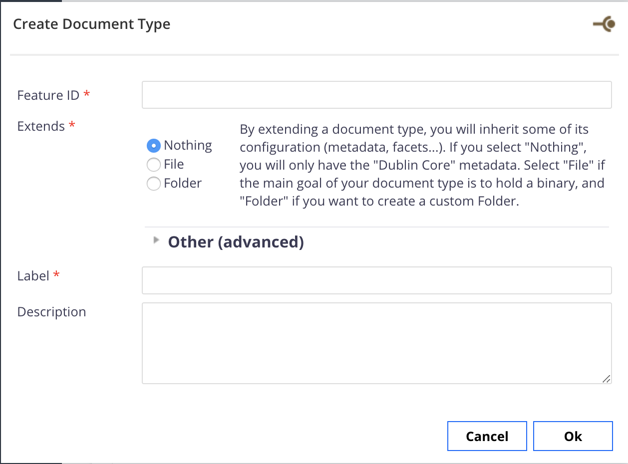
- Feature ID: The id of the document type. Will be used as the technical id at generation. Convention is to use a capital for the first letter.
- Extend: The document type that the type being created will extend. Local types are the ones created in your Studio project. Default types are the ones part of the Nuxeo distribution you use (Nuxeo DM 5.6, ...)
- Label: You can put here a label or an i18n key.
- Description: The description of the document type. This description is here for information purposes.
Definition Tab
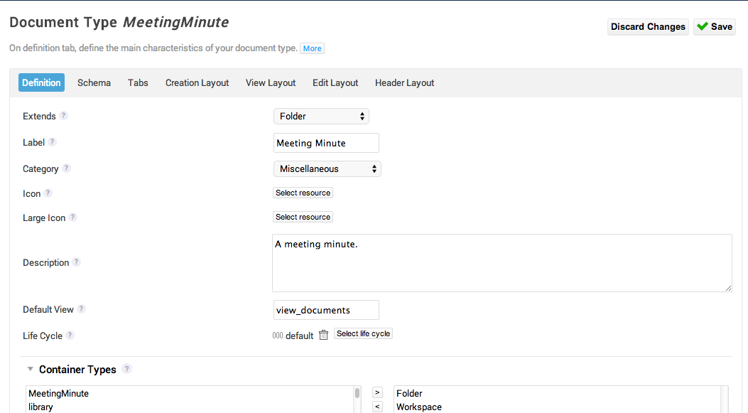
- Extends: See the Creating a Document Type section of this page.
- Label: See the Creating a Document Type section of this page.
- Category: The category defines in which column the document type appears on the "new Document" pop up in Nuxeo Server, when using JSF UI. If you don't want to use the default categories, you can add a new one using the custom document category registry.
- Icon: The icon displayed in the default list view.
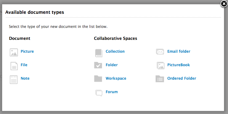
- Large Icon: The icon displayed in the "Available document types" pop-up when using JSF UI and the Icon view (view available up to Nuxeo Platform 5.8).
- SVG Icon: The icon displayed in the document creation pop-up when using Web UI. If you've already configured your document type icons by uploading the corresponding files in Designer's "Resources" tab, it overrides the configuration made in this field.
- Default view: The default JSF view. This is a technical attribute that you probably don't want to change (will be moved in an advanced section in the future).
- Lifecycle: The lifecycle the document follows. You can use a lifecycle that you defined in Studio Modeler.
- Container types: The document types from which it is possible to create the document type being configured.
- Accepted children types: The document types selected here will be creatable just under the document type being designed. This attribute only appears for document types that have the "folderish" facet.
- Document Facets: Read the page Available Facets for better understanding of what facets are and which ones are available. If you don't find the facet you are looking for, you can create it using the Facet editor or reference an external one using the custom facet registries.
- Deployment mode: This is particularly useful when you declare a document type that already exists in the default product from Studio, for instance "Folder", or "File". When the contribution generated by Studio is deployed on Nuxeo DM (for instance when you click on "Update" from Admin Center), either you want to delete the previous definition, and use only what was defined from Studio (override), or you just want to "complete" the definition from what you configured in Studio (merge). A concrete example is: by default, an icon is defined for the Folder document type. If you redefine the folder document type from Studio and don't configure the Icon and Big Icon attributes, then if you select "override" for Deployment mode, your folders won't have any icon, while if you select "merge", they will keep the icon that was originally defined.
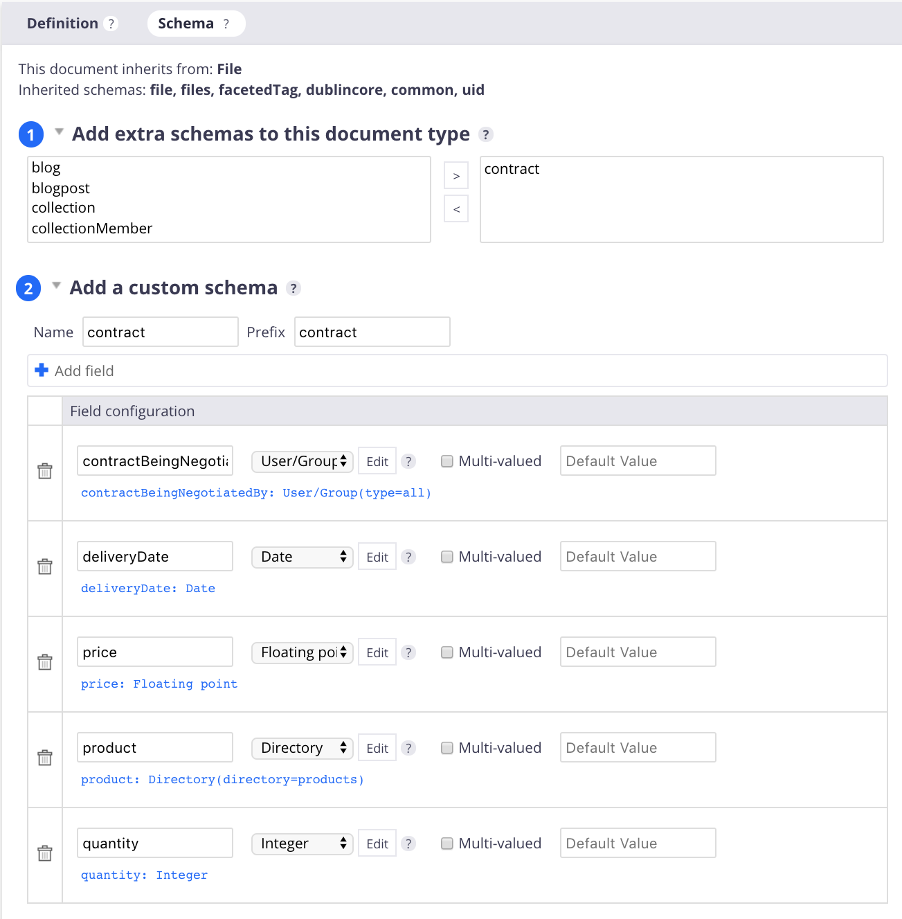
Schema Tab
This is where you can define a schema for your document type. It shows:
- The inherited schemas, i.e. schemas from the document type you are extending
- The Add extra schema to this document type form: Select schemas from other document types to be available for your custom document type.
- The Add a custom schema form: Define your own schema. This is equivalent to defining the schema from the Schema feature and assign it from the Add extra schema form. Read the Schema page for more information on how to define your schema.
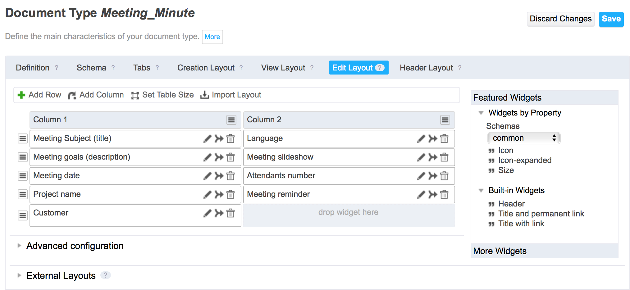
Creation, Edition, View and Header Layout Tabs
On those tabs, you can respectively configure the creation, edition, view and header layouts of the document type you are designing. They work like the form layouts feature, thus you can follow the same instructions.
However there are a few differences/additional features:
- The Header layout, which is not on the form layout feature is the part that is displayed on top of the tabs when viewing a document. By default, it displays the title and the description.
- You don't have to reference the layout anywhere, they will be bound automatically to the document type you are configuring.
- External Layouts: it is possible to "compose" the creation/edition/view/header layouts as being the aggregation of multiple layouts that are created from the form layouts feature.
Tabs - Default Tabs Filtering
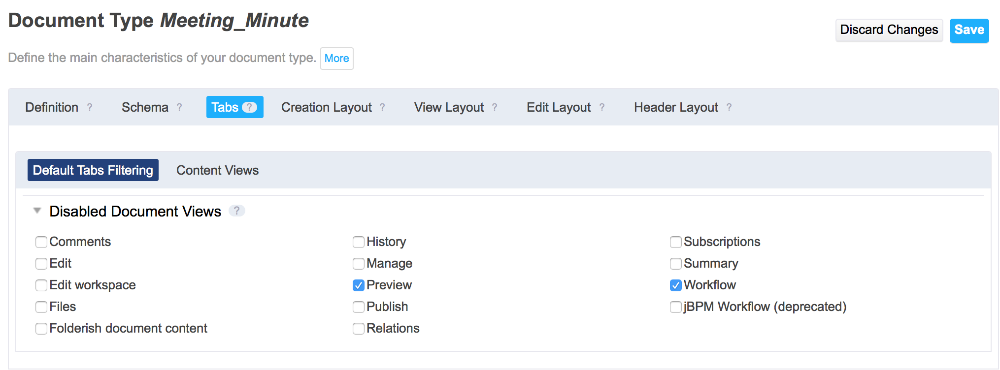
Select the Nuxeo JSF UI target package in your Application Definition for this feature to be available.
Documents in DM are displayed with a series of tabs to display all the actions that can be done on documents. By default, a new document type will hold all the tabs. From this view in Studio, you can disable some of them, for the document type you are configuring. This is a binary activation/inactivation. If you want to refine the tabs display rules, you can contribute XML extensions to the action service, so as to override existing contributions (for advanced users).
Tabs - Content Views
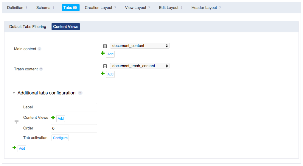
Select the Nuxeo JSF UI target package in your Application Definition for this feature to be available.
Content view tabs are tabs that display a list of documents in a table, that is the result of an NXQL query (a content view). You configure the content view with the content view feature and just reference it here.
- Main content: you can choose which content view is used for the document you are configuring. This appears only for document types that are folderish.
- Trash content: you can choose which content view is used for the document that are displayed in the trash. This appears only for document types that are folderish.
- Additional tabs configuration:
- Label: The name displayed for this new tab. Can be a translated key.
- Content views: You can reference several content views that will be displayed one after the other.
- Order: The place of the tab on the document . You can put numbers like 0, 5, 10, 40, 150, ...
- Tab Activation.