Nuxeo Web UI is a standard base web application for Nuxeo Server that connects via HTTP and displays all the features of the platform to the users. Customizable, scalable and built upon a framework of Web components, it allows Nuxeo Platform developers to build their own front-end application using these components. The Nuxeo Web UI addon is available on Nuxeo Marketplace.
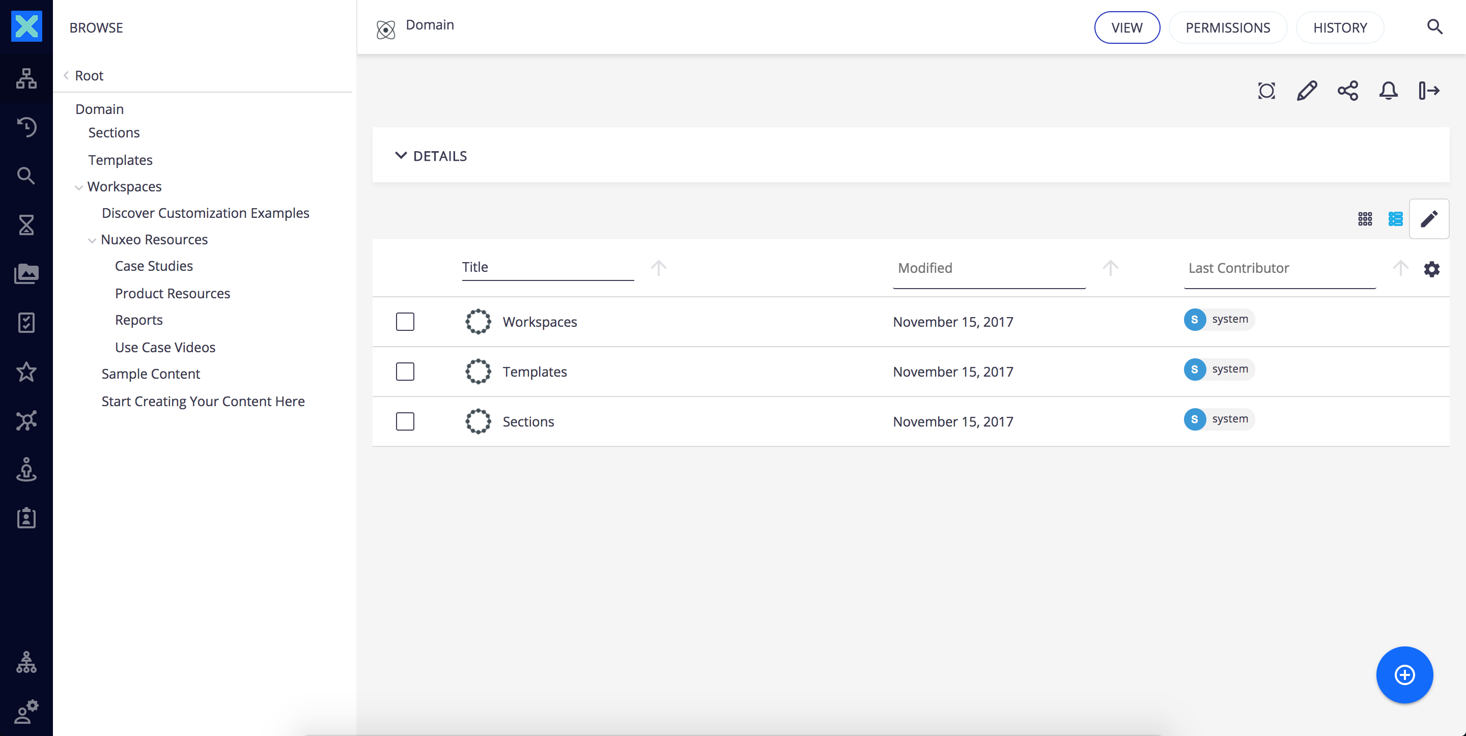

It leverages the web as a platform and allows enhanced productivity with direct access to last visited documents, collections, easy browsing between previous/next document, full screen suggester and several other features built to provide a rich user experience. Here are the most important topics on getting started with Web UI, customizing it and building new web apps using Nuxeo Elements:
Requirements
Nuxeo Web UI and Nuxeo Web UI Elements framework make use of the recent W3C standard Web Components and Google Polymer 2.0 framework (legacy mode). The Google Polymer framework comes with polyfills for Web Components, a library that extends the support of web components standard to more browsers.
Previous versions of Nuxeo Web UI (1.x) relied on Polymer 1 so for compatibility reasons and to ensure a simple incremental upgrade the current version of Nuxeo Web UI is running Polymer 2 in legacy mode thus using the Polymer factory method, not the ES6 class-based syntax. Most of the 1.0 APIs are thus still available, as are any new 2.x APIs.
The following browsers are supported:
- Google Chrome
- Microsoft Edge
- Mozilla Firefox
- Safari 11+
- Safari Mobile
- Chrome Android
Edge, Firefox, and Chrome are called “evergreen browsers”: they are automatically updated at a high pace. The UI code of the version of Nuxeo relies on Polymer 2, supported by Google on those evergreen browsers. Nuxeo guarantees to support Web UI and fix bugs caused by misuse of the Polymer 2 framework. Nuxeo cannot guarantee to provide fixes for bugs inherent to the underlying Polymer 2 framework, especially when those bugs will happen with future versions of the above-mentioned browsers. Nevertheless, Nuxeo is committed to using the latest supported version of the Polymer 2.X framework, provided by Google to the community, when it helps fixing bugs, especially against evergreen browsers.
When developing using Nuxeo Web UI, make sure to set up your development environment according to the requirements described in the Nuxeo Web UI repository.
Functional Overview
Nuxeo Web UI is a responsive application with three main layout regions:
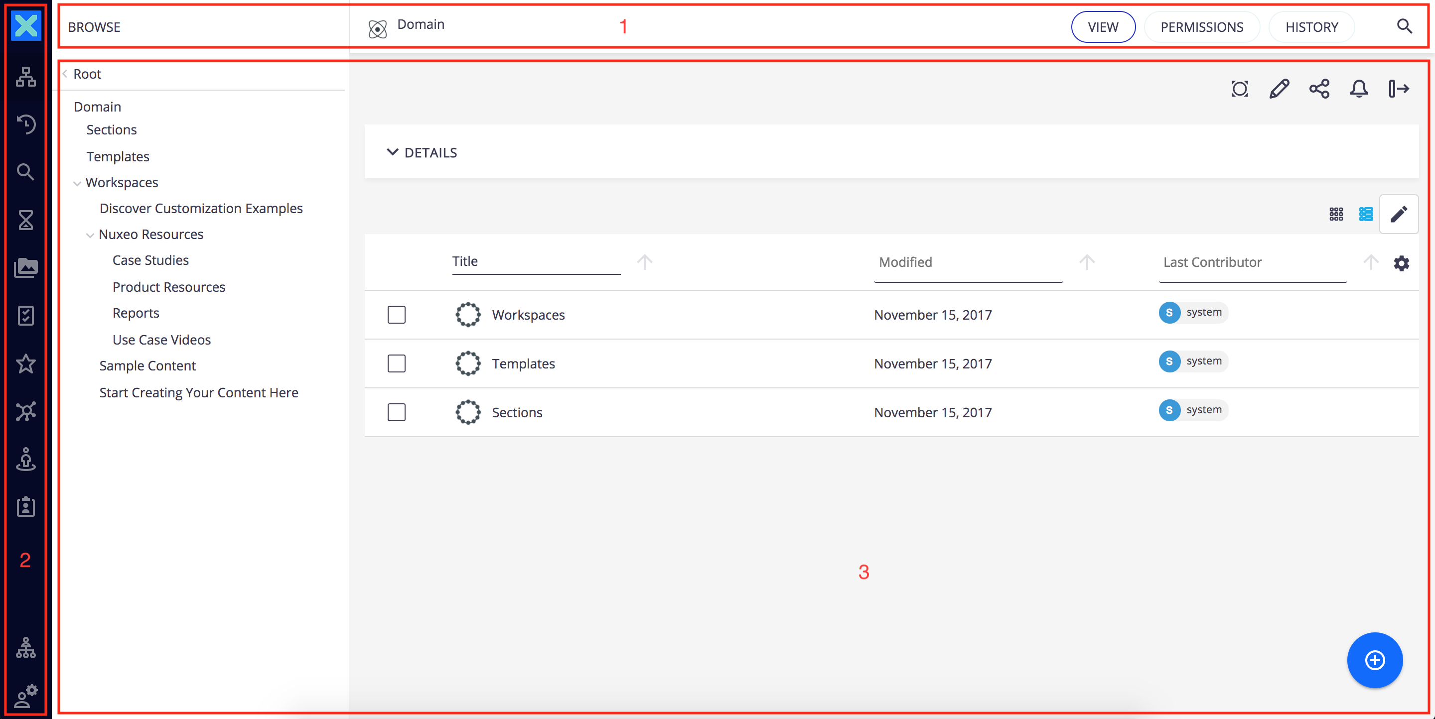

Header Toolbar


- Domain: The title of the selected page / document.
- Sub-Views: The sub-views available.
- Quick search: Search by keywords or users.
Side Menu
The menu displays different tabs. Clicking on one of them will open a side panel with the content of the tab selected: browsing options are on the first left column, content to browse on the second and content to view on the main area. We will see the description of the main area on the last part of this section.


This new pattern allows to start browsing without changing the context of work.
 | Dashboard: Displays the dashboard |
 | Browse: Shows the navigation tree to let you browse your content |
 | Recently Viewed: Shows the 10 last documents viewed |
 | Search Filters: Search content using full text and metadata |
 | Expired Queue: Queue displaying expired documents |
 | Tasks: Shows the list of pending workflow tasks |
 | Favorites: The list of documents added to Favorites |
 | Collections: The list of collections you can access |
 | Personal Space: Access to your personal workspace, which is the default location for your Favorites and Collections folders |
 | Clipboard: Clipboard to copy and move documents |
 | User Settings: Displays a Themes tab to manage branding and possibly other tabs depending on Nuxeo addons installed. For instance when Nuxeo Drive is installed a Drive tab is available to manage the user's synchronization roots. |
 | Administration: Displays the Administration tab. |
Main View
The main view display depends on what has been selected on the side menu. The main view will usually show lists of documents or a document and its details. Lists of documents are presented in a table that proposes different functionalities like infinite scroll instead of pagination, faceted filters in the header, easy columns selection with persistence of the user's choice and a great visibility of selected elements.
At the top of the main view toolbars are displayed according to the content being displayed:
Document Actions: Displays actions available for the current document


Results Actions: Displays actions available for the current result listing

A create button ![]() is also permanently displayed at the bottom right corner of the main view the to let you create or import documents from anywhere in the application.
is also permanently displayed at the bottom right corner of the main view the to let you create or import documents from anywhere in the application.
Technical Overview
Nuxeo Web UI has been built with simplicity and composability in mind. Nuxeo is a content application platform and our goal is to provide tools and components for you to build your own application. With Nuxeo Web UI we wanted to review our approach, make it simpler so anyone familiar with web development couple easily customize it or even just take is as an example of what can be achieved and build their own. Hence the shift from a highly configurable and pluggable UI to a more modular and composable one.
With the introduction of Web Components, browsers now offer a well-defined high performance component model out of the box and has a familiar API. By leveraging DOM as the framework and extending HTML with our own custom tags we can empower web developers to use the tools and frameworks they are already familiar with to build rich web applications.
Web Components
Web Components are a collection of standards which ultimately allow developers to create their own custom HTML elements. Among those standards are:
- Custom Elements: These custom elements can use custom tag names, attributes and events and can also expose a custom script API. Developers can even extend native HTML elements as well as other custom elements. Custom elements allow you to bring new semantics to the Web, extending the existing HTML vocabulary and promoting more meaningful structured markup and content.
- Templates: The content of the custom elements can be defined by templates - chunks of markup that can be attached and activated on demand. If you have used Mustache or Handlebars you should be pretty familiar with the concept of templates.
- Shadow DOM: Proper isolation is also a cornerstone of Web Components thanks to a new specification called Shadow DOM. It allows encapsulation and well defined boundaries within the DOM. Any HTML, CSS or JavaScript inside your custom element can be protected from the parent document allowing for more reliable composition of your user interface components.
- Imports: Web Components specify the packaging and loading of your custom elements as well, thanks to Imports which provide a convention for bundling your HTML, CSS and JS into a single deliverable: Polymer.
Web Components allow us to finally create reusable custom elements which can interoperate seamlessly with the built-in HTML elements and can be leveraged transparently, regardless of the application framework adopted.
Having a standard component model enables us to really take advantage of the browser as a platform to build rich web applications and keeps our code cleaner and less expensive to maintain.
Web Components vs JSF
Similarities
- Reusability: Custom elements are like JSF components: they hold their logic, their model, they can be based on custom templates and they provide data-binding. They authorize you to build advanced components with reusability in mind, which is a key point when you are building a platform.
- Modularity: Close to native HTML chunks, Custom Elements are compatible with templating and composition design, which is absolutely necessary for building an extensible and modular application
- Decoupling: Another aspect of Seam/JSF that helped us a lot with was the decoupling supported by the event/observer pattern, which allowed us to deploy new SEAM components without having to strictly reference them in other components. We can use custom events to have a similar approach with Custom Elements.
- Databinding: Web Components frameworks such as Polymer have added a notion very similar to the JSF EL for having advanced data-binding in attribute values, with easy references to scripts variables and methods, a bit like the way Seam component methods can be referenced from the JSF EL. This makes it very easy to wire Web Components together and provide an easy to understand pattern for implementing what you need.
Web Components Advantages
- Client-Side versus Server-Side: Web Components is a client side technology, while JSF happens server side. Aside from all the stateless/stateful design comparison that clearly goes in favor of stateless design, the necessity of having a complete tree representation of your page server-side added a lot of complexity in the JSF cycle and its framework apprehension.
- Agnosticism: JSF is a standard limited to the Java World while Web Components are a W3C specification.
Polymer
Polymer presents itself as a new type of library for the web built on top of Web Components and designed to make it easier and faster for developers to create great, reusable components for the modern web.
Polymer just removes some boilerplate and adds bit of sugar over the standard Web Components APIs. Its goal is to make it easier to develop web components by providing a simpler API which also by building on top of existing polyfills which fill in the gaps where browsers' are lacking:
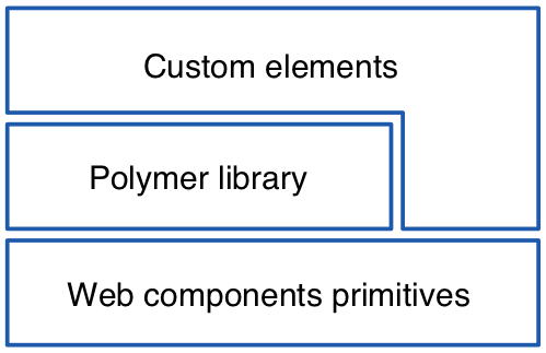

The Polymer library provides a simple declarative syntax to define custom elements and help you build powerful, reusable elements with less code while also including special features like:
- Element registration
- Lifecycle callbacks
- Property observation
- Local DOM template
- Data binding
There are a number of elements built with Polymer that you can use to build your own applications and while these elements depend on the Polymer library, you are free to use them without using Polymer directly.
To learn more about Polymer and how you can start building your elements you can check out our Polymer Guide.
It is important to keep in mind that Polymer is but a means to an end. It's there to make the job of building custom elements simpler, it is not a commitment in terms of application framework. Web Components are a standard and interoperability with other frameworks that build on web native technologies should be ensured.
This promise of interoperability and the ease of use of components built with the Polymer library led us to the creation of our own Nuxeo elements, a set of custom elements provided by us that allowed us to build our UI and which we've made available to developers so they too can build their own custom UIs.
Nuxeo Elements
Nuxeo Elements are built with Polymer which even if not initially envisioned as an application framework was quickly adopted as such due to its simplicity and familiarity. Applications built with Polymer are modular by nature since everything is an element and these elements themselves are reusable and interoperable since they rely on the native component model. Concepts and features provided by other application frameworks are generally provided by the DOM and Polymer adds some "sugar" where things are lacking.
Our Web UI is built itself with Polymer too. Goals were to not only ensure the simplicity and composability we aimed for but also to be as framework independent as possible so developers can use our elements to build their own UIs with whatever framework they see fit.
Web UI elements
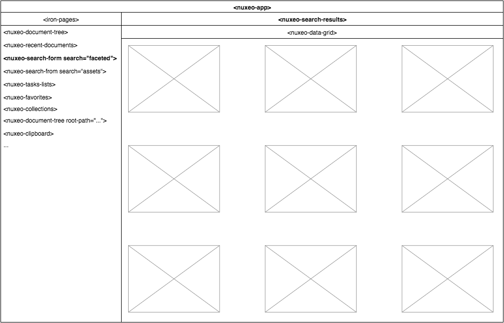
Everything in the web UI is built as a custom element with <nuxeo-app> as top level component. This application element acts as application data store / mediator storing context data as properties which are then forwarded through the hierarchy thanks to data binding. To learn more about data binding and its relation to the mediator pattern you can read the article on our "Polymer" series.
<nuxeo-app> relies on our data elements (<nuxeo-document>, <nuxeo-resource>, etc..) to fetch application wide data and it is in charge of refreshing this data when changes are made. We are not relying on two way binding in order to keep the data flux manageable thus parent elements act as data stores and children fire events to notify of changes causing data to be refreshed and then propagated down through the DOM tree. Alternative would be to rely on a custom event / action system like many framework do but, although this would avoid the cost inherent to event bubbling, it would make our elements dependent on the the existence of such as bus and introducing framework lock-in.
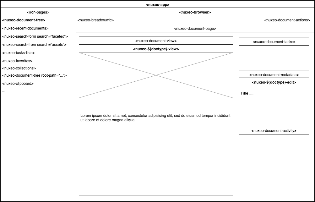

The drawer's content is managed by <iron-pages> which toggles between its children depending on current selection in the left icon menu of the UI.
The main area is reserved for displaying the current page's content. Our router relies on page.js and is in charge of parsing the URL and setting the current page and context data in <nuxeo-app> accordingly.
