General Guidance
Nuxeo-dropzone allows the user to transfer a file or submit content or their own.
- Nuxeo-dropzone is commonly used in forms, but they can also live as a standalone element.
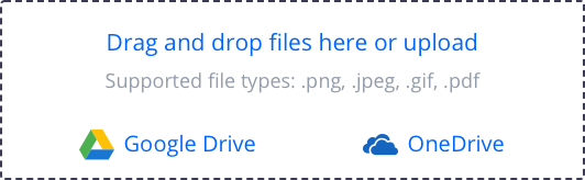
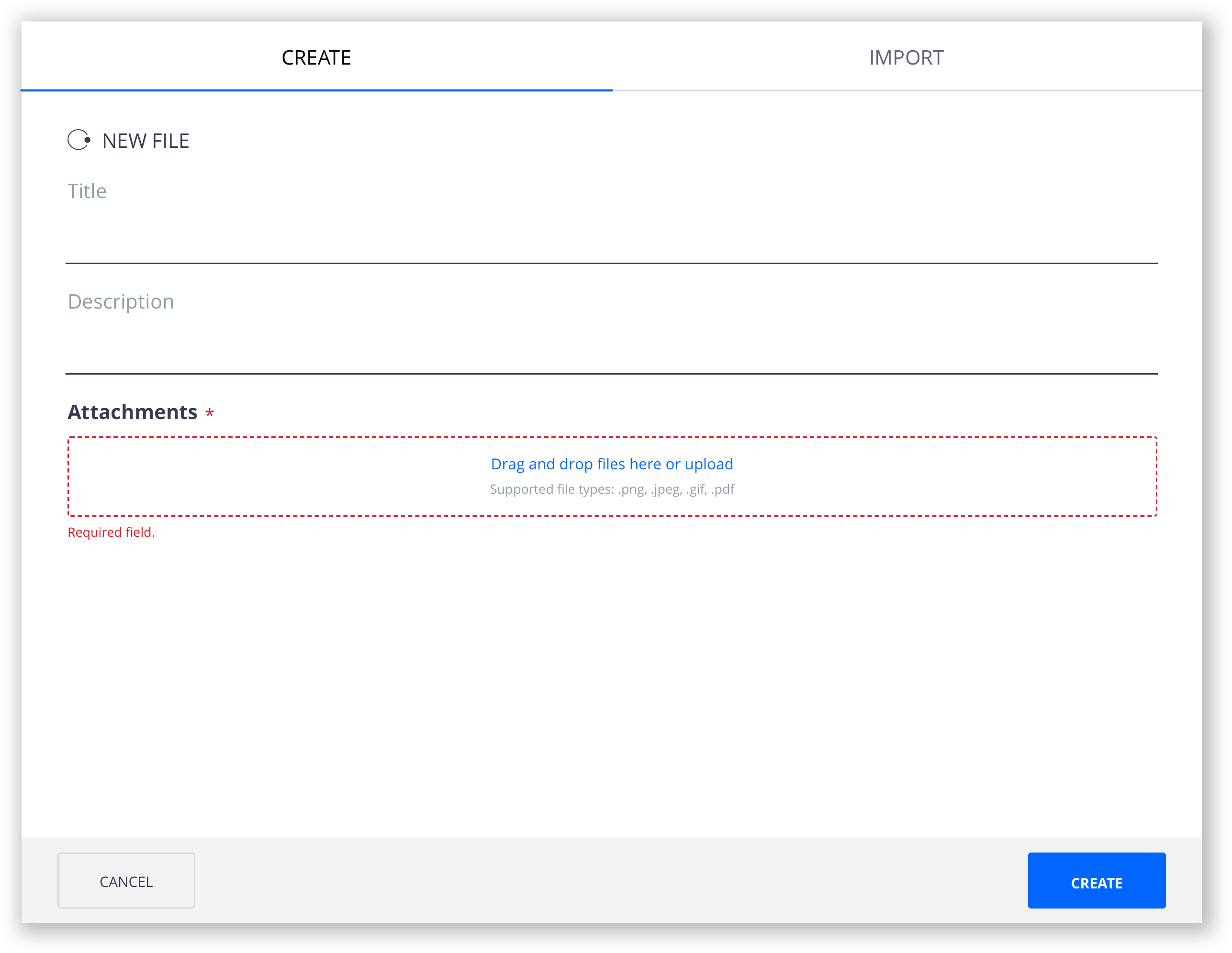
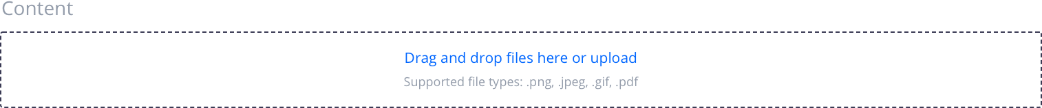
Drag and drop files here or upload is the default label that appears with the file uploader.
A helper text under the label is empty by default but can be edited by the configurator to alert the user about the supported file types and/or maximum file size.
 |
 |
 |
|---|---|---|
| Default | On hover | With add-ons |
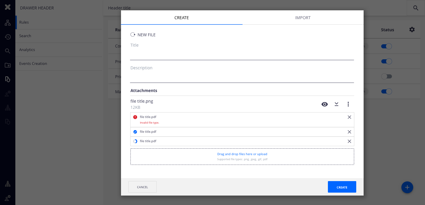
- In edit mode (such as forms) the nuxeo-dropzone will only create the items once the user submits or completes the form. If the user decides to cancel the form, none of the items uploaded on nuxeo-dropzone will be created. If the items fail to upload or are still uploading when the user tries to submit the form, an inline notification will be displayed alerting for the failed upload and/or items still uploading.
If the nuxeo-dropzone is used as a standalone element, the items are automatically created after the successful upload.
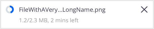
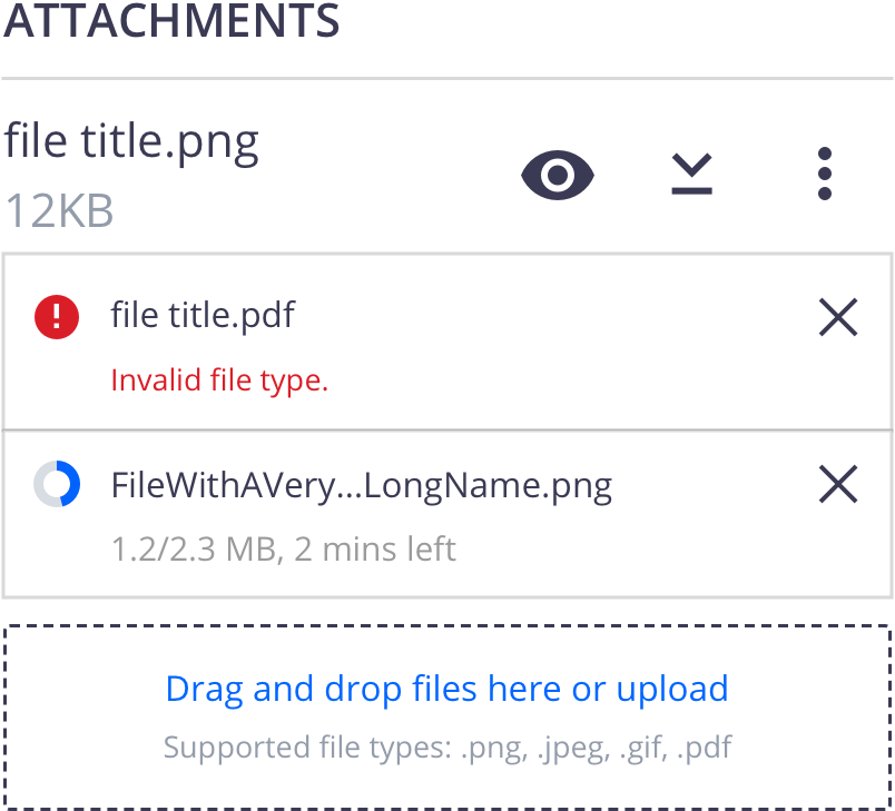
If the filename extends beyond the width of its parent element, use an ellipsis (…) in the filename but still show the format. When the user hovers over the filename, a tooltip displays the entire filename.
- In forms, if the dropzone is a required field and the user is trying to create/save the form without any input, an error message is displayed underneath the dropzone.
Interaction
The action of clicking the label will trigger a browser-specific upload window where the user can select the files to be uploaded.
Once the user chooses the files to upload, the browser-specific upload window closes.
The user can, instead, drag and drop files over the dropzone.
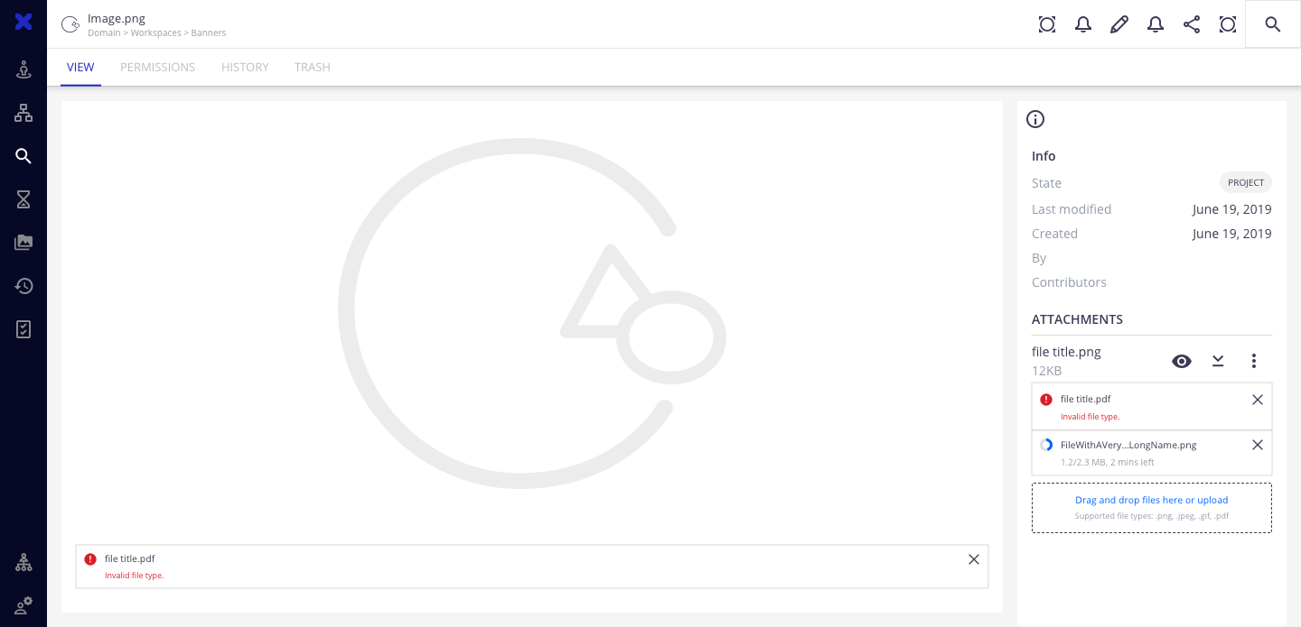
The selected or dropped files will appear over the dropzone. In view mode, if there are already existing files, the recently uploaded files will appear beneath the existing ones.
- For single blobs, once a file is uploaded, the dropzone is replaced by the inline notification of the uploaded file with actions to replace and remove on the top right corner. If the file is removed, the dropzone is displayed again.
Empty
With File
 |
|
Upload State
After dropping/selecting the files, show upload status followed by the file name and action to remove.
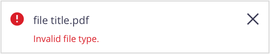
The order of the uploading files will be: failed to upload, successfully uploaded, and uploading.
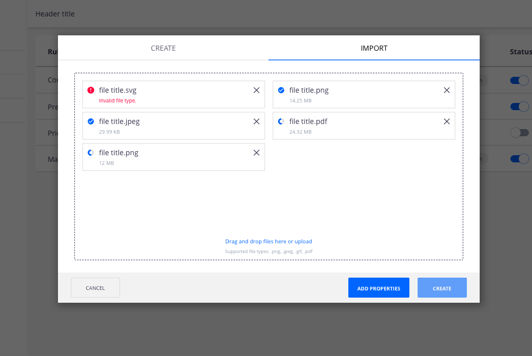
When the file is uploading, show the size and time estimate (if we can get that information), under the filename. If we can’t get that information, the indeterminate circular progress indicator should be looping.
When the file is successfully uploaded and automatically created (in view mode), it will highlight for 4 seconds: the title becomes semi-bold and in nuxeo-primary color.
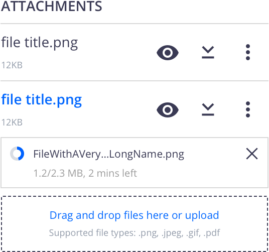
- Any error that may occur with the file should appear as an inline error notification. The description of the error shows under the filename.
References
Page Laubheimer, Drag–and–Drop: How to Design for Ease of Use, (Nielsen Norman Group, 2020)