Color
Refer to the buttons for primary and secondary button styling in the transactional modal.
| Text + close icon | nuxeo-text-default |
|---|---|
| Background | paper-dialog_-_background |
| Box-shadow | var(--shadow-elevation-16dp_-_box-shadow) |
| Overlay | var(--iron-overlay-backdrop-opacity, 0.6) |
Typography
| Font-size (px) | Font-weight | Class | |
|---|---|---|---|
| Title | 20px/1.25rem | Regular (400) | Headline 3 |
| Body | 14px/.875rem | Regular (400) | Body |
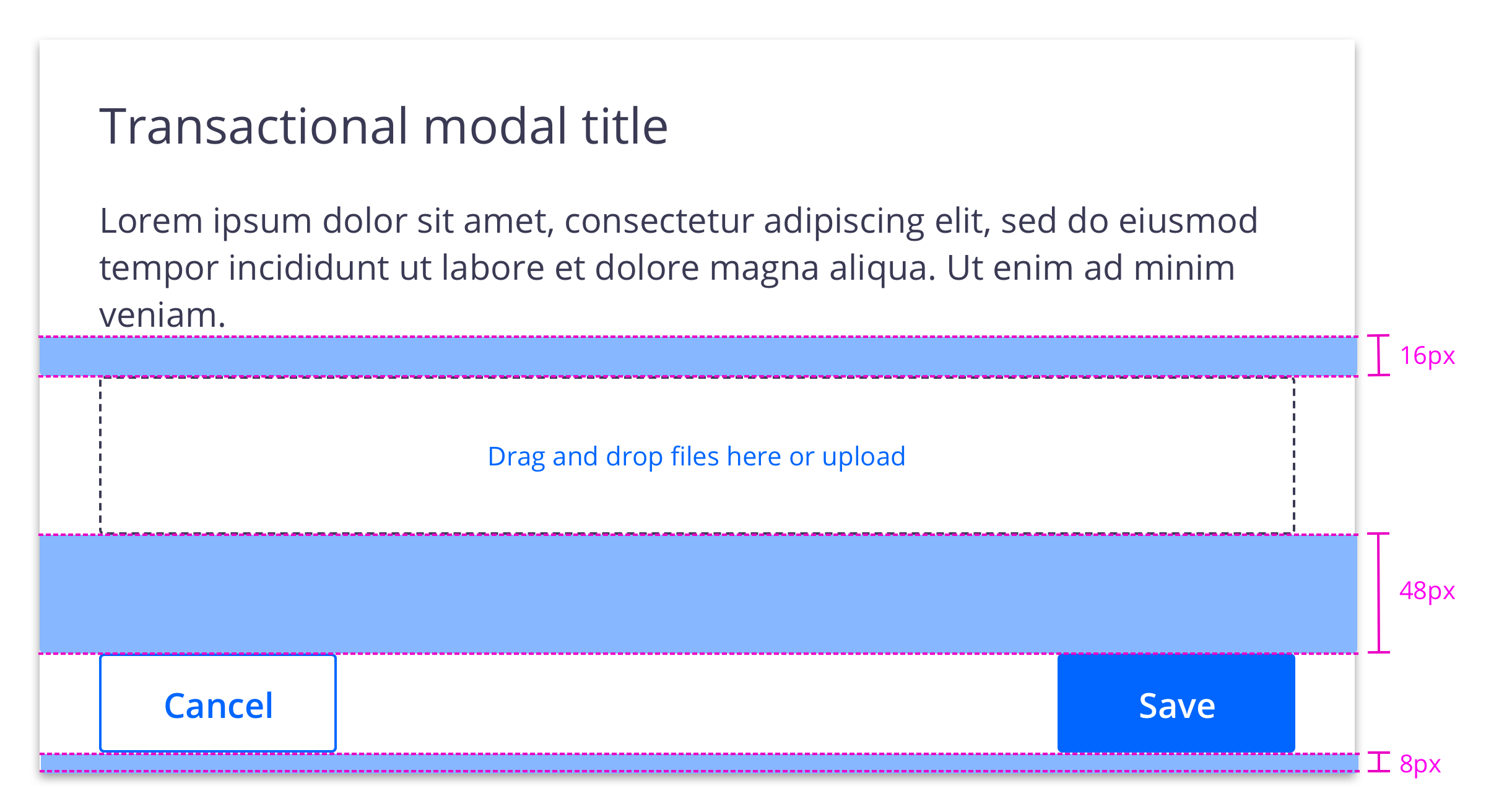
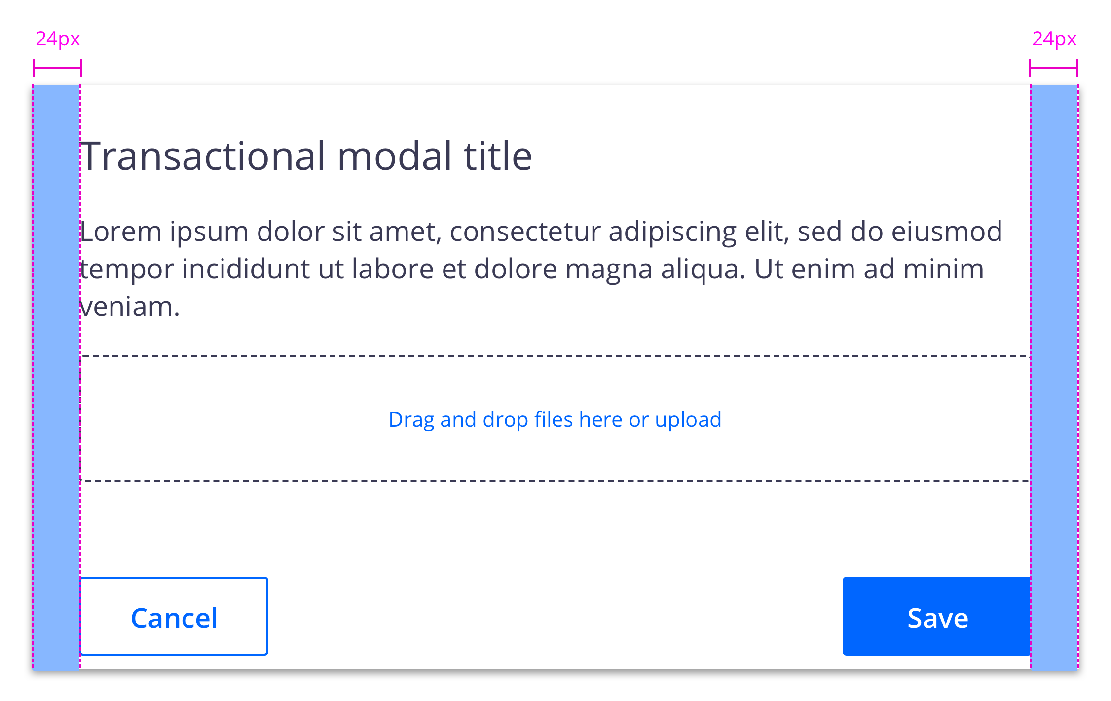
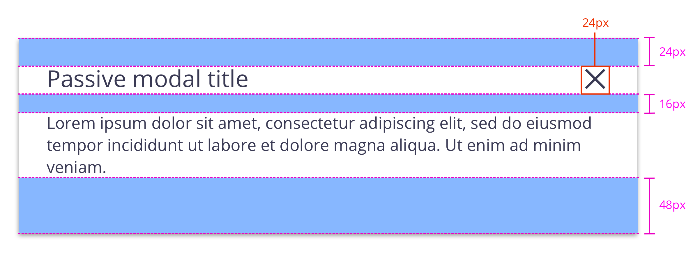
Structure
Structure and spacing measurements for a passive modal
Structure and spacing measurements for a transactional modal