General Guidance
A modal is triggered by a user’s action when the system needs input from the user or to give the user urgent information concerning their current workflow. It interrupts a user’s workflow and focuses the user’s attention exclusively on one task or piece of information via a window that sits on top of the page content.
When active, a user is blocked from the on-page content and cannot return to their previous workflow until the modal task is completed or the user dismisses the modal. The purpose of a modal should be immediately apparent to the user, with a clear and obvious path to completion.
Modals should be used sparingly to limit the disruption to the user.
When to Use
An Immediate Response Is Required From the User
Use a dialog to request information that is preventing the system from continuing a user-initiated process.
Notify the User of Urgent Information
Use a modal dialog to notify the user of urgent information concerning their current work. Commonly used to report system errors or convey a consequence of a user’s action.
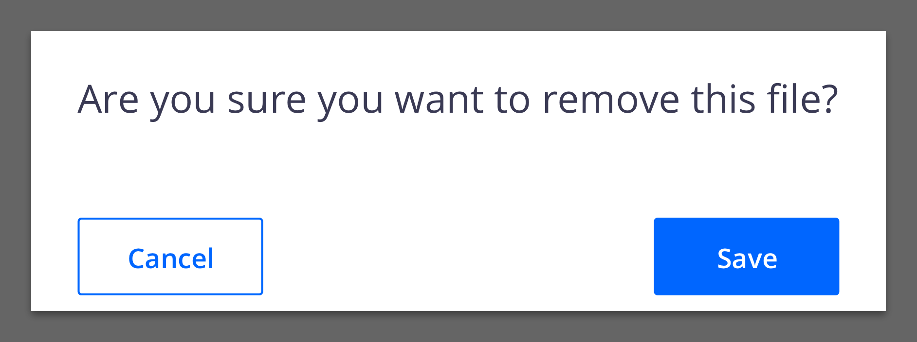
Confirm a User Decision
Use a modal dialog to confirm user decisions. Clearly describe the action being confirmed and explain any potential consequences that it may cause. Both the title and the button should reflect the action that will occur.
When Not to Use
Modals Prevent Access to the Main Page
Don’t use it if additional information outside the modal needs to be consulted. While a modal dialog is active, a user cannot interact with the main page and is restricted to only the information in the modal for making decisions. Modal tasks should be easy to complete with the limited information presented in the dialog itself. If a user needs access to additional information then consider using a full page instead.
Don’t Nest Modals
One modal should never trigger another modal. If the first modal task is dependent on a confirmation modal to approve then that first task should not be performed in a modal.
Don’t Make Modals Full Page
If a modal dialog needs more space than the large modal component allows then the content should be displayed on a page of its own and not in a modal. A modal is not an alternative to a page.
Formatting
Anatomy

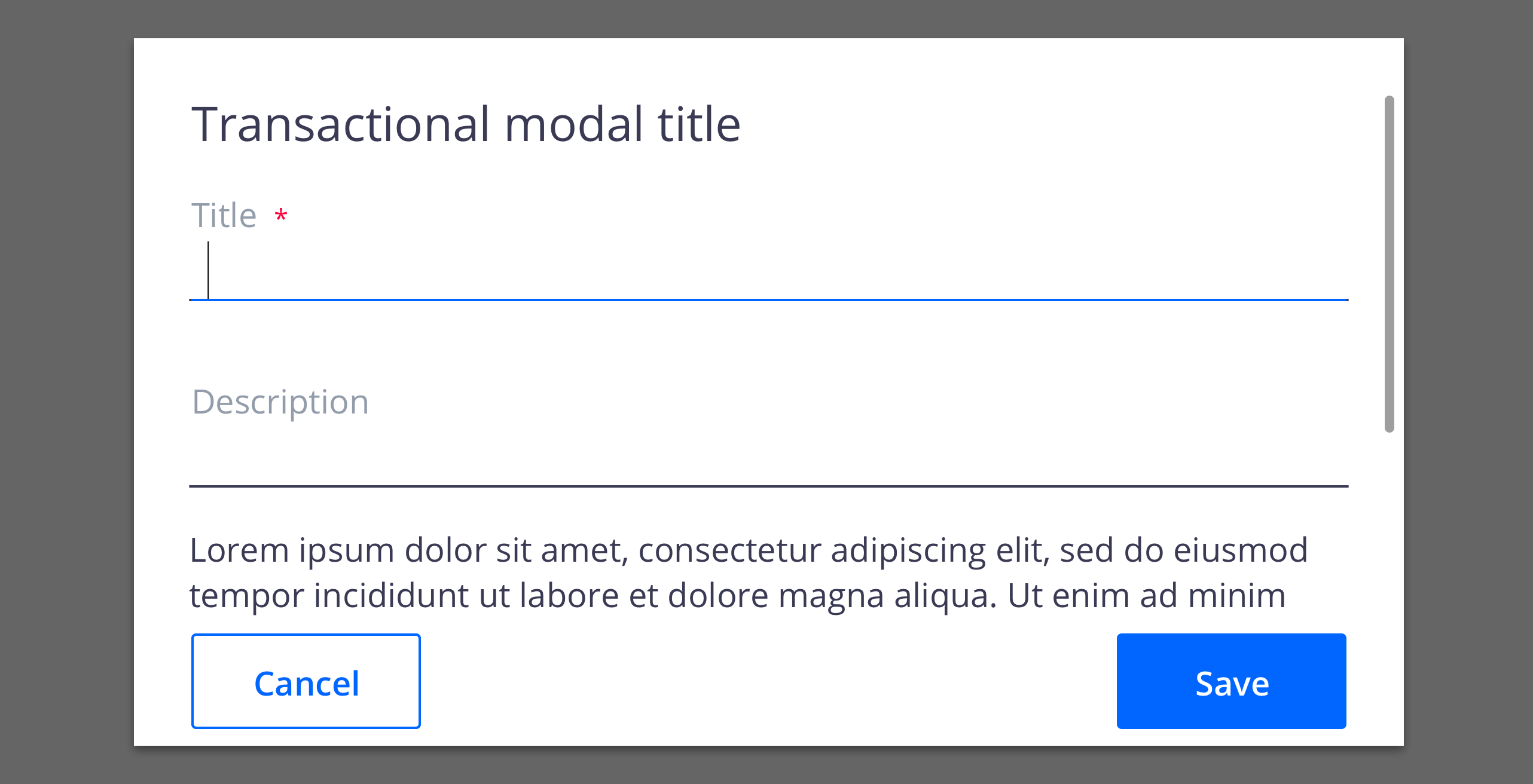
Header: Includes a title, an optional label and the close icon (optional in transactional modals)
Body: Contains the information and/or controls needed to complete the modal’s task. It can include message text and components.
Footer: Contains the main actions needed to complete or cancel the dialog. Button groupings change based on modal variant.
Overlay: Screen overlay that obscured the on-page content.
Content
Overflow Content
When the modal content is longer than the modal height then the body section should scroll vertically with the header and footer remaining fixed in place. The content should visibly cut at the end of the modal body area to indicate there is additional content out of view.
Modal content should never scroll horizontally.
Title as Message
For short direct messages, the title can include the whole message to add visual clarity to an otherwise repetitive title and body message. When using this style, no other body copy may be included.
Modal Types
Passive modals present information the user needs to be aware of concerning their current workflow. Contains no actions for the user to take.
Transactional modals require an action to be taken in order for the modal to be completed and closed. Contains a cancel and a primary action button.
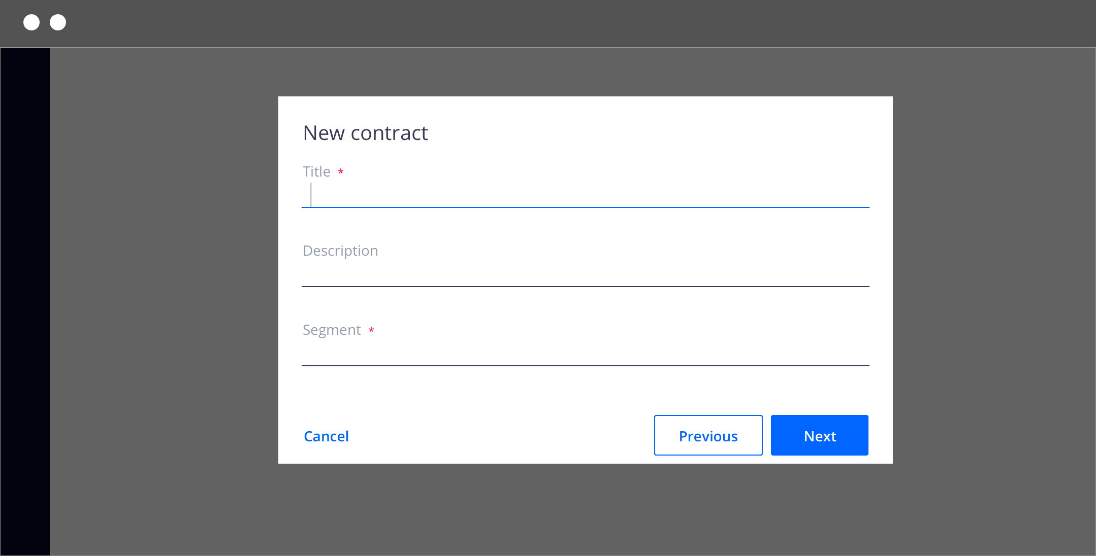
Progress modals require several steps to be completed before it can be closed. Contains a cancel, previous and next/completion buttons.
Behaviors
Trigger
Modals are triggered as a result of a user’s action and are not system generated. Common components that can trigger a dialog include a button, link or icon. On a keyboard, selecting Enter or Space on the trigger should launch the modal.
Focus
Once the modal is open, set the initial focus to the first location that accepts user input. For example, if the modal contains a form then the focus should automatically be set to the first field when opened. If it is a transactional modal without form inputs in the body section then the first focus should be on the primary button.
The focus should then remain trapped in the dialog until it is closed. On keyboard navigation:
| Key | Function |
|---|---|
Tab |
Moves focus to the next focusable element inside the dialog. When the focus is on the last focusable element in the dialog, moves focus to the first focusable element in the dialog. |
Shift + Tab |
Moves focus to the previous focusable element in the dialog. When the focus is on the first focusable element in the dialog, moves focus to the last focusable element in the dialog. |
Esc |
Closes the dialog. |
Scrolling
If the dialog content is longer than the dialog height then the body section should scroll vertically with the header and footer remaining fixed in place.
Loading
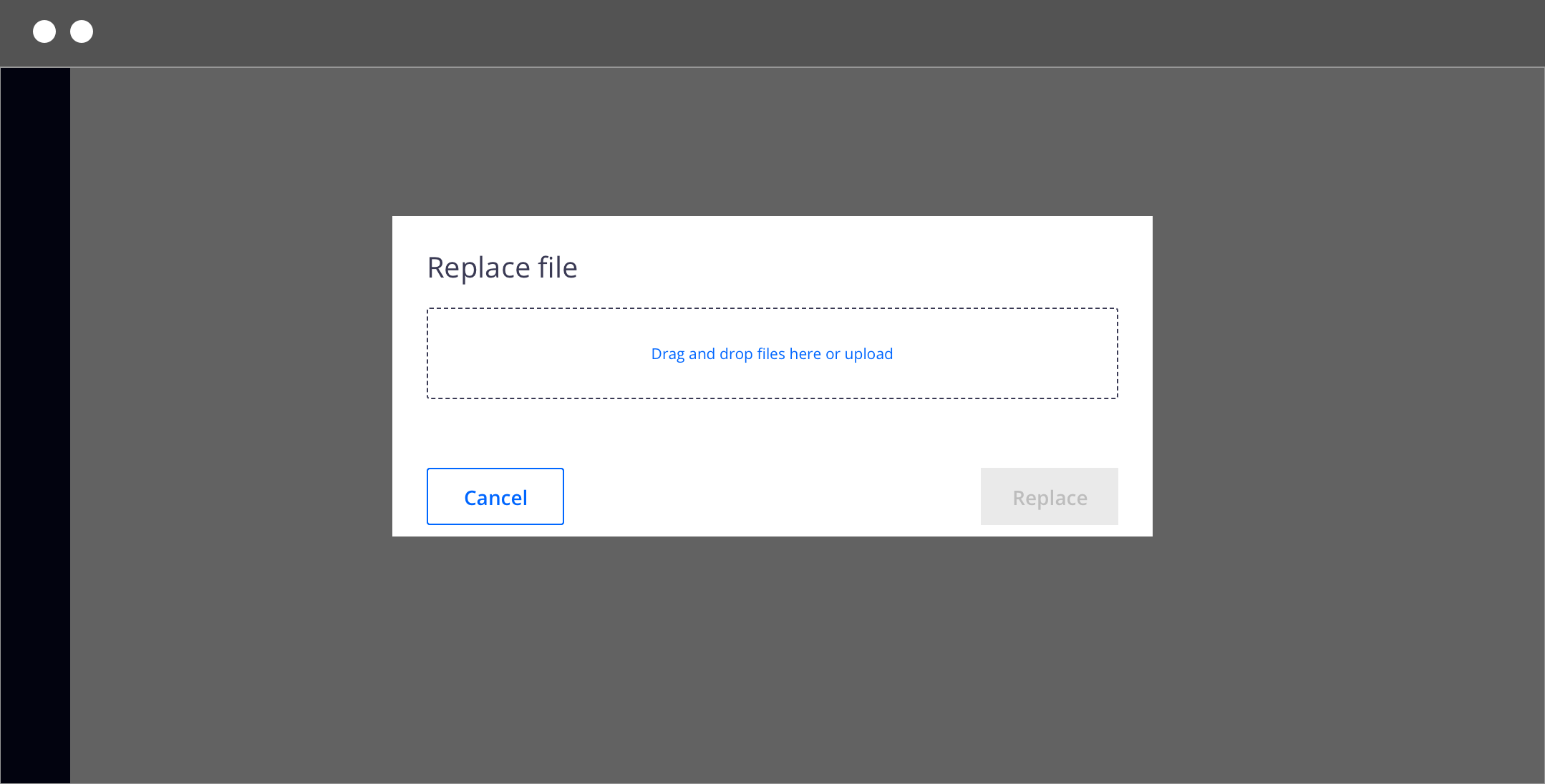
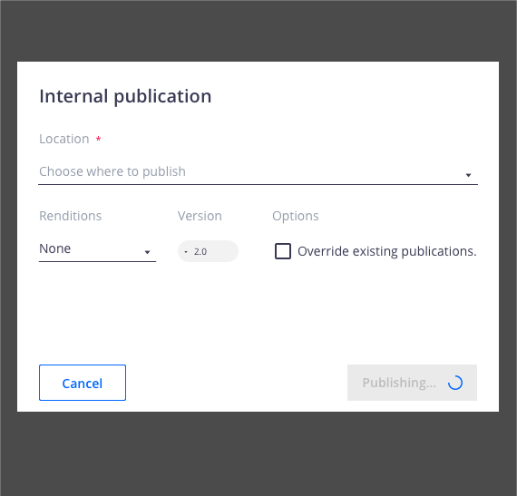
The task completion action should take place immediately. If a longer period is needed then a loading spinner and overlay should appear on top of the modal body area with content disabled. The primary action button should be disabled while loading is in progress.
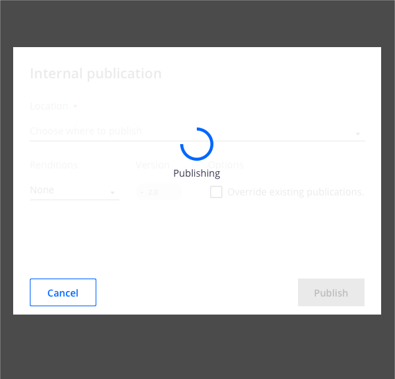
If a quick loading period is needed then use an inline loading behavior on the primary button to indicate the data is being processed.
Validation
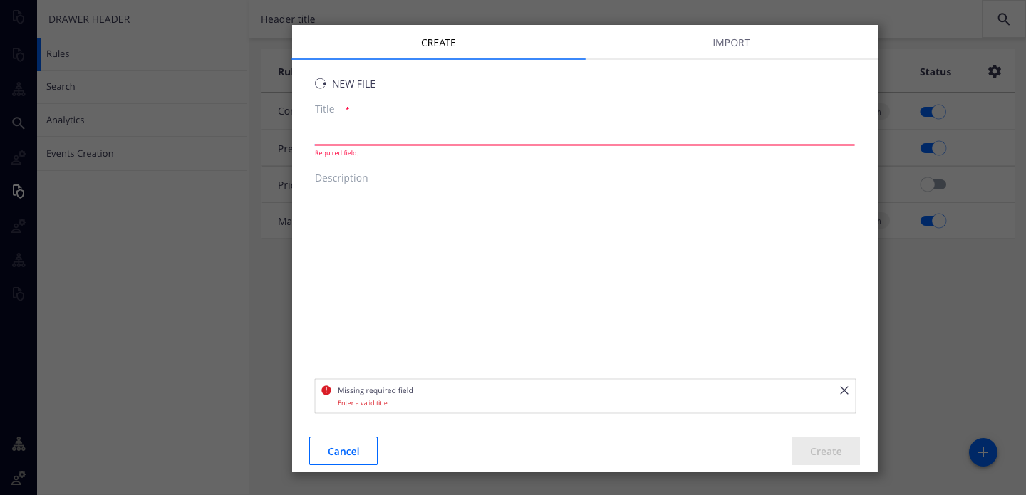
Validate a user’s entries before the modal is closed. If any entry is invalid then the modal should remain open with the entry marked in an error state and include an inline error message. The message should inform the user what has happened and provide guidance on the next steps or possible resolutions. Effective and immediate error messaging can help the user to understand the problem and how to fix it.
When possible, we recommend validating the user’s data before submission. This type of inline validation should happen as soon as the field loses focus. This will help easily identify the elements that need to be corrected. On-field error messages should disappear when the form criteria are met. If the data was not able to be submitted due to server-side issues then an inline notification should appear.
Actions
Type of Actions
Dialogs should contain a maximum of two buttons (check button order), except progress indicators.
Confirming actions resolve what triggered the dialog by confirming a proposed action. These actions can involve removing something such as Delete or Remove, if it suits the context. These are primary buttons and are always the outmost right button. There should only ever be one primary button per dialog.
Dismissive actions dismiss a proposed action and return the user to the originating screen or step. Commonly named Cancel, this is a secondary button and is aligned to the left side of the dialog.
Acknowledgment actions are used when the user acknowledgment is required to proceed. For a less disruptive alternative, use a snackbar to communicate this type of information.
Progress indicator buttons are: Cancel, Previous, Next. Previous and Next should be grouped together and placed on the right half of the dialog, with Previous as a secondary button and next as a primary button. The Cancel button is aligned to the left side of the dialog and, in this case with more than two actions, uses a text button.