General Guidance
Notifications are messages that communicate information to the user. The two main types of notifications are toast notifications and inline notifications.
They can be used when performing actions, to help notify the user’s that their action is being processed. The waiting experience is a crucial design opportunity. Although it may not be obvious what is occurring on the back-end, we can communicate clearly to reassure the user that progress is happening.
Types
| Type | Purpose |
|---|---|
| Inline | Inline notifications show up in task flows, to notify users of the status of an action. |
| Toast | Toasts are non-modal, time-based window elements used to display short messages. |
States


Format
Anatomy
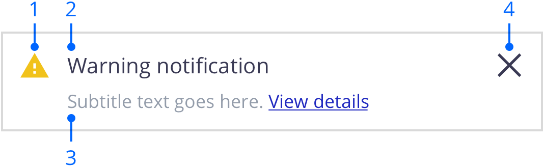
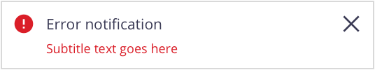
Icon (optional): Informs users of the type of notification at a glance. Using an icon on the notification is optional but encouraged.
Title: Gives users a quick overview of the notification.
Message (optional): Provides additional detail and actionable steps for the user to take. This descriptive text for the action is optional but encouraged.
Close button (optional): Closes the notification.
Sizing
The width of inline notifications varies based on content and layout. They can expand to fill the container or content area they relate to. Their height is based on the content length, which should not exceed two lines of text.
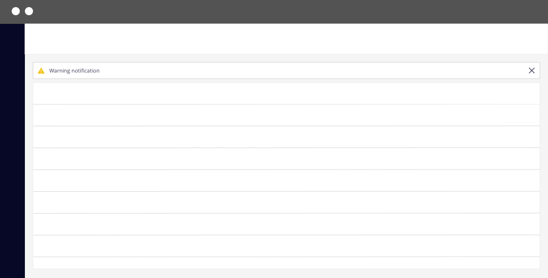
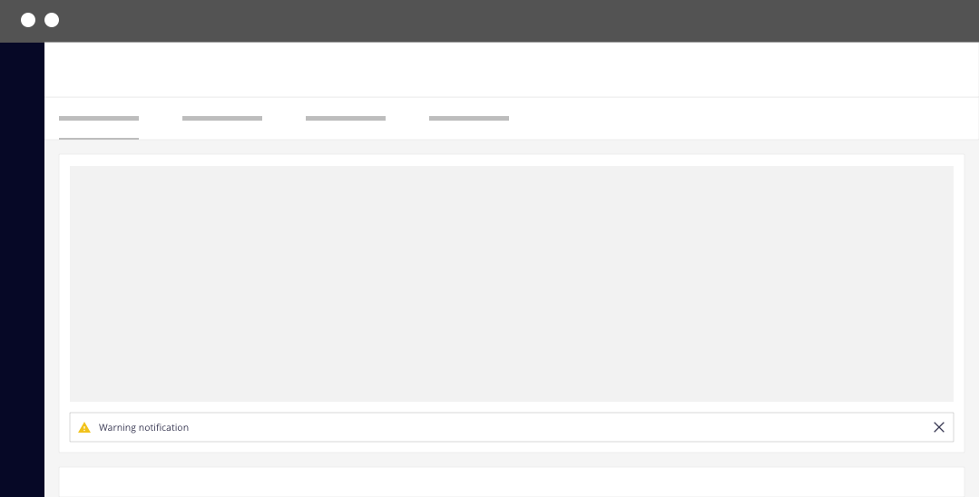
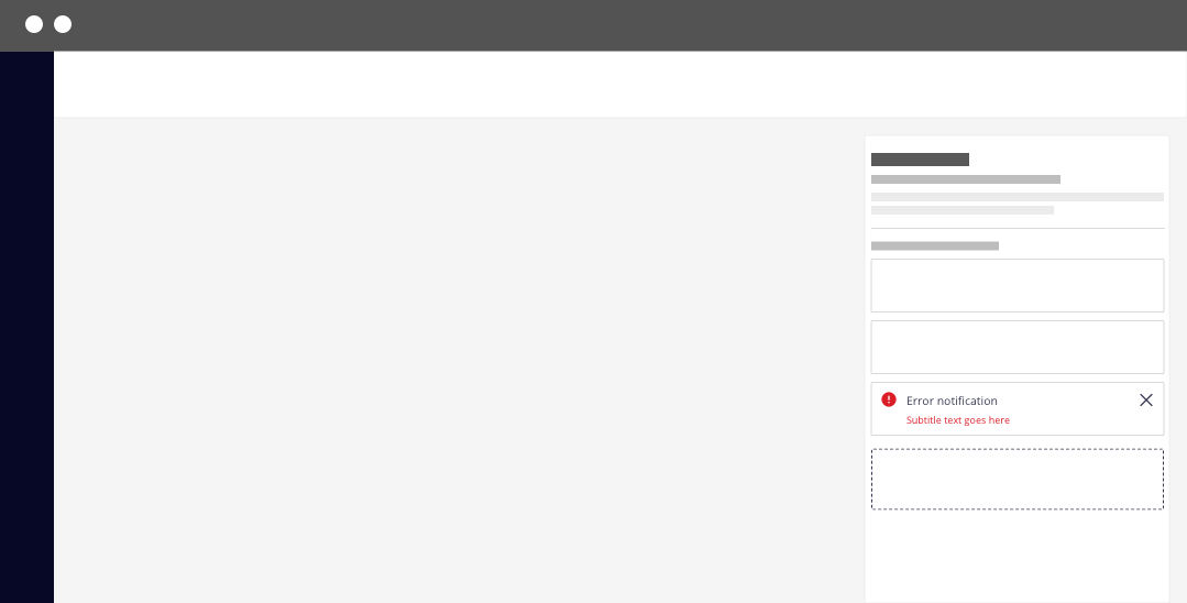
Placement
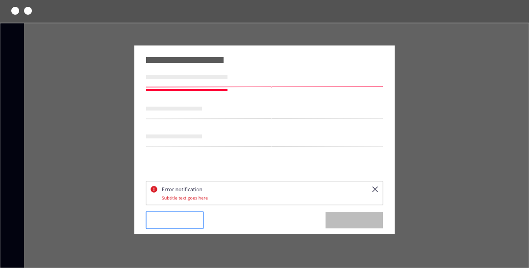
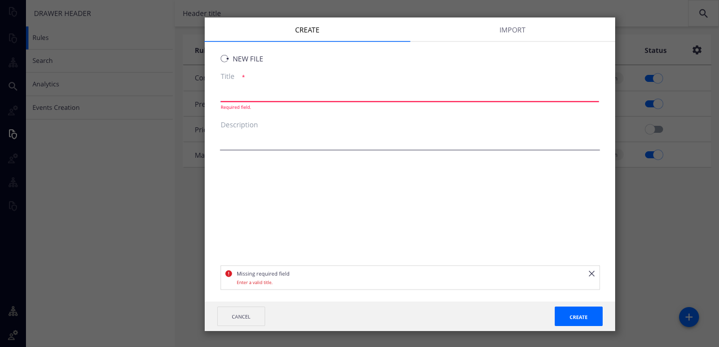
Inline notifications appear near their related items. On forms, error notifications can supplement the error state on a specific input field. In this situation, the notification can be placed at the bottom of the form, just above the submission and cancel buttons.
Content
Notifications provide limited space for content, and therefore the content must be short and concise. A user should be able to quickly scan the notification, be apprised of the situation, and know what to do next.
Main Elements
Title
The title should be short and descriptive, explaining the most important piece of information.
When possible, communicate the main message using just the title.
Use a period only if the title is a full sentence.
Message
Be concise and avoid repeating or paraphrasing the title.
Limit the message to one or two short sentences.
Explain how to resolve the issue by including any troubleshooting actions or next steps. You can include links within the notification message that redirect the user to the next steps.
Overflow
If an inline notification requires a message longer than two lines, include a short message with a “View details” link that takes the user to a view of the full notification message. This can be either a full page with more details or a modal.
Behavior
Dismissal
Inline notifications do not dismiss automatically. They persist on the page until the user dismisses them or takes action that resolves the notification.
A small “x” in the top right corner is used to dismiss inline notifications. Including the close button is optional and should not be included if it is critical for a user to read or interact with the notification.