General Guidance
A form is a group of related input controls that allows users to provide data or configure options.
Forms are used for submitting data so be as concise as possible when designing. Keep it short. Think about each field and what value the data will provide.
Variants
Forms may be presented as dedicated pages or dialogs depending on the use case and the situation.
| Form variant | Usage |
|---|---|
| Dedicated page | For more complex, lengthier, or multistep requests for user input. If you need to use an accordion to dynamically expose and hide sections of related information, and if you need to use a data table. |
| Dialog | Use a dialog when dealing with less than five inputs. Do not hide information in accordions or tabs, instead, you may use a progress modal to progressively disclose information. |
Formatting
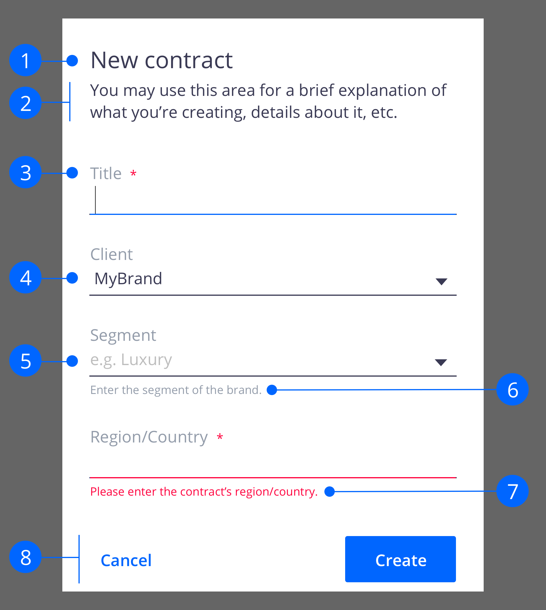
Anatomy
Form title: Inform users what is creating
Description: (optional) Gives more detail about what and how to fill the information requested in the form, or what the form is about.
Labels: Inform users what the corresponding input fields mean.
Input fields: Enable users to provide information. Information can be entered through a variety of different input fields ranging from text fields, checkboxes, and many other types.
Placeholder text: Hints at what goes into a field. Placeholder text is optional.
Helper text: Assists on how to fill out a field. Helper text is optional.
Validation: Ensures the data submitted by the user conforms to acceptable parameters.
Actions: Allow users to submit a form.
Building a Form
Text Inputs
 |  |
| Control | Usage | Context |
|---|---|---|
| nuxeo-input | To display only one line of text. | Names, titles, emails. |
| nuxeo-textarea | This field grows to accommodate multiple lines of text. | Descriptions, comments. |
Best Practices
The first required input field in a form should receive focus on presentation to a user.
The field widths should reflect the intended length of the content while still aligning to the responsive column.
Make sure users can enter their information at smaller screen sizes.
Truncate when an input is too long to be fully displayed in the field.
Numeric Inputs
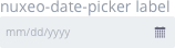 | 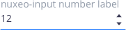 |
| Control | Usage | Context |
|---|---|---|
| nuxeo-date-picker | To select a single localized date. | Scheduling tasks, events, deadlines. |
| nuxeo-input type="number" | To increase or decrease incremental values. | Order quantities. |
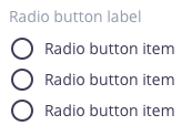
Selection Controls
 |
 |
 |
|---|---|---|
 |
 |
 |
| Control | Usage | Context |
|---|---|---|
| Radio buttons | To select only one option from two or more choices. | Permissions time frame, pick file versions. |
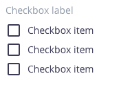
| Checkboxes | To select or deselect one or more choices. | Select search filters, add optional items. |
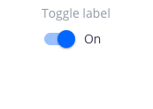
| Toggle | To choose one of two or more binary options. | On/off, Show/hide. |
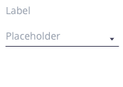
| Select | To select a single item from a short list. | Choose permission rights, choose a saved search filter |
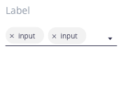
| Selectivity | To select a single or multiple items, with typeahead functionality, from a long list. | Add tags, choose a file’s coverage or subjects. |
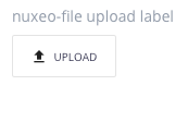
| File uploader | To upload/attach a file or multiple files to a form. | Upload file’s content, upload attachments. |
Best Practices
- Radio buttons:
- Pre-select a default option for the user; if the user selects a different option the default is deselected.
- For null options, provide a radio button with the label “None”.
- Radio buttons and checkboxes:
- Radio buttons and checkbox item text falls to the end of their controls.
- When possible, arrange the checkbox and radio button groups vertically for better scannability.
- Toggles:
- Always label toggles with the affected attribute due to accessibility constraints; color cannot be the only indicator.
- A standalone toggle or a checkbox can be used for a single option that a user can turn on or off.
- Toggles are very common controls in instantly updating forms, where submission is not required.
- Select and selectivity:
- When there are more than five options to present to the user, use a select list (select or selectivity), not a checkbox or a radio button.
Offering Help
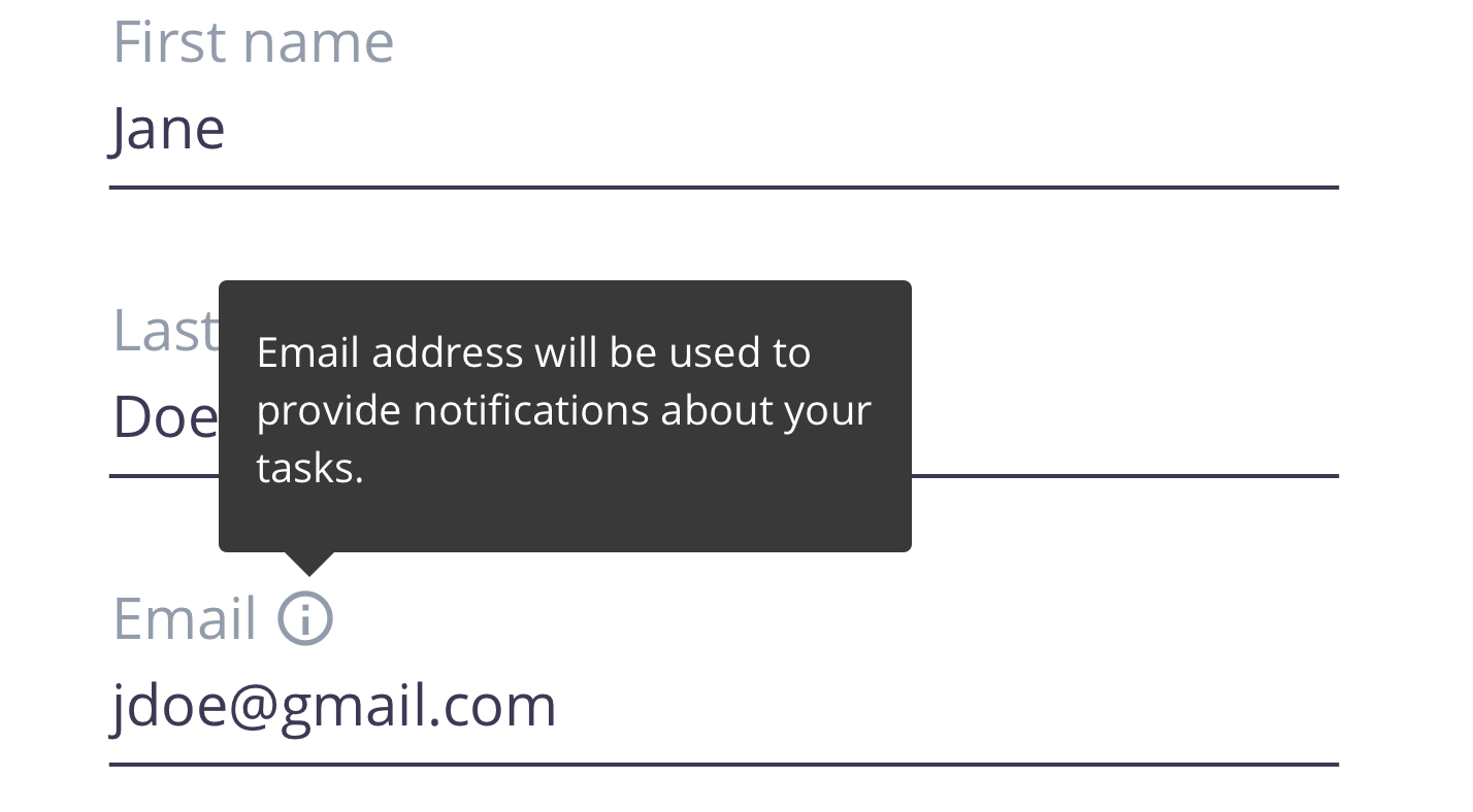
Tooltips
Tooltips can be very useful for providing explanatory or added information to a particular form field. However, research suggests that users should not have to dig around for a tooltip to access information that’s essential for the completion of their task.
Tooltip appears on hover (desktop) and on click (tablet and mobile).
Don’t use tooltips as catchalls for content that doesn’t fit elsewhere nor for essential information.
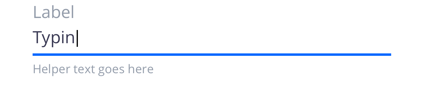
Helper Text
Helper text appears below the input label and assists the user to provide the right information. Helper text is always available, even when the field is focused, that’s why it’s the correct choice for need-to-know information. For context or background information that is “nice to have”, use placeholder text or a tooltip.
Don’t use helper text in place of field labels.
Placeholder Text
Placeholder text provides hints or examples of what to enter (e.g. YYYY-MM-DD). Since placeholder text disappears once the user begins to input data, it should not contain crucial information. When the requested input may be unfamiliar to the user or formatting is in question, use placeholder text.
Don’t use placeholder text to communicate complex and lengthy requirements like password requirements. Instead, use a tooltip.

Designing a Form
Spacing
Users will be confused if inputs are too close together. To ensure sufficient spacing between single form elements as well as groups of inputs, use margins, spacers, gutters, and key alignments to guide you.
Separating inputs, actions and sections
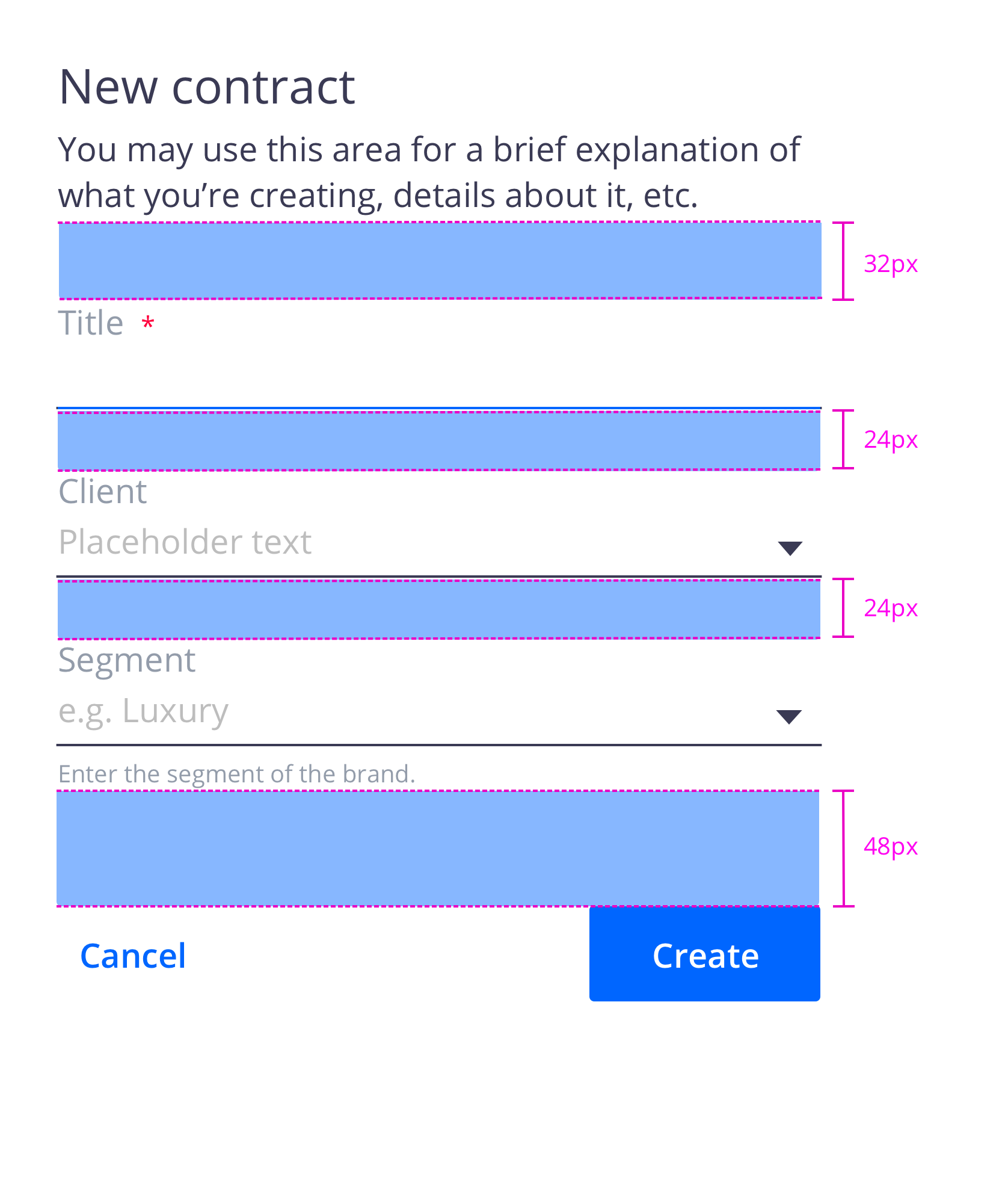
Vertical spacing between form sections also depends on whether the form is a dedicated page or a container. Spacing between groups should be adjusted in relation to the spacing between individual items. The vertical spacing between individual inputs is 24px with a 32px spacer before the first input and between sections.
As a general rule, we recommend a 48px spacer between the last input and the button or button group.
Columns
Based on research from the Nielsen Norman Group, we recommend single-column forms, simply because multi-column forms are more prone to misinterpretation. However, when faced with larger screen sizes and a lot of empty space, multicolumn forms may seem like a good idea. And in certain situations they are appropriate.
If you would like to create a multicolumn form, the number of columns should depend on the number of input controls on the page, their relationship to one another, and the screen size of the product window.
Always use common sense to group related fields horizontally. Two to three inputs on a single line will not cause problems if they logically belong together (for example [first name][mi] [last name], [city][state/province] [zip code]).
Validation and Errors
Error messaging
Error messaging can help the user to understand the problem and how to fix it. First, inform the user what has happened, then provide guidance on the next steps or possible solutions. Inline notifications can be used to state the general problem with the users' input.
Button Placement
On non-modal or in-page forms, align single buttons or Secondary/Primary button groups to the right. Buttons should align with the form controls regardless of the user‘s window width. This position conveys the “next step” intention.