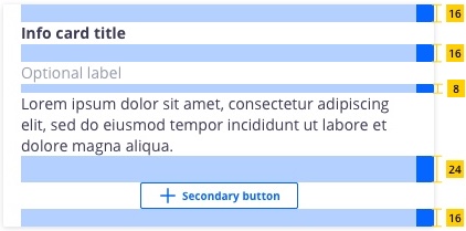
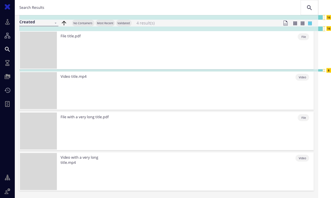
We have two spacing scales; one for general spacing within components and the other for layout spacing. Both are designed to complement the existing components and typography throughout the system.
Spacing Scale
Use the spacing scale when building individual components. It includes small increments needed to create appropriate spatial relationships for detail-level designs.
| rem | px | Example |
|---|---|---|
| 0.125 | 2 | |
| 0.25 | 4 | |
| 0.5 | 8 | |
| 0.75 | 12 | |
| 1 | 16 | |
| 1.5 | 24 | |
| 2 | 32 | |
| 2.5 | 40 | |
| 3 | 48 |
Example of the spacing scale applied

Layout Scale
Use the layout scale for arranging components and other UI parts into a full-page layout. It has larger increments that are used to control the density of a design. Use the smaller layout spaces to create more dense compositions and direct relationships. Use the larger spaces to increase the amount of white space and to disassociate sections.
| rem | px | Example |
|---|---|---|
| 1 | 16 | |
| 1.5 | 24 | |
| 2 | 32 | |
| 3 | 48 | |
| 4 | 64 | |
| 6 | 96 | |
| 10 | 160 |
Example of the layout scale applied
