Colors
See what colors we apply to each button on the default theme and on the dark theme.
Typography
| Font-size (px) | Font-weight | Class |
|---|---|---|
| 14 | Semibold (600) | — (H6) |
Structure
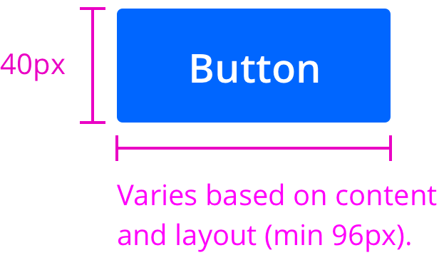
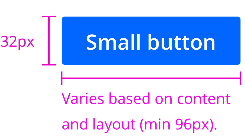
Sizes
| Button size | Height (px/rem) | Use case |
|---|---|---|
| Default | 40px / 2.5rem | Use as primary page actions and standalone actions. |
| Small | 32px / 2rem | Use when there is not enough vertical space for the default sized button. |
 |
 |
 |
|---|---|---|
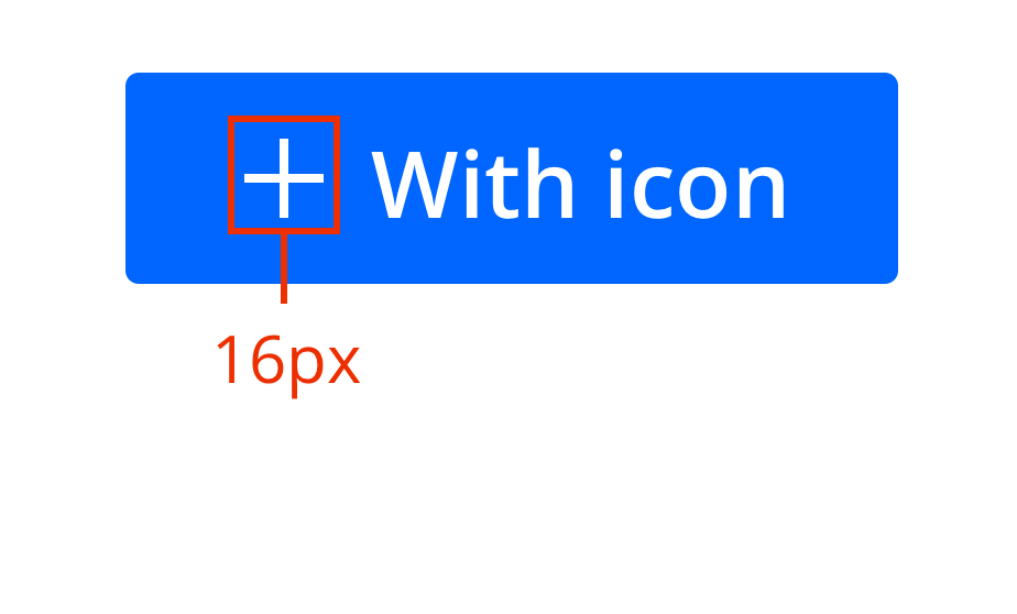
| Default button | Small button | Icon size |
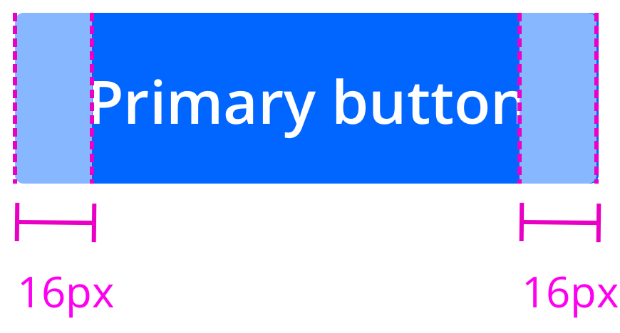
Spacing
 |
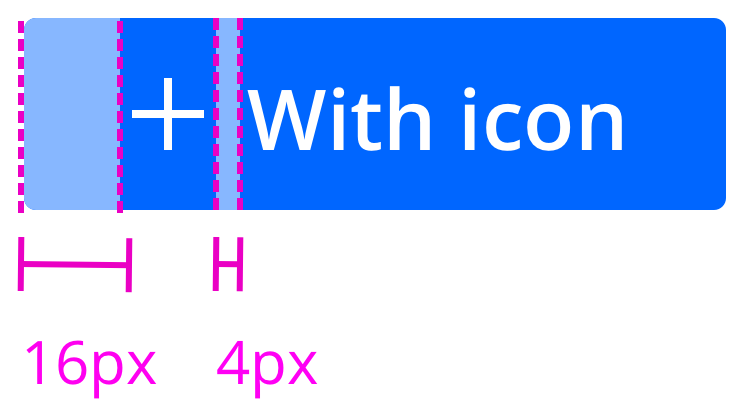 |
|---|---|
| Without icon | With icon |