General Guidance
Buttons are used to initialize an action. Button labels express what action will occur when the user interacts with it. Examples include Add, Save, Delete, and Cancel.
Do not use buttons as navigational elements. Instead, use links when the desired action is to take the user to a new page.
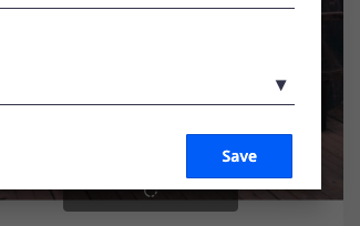
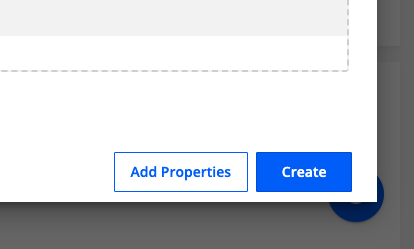
Primary buttons always appear to the right. Secondary buttons appear to the left of the primary button.
Button Order
When using multiple buttons, the primary button appears to the right and any secondary buttons appear to the left. Research has shown that performance differences between secondary and primary button placement are negligible, however maintaining consistency throughout a product, offering, or platform is crucial. The Secondary / Primary button order (secondary to the left and primary to the right) is, therefore, our required guidance and should be followed at all times.
Hierarchy
There are three levels of hierarchy on buttons: primary, secondary and text button.
Primary buttons are high-emphasis, distinguished by their fill. This button is used in actions that are primary to the app.
Secondary buttons are medium-emphasis, with a transparent container and a colored outline. This button is used in actions that are important but aren’t the primary action in an app.
Text buttons are low-emphasis and typically used for less-pronounced actions. This button is often embedded in a contained component like cards and dialogs, in order to relate themselves to the component in which they appear. Because text buttons don’t have a container, they don’t distract from nearby content.