General Guidance
Cards are surfaces that display content and actions on a single topic. These used to apply a container around a related grouping of information.
They should be easy to scan for relevant and actionable information. Elements, like text and images, should be placed on them in a way that clearly indicates hierarchy.
Principles
- Contained: A card is identifiable as a single, contained unit.
- Independent: A card can stand alone, without relying on surrounding elements for context.
- Individual: A card cannot merge with another card, or divide into multiple cards.
Anatomy
The card container is the only required element in a card. A card is made up of 2 sections, a header, and a body. The header has limitations but the body section layouts can vary to support the types of content they contain.
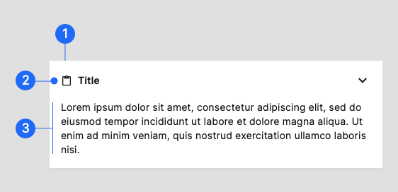
- Container Card containers hold all card elements, and their size is determined by the space those elements occupy. Card elevation is expressed by the container.
- Header [optional] The header can include an icon, a title, and a collapsible action. The icon and title are located on the left, while the collapsible action is located on the right side of the card header.
- Body [optional] The body section can include text elements, data tables, media, etc.
Behavior
Focus
When traversing through focus points on a card, visit each focused element before moving to the next card.
example animation
Scrolling
On desktop, card content can expand to reveal more content and scroll within a card.
On mobile, cards can expand and scroll within the screen. Content within cards doesn’t scroll.
example animation
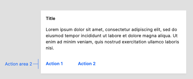
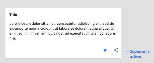
Actions
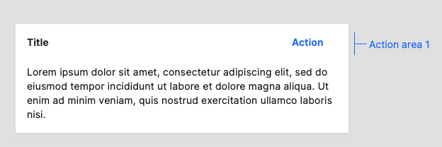
Actions can be represented by small secondary or text buttons, icons, and UI controls. Primary buttons should be reserved for the most important action a user can take on the page. For more than two supplemental actions, use an overflow menu.
The primary action area of a card is typically at the top right, aligned with the header in case there is one.
Supplemental actions are typically placed at the bottom of the card.