On storybook you’ll find our nuxeo-icons and iron-icons, that we were using and that still can be found in the platform. For new icons, we’re now using outlined material design icons.
Sizing
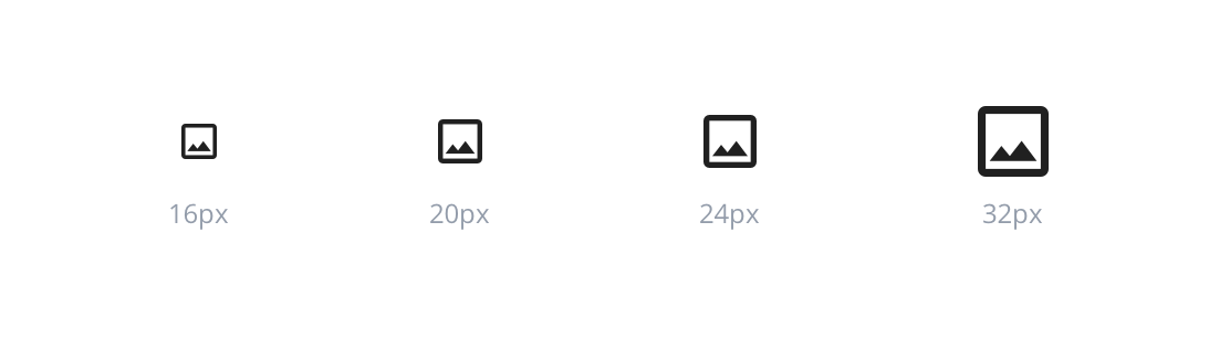
Components typically use icons with 16px. Use 20px icons on menu buttons. Icons on 24px and 32 px can also be used within the UI. Be sure icon size is consistent throughout your product.
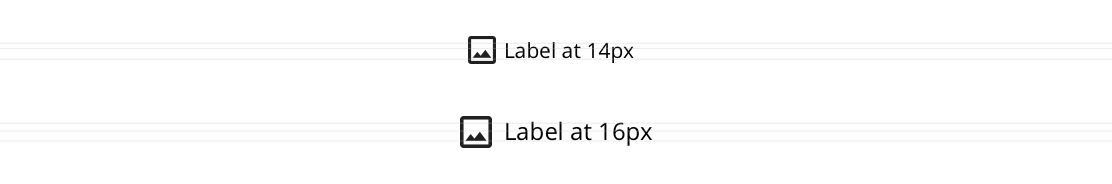
The 16px icons are optimized to feel balances when paired with a 14px text, whereas 20px icons are used with 16px text.
 |
 |
|---|---|
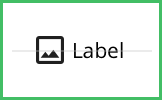
| Do: Use the correct icon size next to the text. | Don’t: Alter the icon-text size ratio. |
Touch Targets
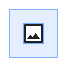
To follow WCAG success criteria, all touch targets need to be 44px or larger.
On icons used as menu buttons, use a 20px X 20px icon centered in a 48 X 48px button.
Color
 |
 |
|---|---|
| Do: Match the icon color with the text color when pairing them. | Don’t: Use different colors when pairing text and icons. |
Alignment
 |
 |
|---|---|
| Do: Center-align icons to the text when pairing them. | Don’t: Base-align icons to the text when pairing them. |