Colors
Primary Button
 |
 |
 |
 |
 |
|---|---|---|---|---|
| :enabled | :hover | :focus | :active | :disabled |
| Status | Background-color | Text + Icon color |
|---|---|---|
| :enabled | Blue 60 — #0066ff |
White — #ffffff |
| :hover | Blue 70 — #0052cc |
White — #ffffff |
| :focus | Blue 60 — #0066ff |
White — #ffffff |
| :active | Blue 80 — #003d99 |
White — #ffffff |
| :disabled | Gray 80 — #393939 |
Gray 70 — #525252 |
Secondary Button
 |
 |
 |
 |
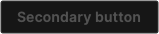 |
|---|---|---|---|---|
| :enabled | :hover | :focus | :active | :disabled |
| Status | Background-color | Text + Icon color | Border-color | Border-width |
|---|---|---|---|---|
| :enabled | transparent |
Blue 40 — #66a3ff |
Blue 60 — #0066ff |
1px |
| :hover | Blue 70 — #0052cc |
White — #ffffff |
N/A | N/A |
| :focus | Blue 60 — #0066ff |
White — #ffffff |
Blue 60 — #0066ff |
1px |
| :active | Blue 80 — #003d99 |
White — #ffffff |
N/A | N/A |
| :disabled | transparent |
Gray 70 — #525252 |
Gray 80 — #393939 |
1px |
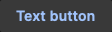
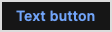
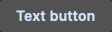
Text Button
 |
 |
 |
 |
 |
|---|---|---|---|---|
| :enabled | :hover | :focus | :active | :disabled |
| Status | Background-color | Text + Icon color |
|---|---|---|
| :enabled | transparent |
Blue 40 — #66a3ff |
| :hover | Gray 80 — #393939 |
Blue 30 — #99c2ff |
| :focus | transparent |
Blue 40 — #66a3ff |
| :active | Gray 70 — #525252 |
Blue 20 — #cce0ff |
| :disabled | transparent |
Gray 70 — #525252 |