Since the version 1.9.0 on iOS and 1.6.0 on Android, the Nuxeo Mobile application comes with 4 predefined themes that can be overridden from the server itself.
Configuration Format
Themes are configured in a themes entry of a more generic JSON configuration object for the mobile application.
The configuration object looks like:
{
  ...
  "themes": [],
  ...
}
The mobile application tries to retrieve the configuration after being connected to a Nuxeo Server.
Theme Format
A theme is just a JSON object with a name and a list of configured colors for some parts of the mobile application.
A theme object looks like:
{
  "name": "Default",
  "theme": {
    "drawerBackgroundColor": "#3a3a54",
    "drawerTextColor": "#fff",
    "drawerIconColor": "#4ecdc4",
    "navBarBackgroundColor": "#4ecdc4",
    "navBarTextColor": "#fff",
    "pageBackgroundColor": "#e9eef0",
    "sliderBackgroundColor": "#3a3a54",
    "actionColor": "#3a3a54",
    "activeActionColor": "#4ecdc4"
  }
}
- drawerBackgroundColor: the background color of the drawer/side menu top part.
- drawerTextColor: the text color of the drawer/side menu top part.
- drawerIconColor: the icon color (for the initial) of the drawer/side menu top part.
- navBarBackgroundColor: the main navigation bar color.
- navBarTextColor: the main navigation bar text color.
- pageBackgroundColor: the global page background color.
- sliderBackgroundColor: the background color of the actions menu when sliding on a document in the list.
- actionColor: the color of actions/links, such as menu actions, document title in listing, ...
- activeActionColor: the color of an active action, such as the selected menu entry, ...
How to Configure the Themes
The customization can be done in the Studio Designer, but "manually" for now.
In the Resources tab of the Designer, create a new folder mobile inside the ui folder. Then, create a config.json file inside the mobile folder.
Fill it with a JSON object defining the themes:
{
  "themes": [{
    "name": "Default",
    "theme": {
      "drawerBackgroundColor": "#3a3a54",
      "drawerTextColor": "#fff",
      "drawerIconColor": "#4ecdc4",
      "navBarBackgroundColor": "#4ecdc4",
      "navBarTextColor": "#fff",
      "pageBackgroundColor": "#e9eef0",
      "sliderBackgroundColor": "#3a3a54",
      "actionColor": "#3a3a54",
      "activeActionColor": "#4ecdc4"
    }
  },
  {
    "name": "Light",
    "theme": {
        "drawerBackgroundColor": "#f3f6f7",
      "drawerTextColor": "#2e2e3e",
      "drawerIconColor": "#00b0ff",
      "navBarBackgroundColor": "#f3f6f7",
      "navBarTextColor": "#2e2e3e",
      "pageBackgroundColor": "#fafafa",
      "sliderBackgroundColor": "#404052",
      "actionColor": "#2e2e3e",
      "activeActionColor": "#00b0ff"
    }
  }]
}
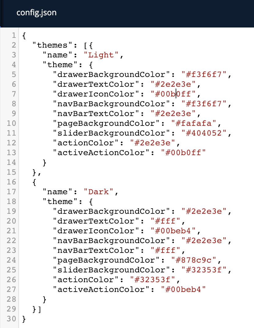
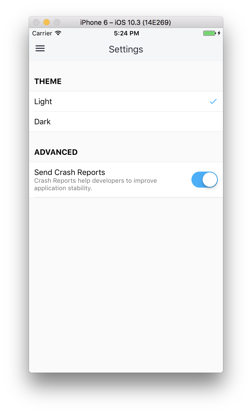
Here we have defined 2 themes, one named Light and another one Dark. The first one is always the default one that the application will use if no theme was already selected for the server.
This gives us the following result in the app: