In this tutorial, you will learn how to create and customize an actions menu on your code. The actions menu is a responsive menu that can hold actions (e.g. buttons), which hides behind a dropdown according to the available (or predefined) space.
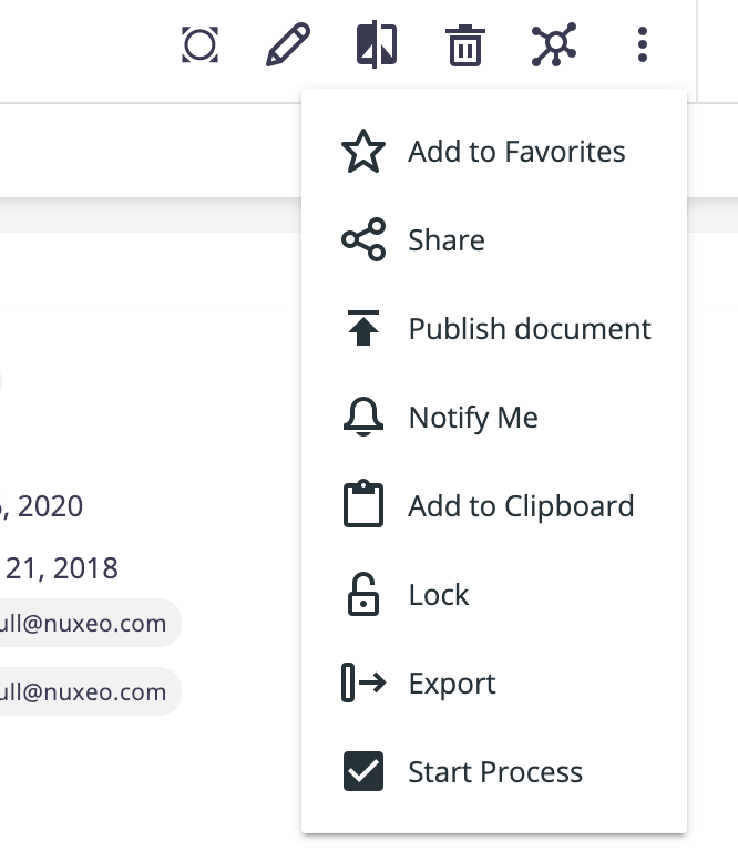
Create an Actions Menu
Add a
nuxeo-actions-menuelement to the custom element/page.<nuxeo-actions-menu> </nuxeo-actions-menu>Add the menu items, which should consist of actions - such as an already existing action, for example:
<nuxeo-actions-menu>
 <nuxeo-add-to-collection-button document="[[document]]">
 </nuxeo-add-to-collection-button>
</nuxeo-actions-menu>
Or adapt your actions, to make them work with nuxeo-actions-menu.
Create and Adapt Actions
Import the
nuxeo-action-button-stylesmodule, to make sure the action is styled correctly:import '@nuxeo/nuxeo-ui-elements/actions/nuxeo-action-button-styles.js';Include the
nuxeo-action-button-stylesmodule in the style element:<style include="nuxeo-action-button-styles"> ... </style>Add a
showLabelboolean property (withfalseas initial value):showLabel: { type: Boolean, value: false, },On the action's DOM, we need to add a span element with class
label, with your label bound to it, right next to your button. The span should be hidden whenshowLabelisfalse, so that it is only displayed when the action is in the dropdown.<paper-icon-button id="myAction" icon="nuxeo:someicon" on-tap=”_doSomething”> </paper-icon-button> <span class="label" hidden$="[[!showLabel]]"> [[_label]] </span>Wrap the two elements above (the button and the label) in a new div with class
action, and move youron-taporon-clickevent listener to it:<div class="action" on-tap="_doSomething"> <paper-icon-button noink id="myAction" icon="nuxeo:someicon"> </paper-icon-button> <span class="label" hidden$="[[!showLabel]]"> [[_label]] </span> </div>
For more examples, you can check the Web UI’s migration commit.
Styling
Nuxeo-actions-menu dropdown can be styled by targeting the classes --nuxeo-action-button-label and --nuxeo-actions-menu-dropdown.
For example, to add some padding to each item in the dropdown, we can do:
--nuxeo-action-button-label: {
  padding-right: 8px;
}
--nuxeo-actions-menu-dropdown: {
  padding: 0 8px;
}
Customizing Number of Actions in Action Menu
Following NXP-25146, the max-width of these three menus can be customized in your themes with three css variables:
--nuxeo-browser-actions-menu-max-width: for the document actions menu--nuxeo-results-selection-actions-menu-max-width: for the result selection actions menu--nuxeo-document-blob-actions-menu-max-width: for the blob actions menu
These variables support all the values valid for the max-width property, so you’ll have to set them to fit the desired number of actions.