In this tutorial, you will learn how to edit the default Nuxeo Web UI document view page, and display the information you need (by adding new Nuxeo cards, removing useless property information, reorganizing the page layout etc.)

Use Case
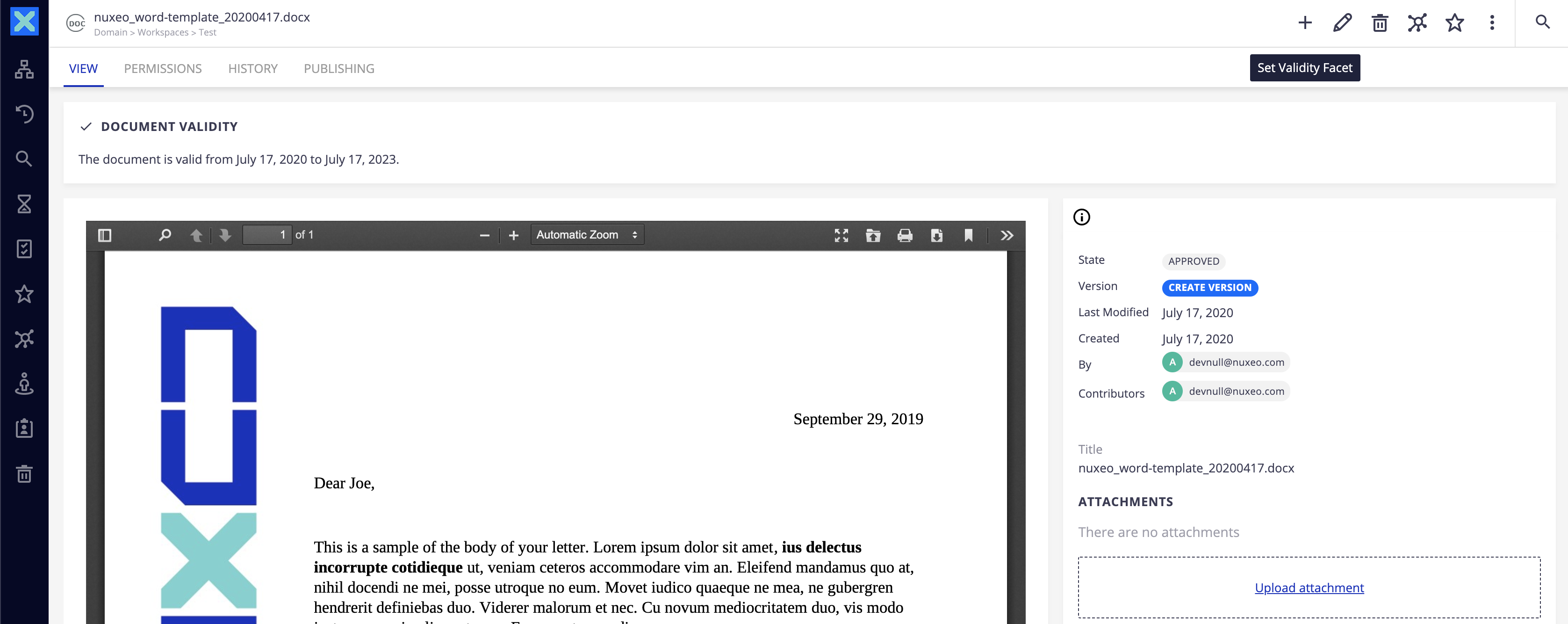
We will add a new nuxeo-card element on top of the default document page when a document is validated, indicating its validation period. If the document is not validated, the element shouldn't be displayed.
Requirements
You need to follow the instructions described in HOWTO: Create and Use Document Facets
We will use a document action to attach the Validity facet, to do so start by creating an automation chain
AC_Attach_Validity_Facetwith the following content:- Context.FetchDocument - Document.AddFacet: facet: ValidityFacet save: "true" - Document.SetProperty: xpath: "validity:ValidityStartFrom" save: "true" value: "@{org.nuxeo.ecm.core.schema.utils.DateParser.formatW3CDateTime(CurrentDate.date)}" - Document.SetProperty: xpath: "validity:ValidityEndsIn" save: "true" value: "@{org.nuxeo.ecm.core.schema.utils.DateParser.formatW3CDateTime(CurrentDate.years(3).date)}" - Document.FollowLifecycleTransition: value: approve
- Create a button in Nuxeo Studio Designer to trigger this automation chain: Ensure the
eventattribute hasdocument-updatedvalue so that Nuxeo Web UI is refreshed after clicking on the button
Instructions
The idea is to override the default Nuxeo Web UI slot contribution by using the same name, to avoid having two layouts added to the DOM.
We will use the priority attribute to control the order of contributions with the same name. It allows you to control the merge of these contributions (e.g: disabling existing ones, requires the disabled contribution to come after the one you want to disable).
The default priority is 0: higher priority wins, therefore this contribution will result in an override of the default slot content template.
Copy the Original Document Page Element
If you need to override any Nuxeo Web UI element, you need first to find the source file on the Nuxeo Web UI Github repository.
It is important to select the right branch on the nuxeo-web-ui repository as the code may change depending on the Web UI releases.
For LTS 2019 (10.10), choose the 10.10 branch: https://github.com/nuxeo/nuxeo-web-ui/tree/10.10/elements.
Copy the the element you need to edit: in our case, this is the
nuxeo-document-pageavailable here.Thenuxeo-collapsible-document-pageis the element used for folderish documents.Go to Nuxeo Studio Designer and paste the code in a custom element, and adjust the element name: Under the Resources tab of Nuxeo Studio Designer:
- Create a folder called
custom-elements - In the
custom-elementsfolder, create an empty file callednuxeo-document-page.htmland paste the code of thenuxeo-document-page.
- Create a folder called
- Comment all the element imports at the beginning of the file (like
<link rel="import" href="nuxeo-document-metadata.html">)
Adapt the Document View Page Element
We are now ready to edit the page. We need to:
- Set a filter so that the new Nuxeo card appears only when the facet is attached to the document
- Display the information related to the validity facet
So add the following code between the </style> and <nuxeo-document-info-bar> HTML tags:
<nuxeo-filter document="[[document]]" facet="ValidityFacet">
  <template>
    <nuxeo-card heading="Document validity" icon="icons:check">
    The document is valid from [[formatDate(document.properties.validity:ValidityStartFrom)]] to [[formatDate(document.properties.validity:ValidityEndsIn)]].
    </nuxeo-card>
  </template>
</nuxeo-filter>
Reference the New Element in the Custom Bundle File
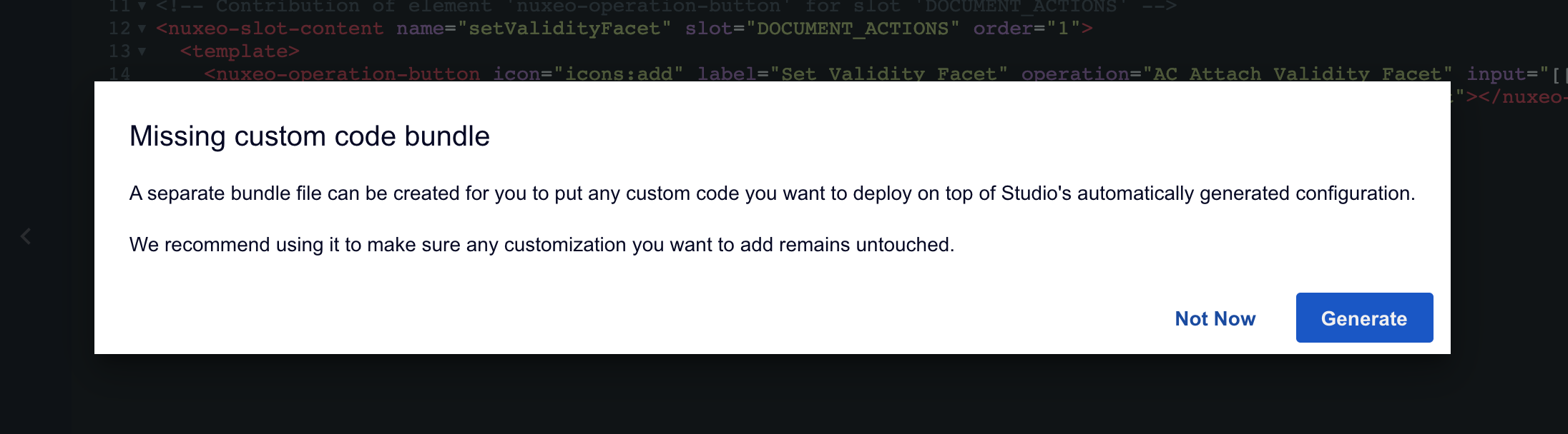
To "activate" the new element, you need to import it in your custom bundle file.
To create it, just click on the default studio bundle file listing below the UI folder, and click on the Generate button.
Then, simply import the new element with:
<link rel="import" href="custom-elements/nuxeo-document-page.html">
Replace the original page by the custom page
At this stage, the new element is imported but does not replace the default element yet. To do so, you need to update the default slot contribution of Nuxeo Web UI.
All default slot contributions car be found in https://github.com/nuxeo/nuxeo-web-ui/blob/10.10/elements/nuxeo-web-ui-bundle.html.
To override the default behavior:
- copy paste the contributions which should be updated and adjust it with your needs.
In our case, we will add the following contribution in our custom bundle file:
<!-- Default order is 10 -->
<nuxeo-slot-content name="documentViewPage" slot="DOCUMENT_VIEWS_PAGES" order="20">
  <template>
    <nuxeo-filter document="[[document]]" expression="document.facets.indexOf('Folderish') === -1
                                                   && document.facets.indexOf('Collection') === -1">
      <template>
        <nuxeo-document-page name="view" document="[[document]]" opened></nuxeo-document-page>
      </template>
    </nuxeo-filter>
  </template>
</nuxeo-slot-content>
Deploy Your Configuration
Hot reload your Nuxeo instance: a new document actions should be available, and the new Nuxeo card should appear when clicking on the button, as below: