Nuxeo Platform JSF UI is the Back office view on the content repository. There are three main spaces in Nuxeo Platform:
- The Home tab provides a set of dashboards
- The Workspace tab enables to navigate in the repository
- The Search tab enables to query the repository
The Nuxeo Platform gives you all the necessary tools to let you customize what is displayed on your platform.
Workspace
This is where the majority of user's activity within the Nuxeo Platform will occur since it's where users can work on documents and browse the application domains, workspace, sections, etc.
Content Hierarchy
You can create different types of documents to be able to display the content hierarchy that you need in your application. By default you can create workspaces, folders, collections, templates, etc., but you can also create your own document types.
The default navigation tree displayed on the left hand side of the pages is the folders navigation tree. It displays all the domain structure from the root. It enables you to easily access any space in the application structure. The navigation tree displays folderish documents, i.e. documents in which you can create other documents (workspaces, folders, etc.).
It is possible to add another type of navigation tree based on metadata instead of folder structure by installing the Nuxeo Virtual Navigation addon.
Breadcrumbs
Breadcrumb enables you to navigate in the platform. For example, you can go up one level in the platform structure, by clicking on the  icon in the breadcrumbs. Users can also click on the workspace's title in the breadcrumbs directly or in the navigation tree. They can go up several levels in the document's path in a single click that way.

Due to technical reasons, it is recommended to NOT use the browser's Back and Next buttons to navigate in the Platform.
Tabs
A tab in the Nuxeo Platform is a view displayed on a document, controlled by a filter. Different tabs are displayed on each document type created in the content hierarchy, the basic ones are:
- Summary: this view lets you see the metadata of your document, start a workflow or more specific metadata like for pictures document.
- Edit: from this tab you can edit the metadata and the content of your document.
- Files: you can add additional files from this tab.
- Publish: this view lets you publish your document in another section of your platform.
- Relations: this tab lets you manage the relations around the document.
- History: this tab lets you see the event log of the document concerned.
On a same document users with different profiles will have access to different tabs. And so they will be presented different forms and buttons that correspond to their profile. Typically users with Read permission are not displayed the Edit tab.
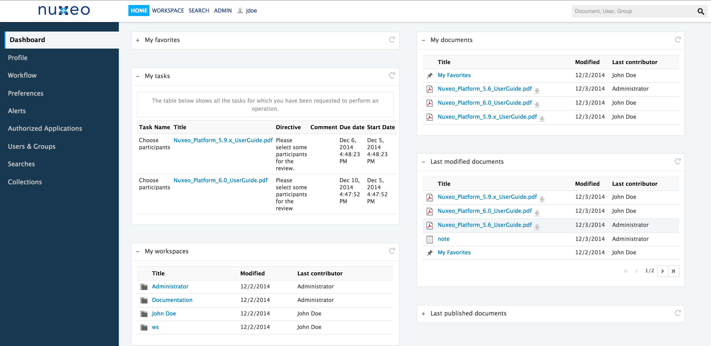
Dashboards
Each user has a set of personal dashboards from the Home tab that display the information they find relevant and help them have a global view of the application's activity.
The Home default tab is the Dashboard tab.
The dashboard is composed of a set of boxes that display either a list of documents matching a criteria (all the workspaces the user can access, the last documents he modified, the last documents that have been published...), or possibly a piece of information either from the Platform or from external websites.
If you want to customize your dashboard, follow this HOWTO.
Other main user-centric information available from the Home is:
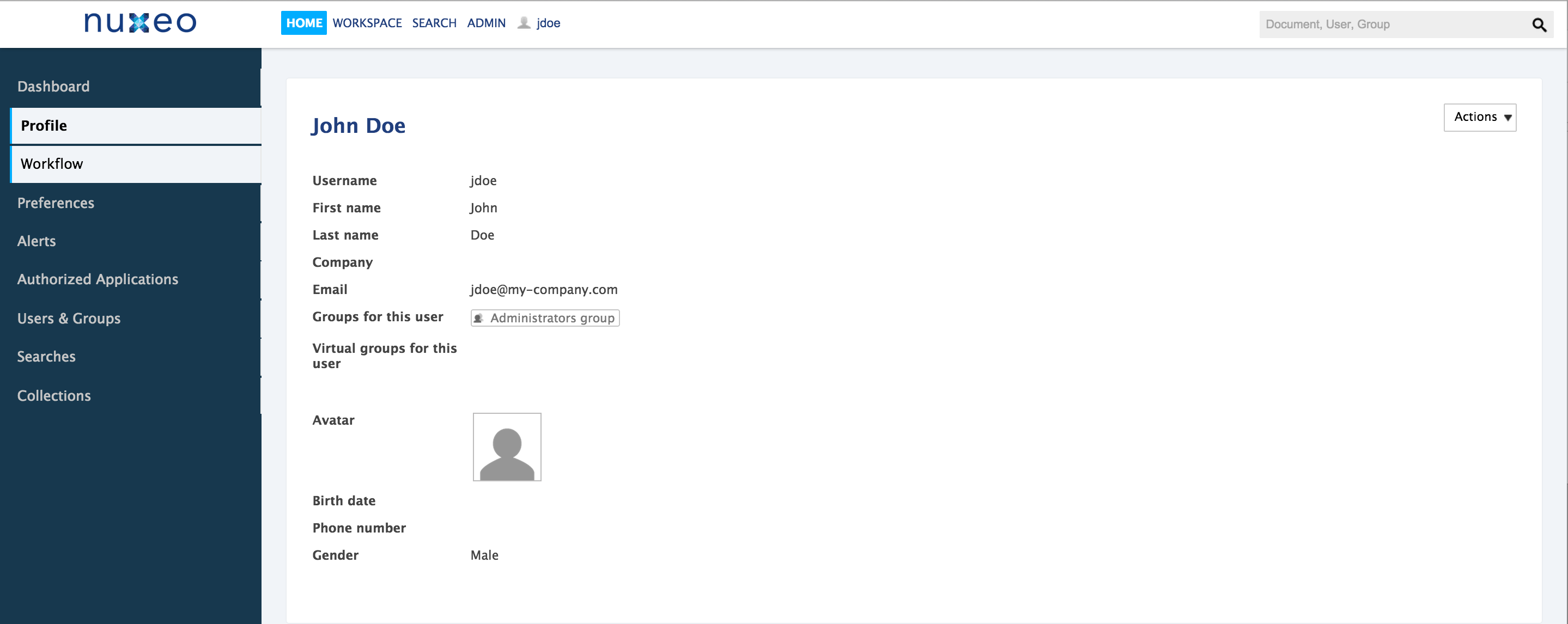
- Profile: Enables the user to edit their personal information and their password
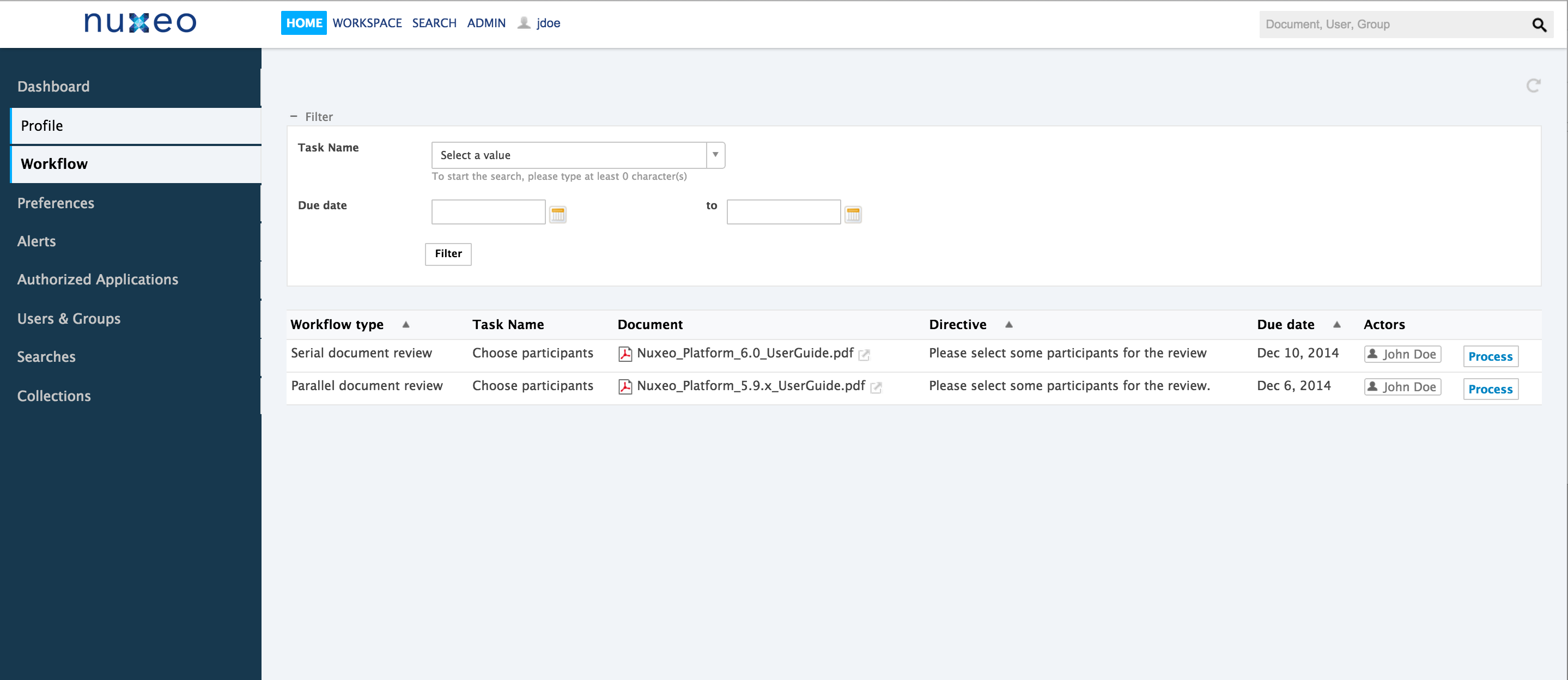
- Workflow: Displays the tasks assigned to the user
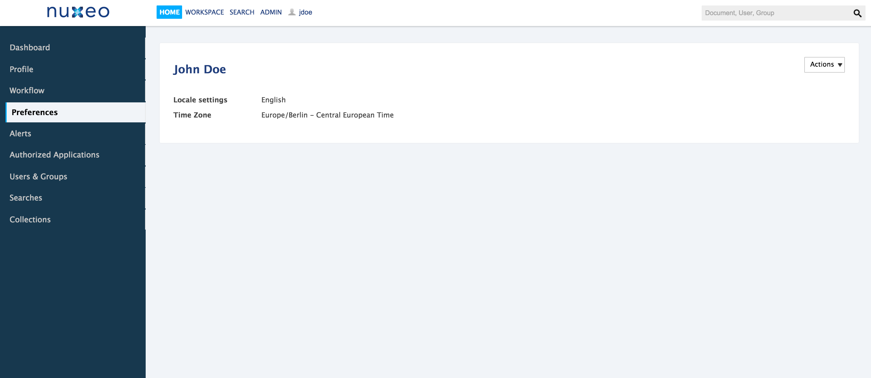
- Preferences : Enables to select the language of the platform interface
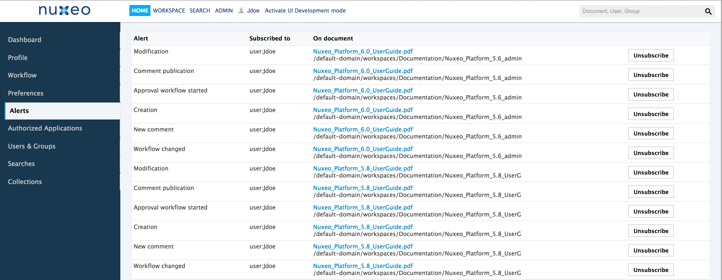
- Alerts: Shows the list of email notifications the user subscribed to
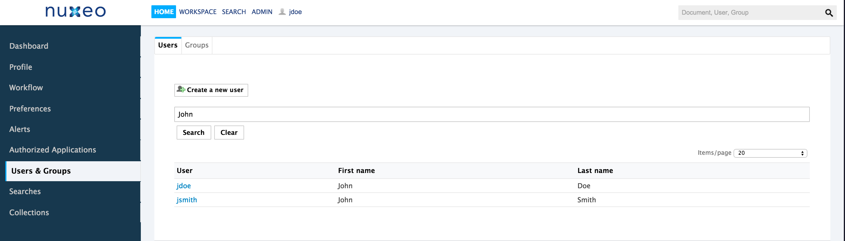
- Users & Groups: Enables the user to browse the users and groups directory
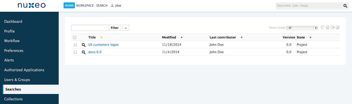
- Searches: Provides access to the user's saved searches
- Authorized Applications: Lists the external applications that can access Nuxeo data. See Nuxeo Media Publishing for instance.
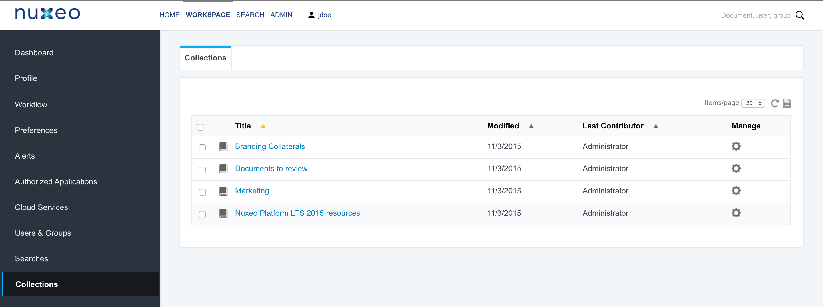
- Collections: Lists the collections the user can access
Search
Available Filters
Facets
The default search filter provides a faceted search, leveraging the Elasticsearch aggregates. You can search for documents from their metadata and other properties and search results are filtered as you add or remove criteria. Aggregate fields values are also filtered so as to display only relevant values and show the count of matching documents for each value.
Result Layout
Users can change the way content is presented in the result layout. They can also change the displayed information. At the top right and corner of the results pages, you have different options to display your content list.
- Thumbnail view
 : this view displays a thumbnail of documents. For folders, the thumbnail of the first item in the folder is displayed.
 Edit Result Columns
 : this button lets you change the information displayed in content lists. The right column shows selected information and the left column shows information that are currently not displayed. You can move information from one column to another using the horizontal arrows and reorder columns using the vertical arrows.
Editing results column is possible from search results and the Content tab of folderish documents. It is not possible from the tag cloud.
When you create new search forms, you can adapt the result layout to your own document types so as to display information relevant to your users. See How to Define a New Content View for instance.