Functional Overview
Nuxeo Web UI is a responsive application with three main layout regions:
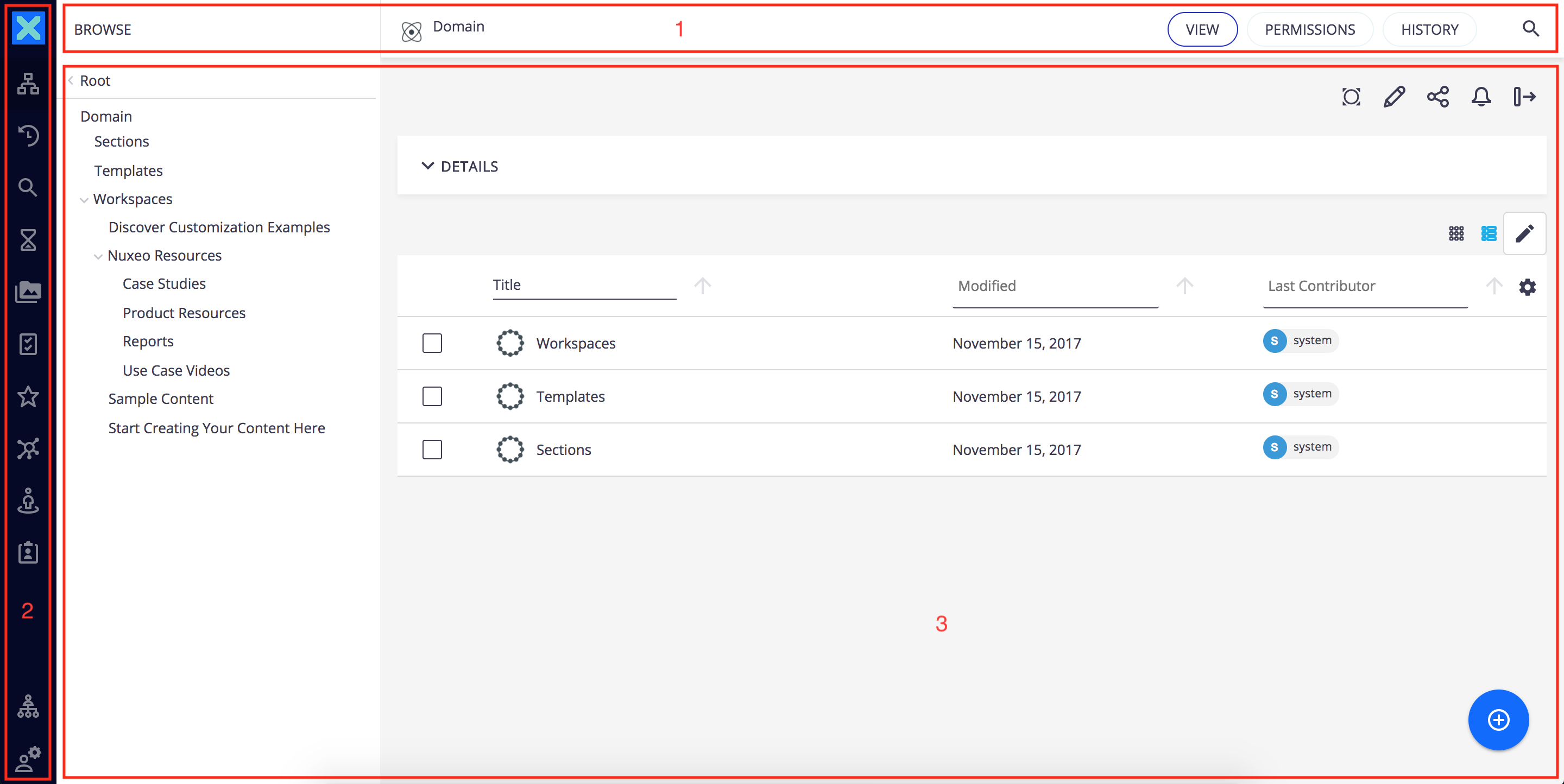
Header Toolbar

- Domain: The title of the selected page / document.
- Sub-Views: The sub-views available.
- Quick search: Search by keywords or users.
Side Menu
The menu displays different tabs. Clicking on one of them will open a side panel with the content of the tab selected: browsing options are on the first left column, content to browse on the second and content to view on the main area. We will see the description of the main area on the last part of this section.
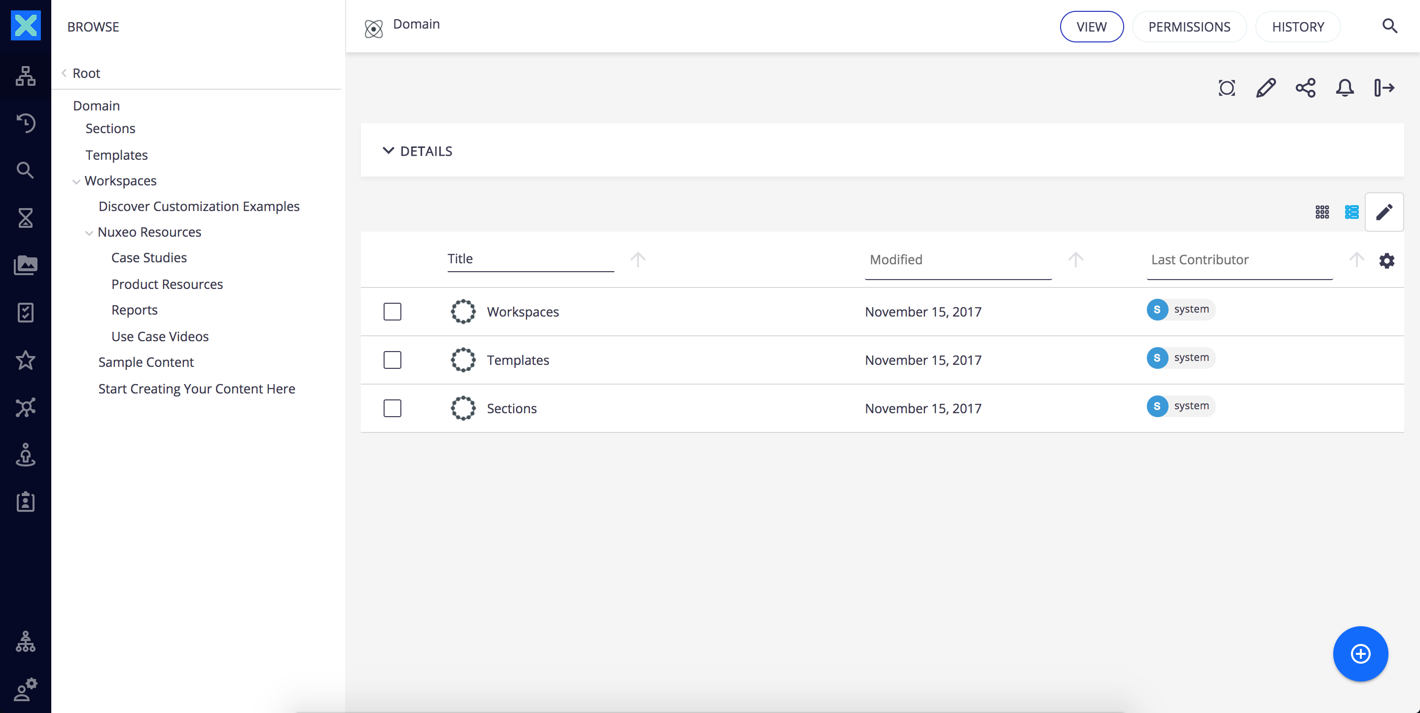
This new pattern allows to start browsing without changing the context of work.
 | Dashboard: Displays the dashboard |
 | Browse: Shows the navigation tree to let you browse your content |
 | Recently Viewed: Shows the 10 last documents viewed |
 | Search Filters: Search content using full text and metadata |
 | Expired Queue: Queue displaying expired documents |
 | Tasks: Shows the list of pending workflow tasks |
 | Favorites: The list of documents added to Favorites |
 | Collections: The list of collections you can access |
 | Personal Space: Access to your personal workspace, which is the default location for your Favorites and Collections folders |
 | Clipboard: Clipboard to copy and move documents |
 | User Settings: Displays a Themes tab to manage branding and possibly other tabs depending on Nuxeo addons installed. For instance when Nuxeo Drive is installed a Drive tab is available to manage the user's synchronization roots. |
 | Administration: Displays the Administration tab. |
Main View
The main view display depends on what has been selected on the side menu. The main view will usually show lists of documents or a document and its details. Lists of documents are presented in a table that proposes different functionalities like infinite scroll instead of pagination, faceted filters in the header, easy columns selection with persistence of the user's choice and a great visibility of selected elements.
At the top of the main view toolbars are displayed according to the content being displayed:
Document Actions: Displays actions available for the current document

Results Actions: Displays actions available for the current result listing
A create button  is also permanently displayed at the bottom right corner of the main view the to let you create or import documents from anywhere in the application.