This page presents widget types to be used to display aggregate buckets.
As described in Page Provider Aggregates, you can define aggregates on content views based on Elasticsearch. In order to display and select the buckets returned by an aggregate, new widget types have been added to the platform.
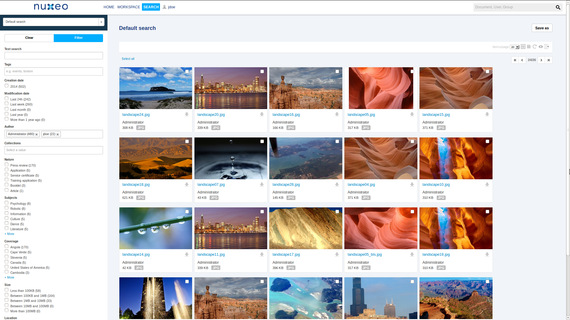
The following picture shows the default search of Nuxeo Platform where you can see a couple of aggregate widget type in action on the left-hand side panel.


Here is a table sumarizing the different type of widget to display aggregate buckets.
| Widget | Name | Since | Specificity | Example (when available) | Compatible Aggregate Type |
|---|---|---|---|---|---|
| Checkbox | selectManyCheckboxAggregate | 6.0 | Term Aggregate Significant Term Aggregate | ||
| Select | selectManyListboxAggregate | 6.0 | |||
| Directory Checkbox | selectManyCheckboxDirectoryAggregate | 6.0 | See section Directory Terms Aggregate Widget Types | dc_coverage_agg | |
| Directory Select | selectManyListboxDirectoryAggregate | 6.0 | |||
| Document Checkbox | selectManyCheckboxDocumentAggregate | 6.0 | See section Document Terms Aggregate Widget Types | ||
| Document Select | selectManyListboxDocumentAggregate | 6.0 | |||
| User Checkbox | selectManyCheckboxUserAggregate | 6.0 | See section User Terms Aggregate Widget Types | ||
| User Select | selectManyListboxUserAggregate | 6.0 | dc_creator_agg | ||
| Histogram Checkbox | selectManyCheckboxHistogramAggregate | 6.0 | Histogram Aggregate | ||
| Histogram Select | selectManyListboxHistogramAggregate | 6.0 | |||
| Date Histogram Checkbox | selectManyCheckboxDateHistogramAggregate | 6.0 | dc_created_agg | Date Histogram Aggregate | |
| Date Histogram Select | selectManyListboxDateHistogramAggregate | 6.0 | |||
| Range Checkbox | selectManyCheckboxRangeAggregate | 6.0 | See section Range Aggregate Widget Types | common_size_agg | Range Aggregate |
| Range Select | selectManyListboxRangeAggregate | 6.0 | |||
| Date Range Checkbox | selectManyCheckboxDateRangeAggregate | 6.0 | dc_modified_agg | Date Range Aggregate | |
| Date Range Select | selectManyListboxDateRangeAggregate | 6.0 |
All these widget types have an important property in common, selectOptions, which needs to be set with the list of bucket returned by the associated aggregate. This will always be:
<property name="selectOptions">#{contentView.pageProvider.aggregates['xxx'].extendedBuckets}</property>
where xxx is the id of aggregate (see the page Page Provider Aggregates).
As you can see, each widget type is actually available with checkbox or select2.
All select2-based widgets have the following properties:
placeholder: The placeholder of the select2 widget. Default is Select a value.width: The width of the select2 widget default is 100%.
All checkbox-based widget have the following properties:
moreLessLimit: By default, only six buckets (i.e. checkboxes) are displayed. If there are more buckets, a 'More'/'Less' link will make show/hide the other buckets. Use this property to change this setting.emptyChoiceMessage: The message to be displayed when there are no returned buckets. Default is No available result.
User Terms Aggregate Widget Types
Using one of these widget types will force to resolve the bucket key (i.e. the value stored in the document property) as a user id and will display its "Firstname Lastname" if any.
Directory Terms Aggregate Widget Types
Using one of these widget types will force to resolve the bucket key (i.e. the value stored in the document property) as a directory entry and will display its localized label.
These widget types have the specific widget properties:
directoryName: The name of the directory from which the entry must be resolved (required)localize: Whether the entry should be localizeddbl10n: false (default) means the entry is to be localized from messages_xx.properties file. true means the directory directly support localization in dedicated columns.
Document Terms Aggregate Widget Types
Using one of these widget types will force to resolve the bucket key (i.e. the value stored in the document property) as a document uuid and will display its title.
Range Aggregate Widget Types
Range aggregates define a set of ranges for which we can define the label to be displayed. This is possible with the use of selectOptions on the widget definition. Here is an example with the range aggregate on common:size :
<widget name="common_size_agg" type="selectManyCheckboxRangeAggregate">
  <fields>
    <field>defaults:common_size_agg</field>
  </fields>
  <widgetModes>
    <mode value="edit">#{contentView.pageProvider.hasAggregateSupport() ?
      'edit' : 'hidden'}</mode>
  </widgetModes>
  <properties widgetMode="any">
    <property name="selectOptions">#{contentView.pageProvider.aggregates['common_size_agg'].extendedBuckets}</property>
    <property name="localize">true</property>
  </properties>
  <selectOptions>
    <option itemLabel="label.aggregate.size.tiny" itemValue="tiny" />
    <option itemLabel="label.aggregate.size.small" itemValue="small" />
    <option itemLabel="label.aggregate.size.medium" itemValue="medium" />
    <option itemLabel="label.aggregate.size.big" itemValue="big" />
    <option itemLabel="label.aggregate.size.huge" itemValue="huge" />
  </selectOptions>
  <controls mode="any">
    <control name="supportInsideInputWidgetEffects">true</control>
  </controls>
</widget>