Actions are grouped in categories to be able to display them in the same area of a page. Widgets can be used to handle rendering of these actions.
Actions are referencing the same category when they need to be displayed in the same area of a page.
The available categories are listed below and can also be found by checking action contributions on the explorer.
CAP Categories
Breadcrumbs
Technical name: BREADCRUMB_ACTIONS
Available since Nuxeo Platform 5.9.2.
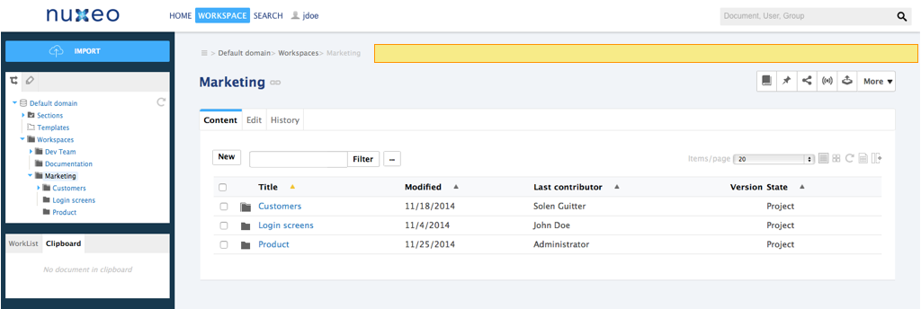

Clipboard
Technical name: CLIPBOARD_LIST
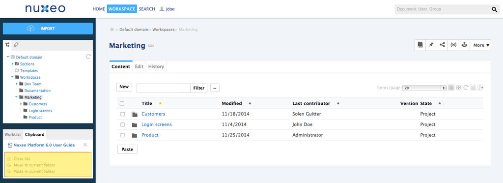

Contextual Tools
Technical name: DOCUMENT_UPPER_ACTION
Unless you specify an icon, the following icon will be used:
![]()
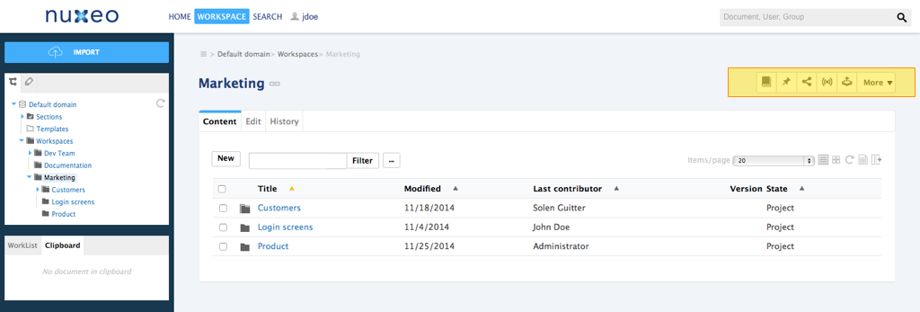

Document Creation Form
Technical name: CREATE_DOCUMENT_FORM
Available since Nuxeo Platform 5.4.2.
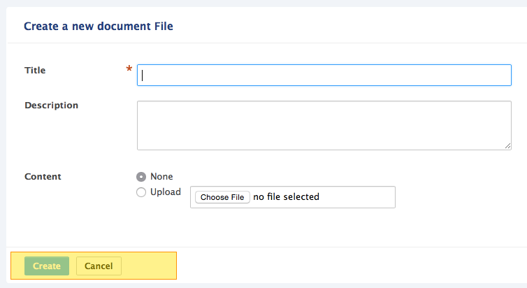

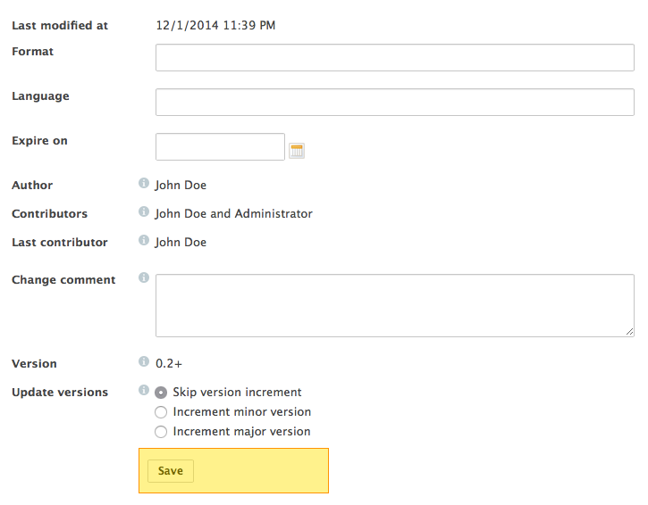
Document Edition Form
Technical name: EDIT_DOCUMENT_FORM
Available since Nuxeo Platform 5.4.2.

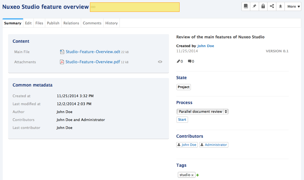
Document Header Actions
Technical name: DOCUMENT_HEADER_ACTIONS_LIST
Available since Nuxeo Platform 5.4.2. This action category requires to use an icon, otherwise it won't be displayed on the UI.

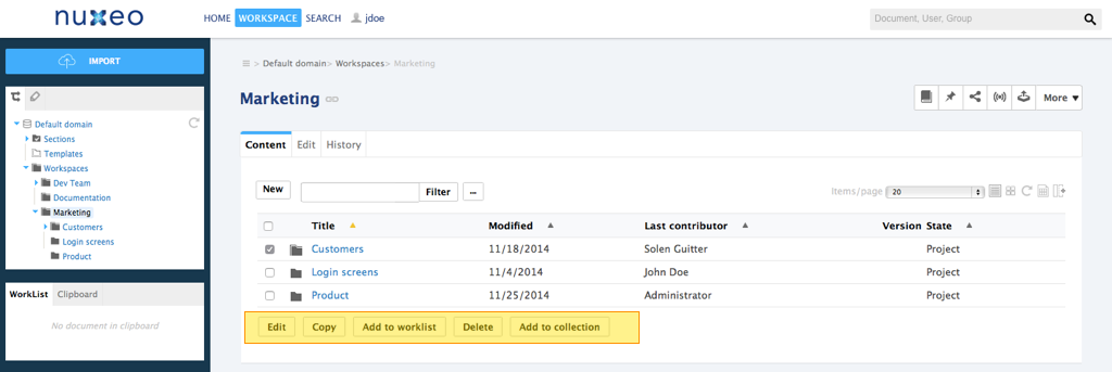
Document List Toolbar
Technical name: CURRENT_SELECTION_LIST

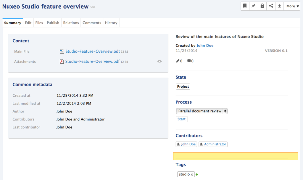
Document Summary Actions
Technical name: DOCUMENT_SUMMARY_CUSTOM_ACTIONS
Available since Nuxeo Platform 5.4.2.

Folder Toolbar
Technical name: SUBVIEW_UPPER_LIST
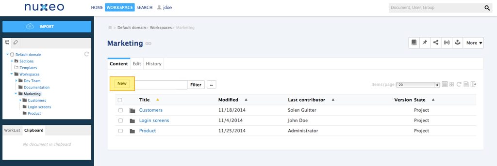

Header Links
Technical name: USER_SERVICES
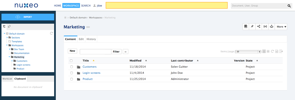

Header Main Tabs
Technical name: MAIN_TABS
Available since Nuxeo Platform 5.8.
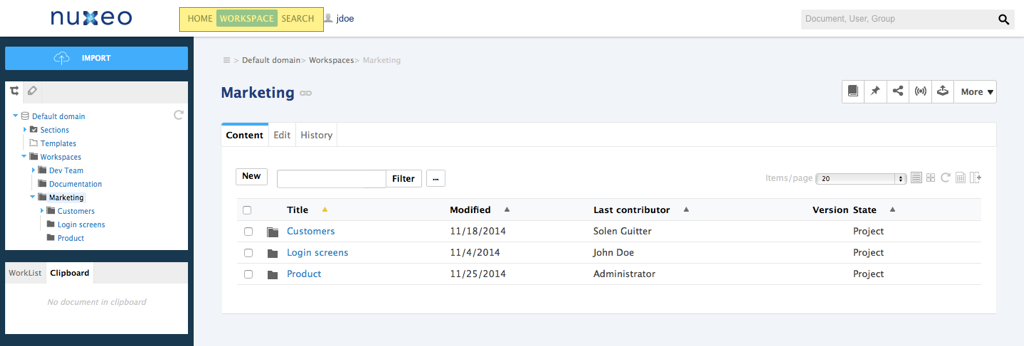

Header Search Actions
Technical name: SEARCH ACTIONS
Available since Nuxeo Platform 5.8.
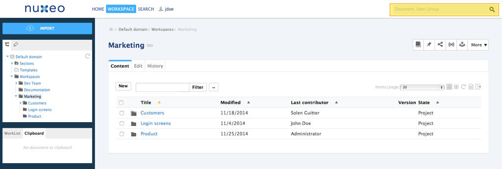

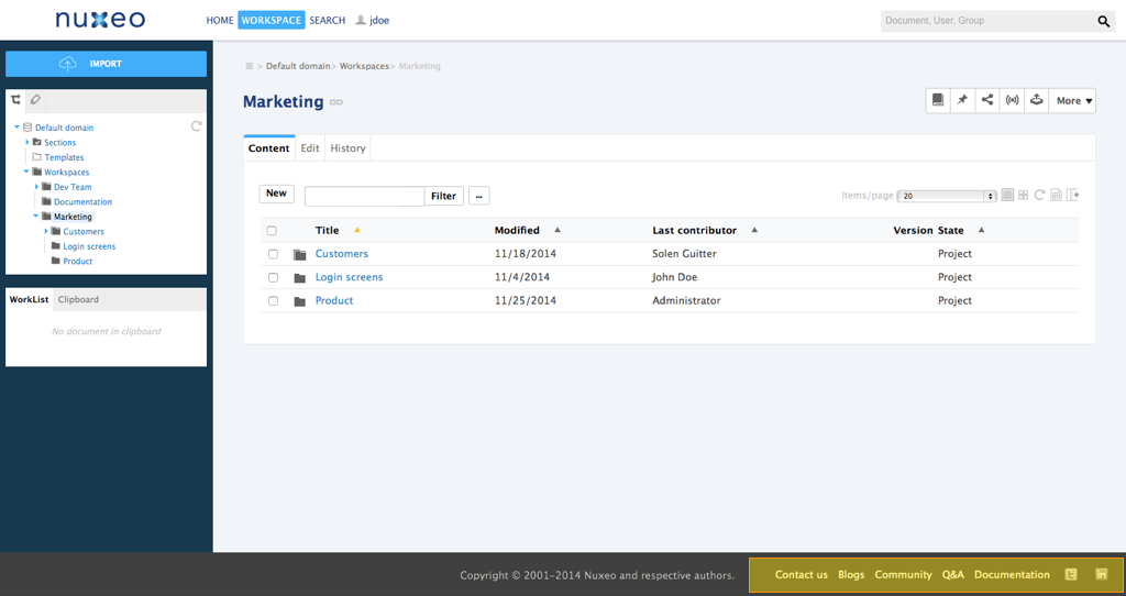
Footer Links
Technical name: FOOTER
Available since Nuxeo Platform 5.8.

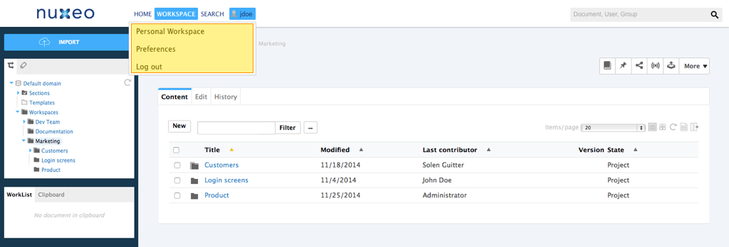
User Menu Actions
Technical name: USER_MENU_ACTIONS
Available since Nuxeo Platform 5.4.2.

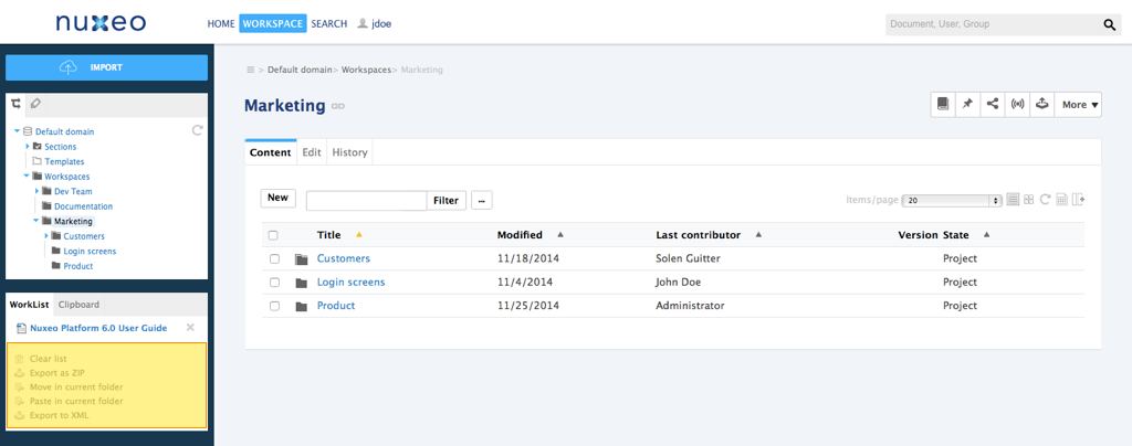
Worklist
Technical name: DEFAULT_LIST

CAP Advanced Categories
These categories can be useful when defining custom actions, that will reference the widgets to display. This is useful when building incremental layouts, like the default summary layout starting from 5.6: the action order and filter information are useful to contribute/display/hide some widgets to the summary default layout.
These categories are not really useful when defining user actions, and the associated features can be broken when migrating from 5.6 to 5.8, as the form around the summary layout has been removed for 5.8 to allow fine-grained form management on this page.
View Action List
Technical name: VIEW_ACTION_LIST.
This category is used for tabs displayed on every document.
<action id="TAB_VIEW" link="/incl/tabs/document_view.xhtml" enabled="true"
  order="0" label="action.view.summary" type="rest_document_link">
  <category>VIEW_ACTION_LIST</category>
  <filter-id>view</filter-id>
</action>

<action id="TAB_CONTENT" link="/incl/tabs/document_content.xhtml" order="10"
  enabled="true" label="action.view.content" type="rest_document_link">
  <category>VIEW_ACTION_LIST</category>
  <filter-id>view_content</filter-id>
</action>
Summary Top Panel
Technical name: SUMMARY_PANEL_TOP
This user action category is not yet fully implemented in Studio (available since Nuxeo Platform 5.6).
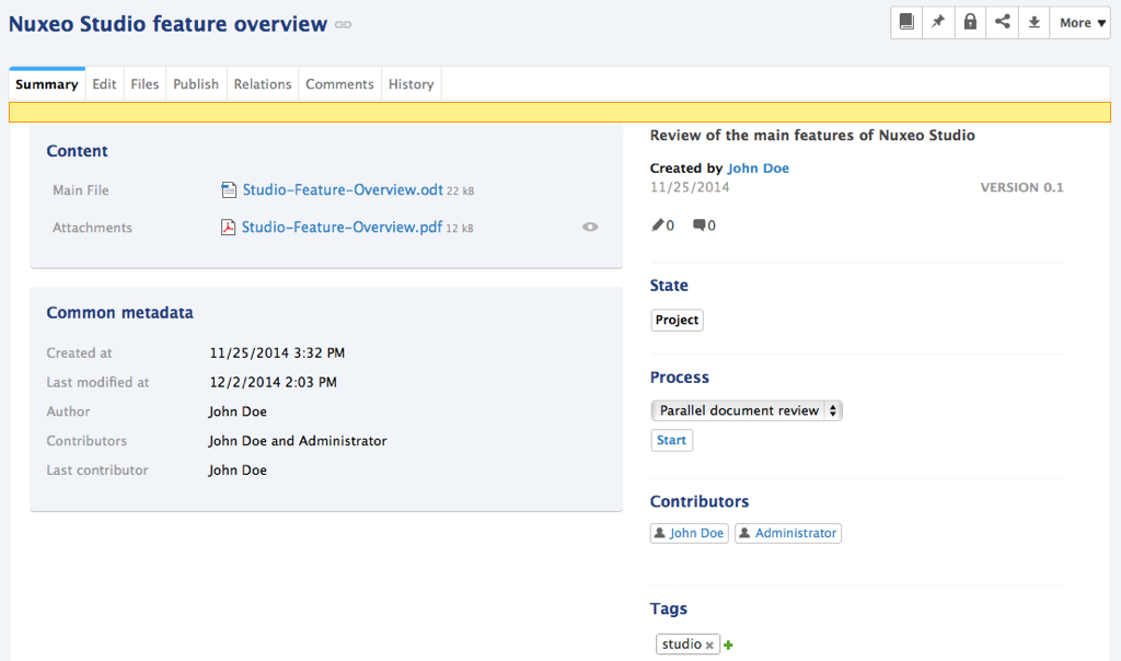

Summary Left Panel
Technical name: SUMMARY_PANEL_LEFT
This user action category is not yet fully implemented in Studio (available since Nuxeo Platform 5.6).
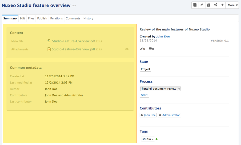

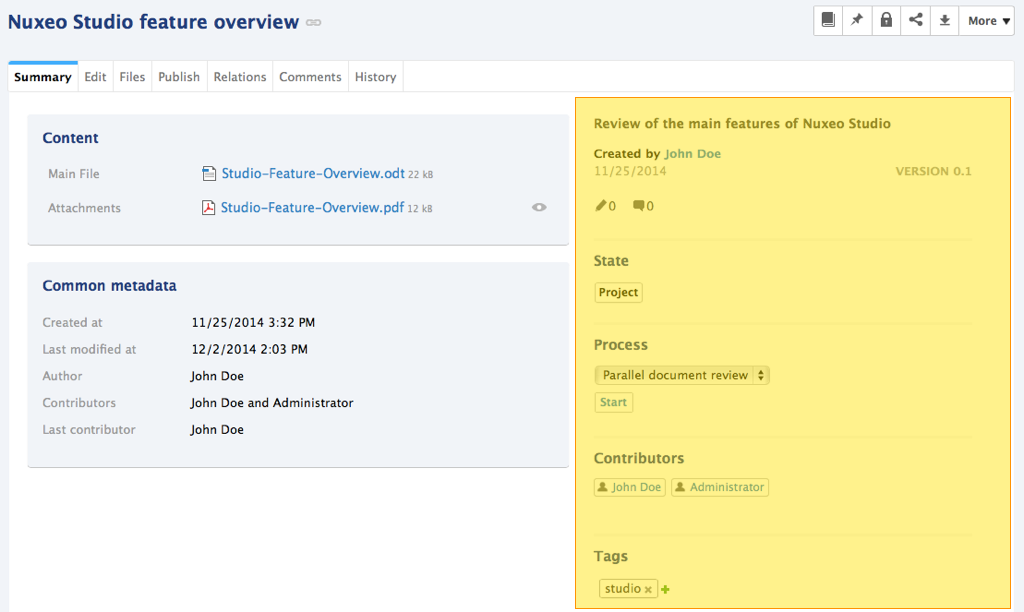
Summary Right Panel
Technical name: SUMMARY_PANEL_RIGHT
This user action category is not yet fully implemented in Studio (available since Nuxeo Platform 5.6).

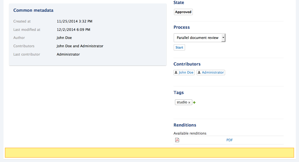
Summary Bottom Panel
Technical name: SUMMARY_PANEL_BOTTOM
This user action category is not yet fully implemented in Studio (available since Nuxeo Platform 5.6).

Content View Actions
Technical name: CONTENT_VIEW_ACTIONS


DAM Categories
DAM Asset view actions
Technical name: DAM_ASSET_VIEW_ACTIONS
Available since Nuxeo Platform 5.7.1.
Unless you specify an icon, the following icon will be used:
![]()
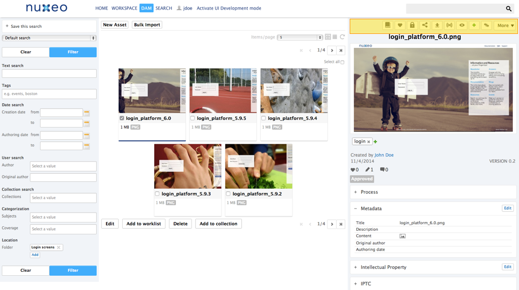

DAM Search results actions
Technical name: DAM_SEARCH_RESULTS_ACTIONS
Available since Nuxeo Platform 5.7.1.
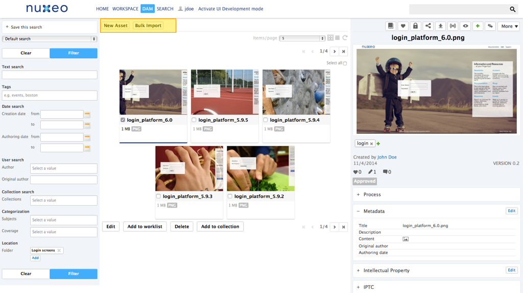

DAM Current selection lists
Technical name: DAM_CURRENT_SELECTION_LIST
Available since Nuxeo Platform 5.7.1.
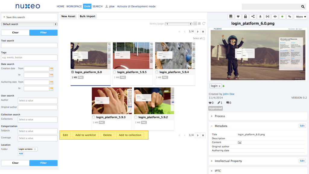

Adapting Templates to Display an Action
Since Nuxeo Platform 5.6, an action can define the way it will be rendered by using the type attribute. This make it easier to combine different kinds of rendering for a group of actions, and this is done by using widget types for action types, to leverage features from the Nuxeo Layout Framework.
The template action type makes it possible to define a custom action rendering. New action types can also be contributed to the framework.
A series of widget types displaying are available by default, see the pages Tab Designer Widget Types and Advanced Widget Types. These widget types include rendering configuration options that are implemented by default action widget types (CSS styling, display as buttons or links, for instance).
Here are two ways of rendering actions.
Rendering Actions via Widget Definitions
Here is a sample widget definition to render actions using category MY_CATEGORY:
<extension target="org.nuxeo.ecm.platform.forms.layout.WebLayoutManager"
  point="widgets">
  <widget name="userActions" type="documentActionsWithForms">
    <properties mode="view">
      <property name="category">MY_CATEGORY</property>
      <property name="actionsDisplay">links</property>
      <property name="overallDisplay">horizontal_block</property>
      <property name="styleClass">userActions</property>
    </properties>
  </widget>
</extension>
This widget can be displayed on a page directly using the following sample code:
<div xmlns:nxl="http://nuxeo.org/nxforms/layout">
  <nxl:widget name="userActions" mode="view" value="#{currentDocument}" />
</div>
Of course this widget definition can also be included within a layout definition, as it's done for Incremental Layouts configuration.
Rendering Actions via Dynamically Computed Widget
It can also be useful to generate the widget definition dynamically from the widget template, by passing the widget properties as tag attributes to the nxl:widgetType tag:
<div xmlns:nxl="http://nuxeo.org/nxforms/layout">
  <nxl:widgetType name="documentActionsWithForms"
    widgetName="documentActionsUpperButtons"
    mode="view"
    label=""
    actionStyleClass="button"
    actionsDisplay="icons"
    overallDisplay="horizontal_block"
    widgetProperty_category="MY_CATEGORY"
    maxActionsNumber="5"
    value="#{currentDocument}" />
</div>
Notice the tag attribute widgetProperty_category used to define the actions category: as widget types also have a notion of category, adding widgetProperty_ prefix to the attribute makes it possible to explicitly state that this is a widget property.
See also chapter about Layout and Widget Display.
HOWTO: Add a Button in the JSF UI Actions Overview Standard Action Types Custom Action Types