Some templating features have been made available to make it easier to control the layouts and widgets rendering.
Custom Layout Template
A layout can define an XHTML template to be used in a given mode. Let's take a look at the default template structure.
<f:subview
  xmlns="http://www.w3.org/1999/xhtml"
  xmlns:c="http://java.sun.com/jstl/core"
  xmlns:f="http://java.sun.com/jsf/core"
  xmlns:h="http://java.sun.com/jsf/html"
  xmlns:ui="http://java.sun.com/jsf/facelets"
  xmlns:a4j="http://richfaces.org/a4j"
  xmlns:nxl="http://nuxeo.org/nxforms/layout"
  xmlns:nxu="http://nuxeo.org/nxweb/util"
  id="#{layout.id}">

  <c:set var="isEditMode" value="#{nxl:isBoundToEditMode(layout.mode)}" />
  <nxu:set var="layoutWidgetsDisplay"
    value="#{layout.properties.widgetsDisplay}"
    resolveTwice="true">

<table class="#{nxu:joinRender('dataInput', layoutProperty_styleClass)}">

<tbody>

        <nxl:layoutRow>
          <nxu:set var="rowStyleClass"
            value="#{layoutRow.properties.styleClass}"
            resolveTwice="true">

<tr class="#{rowStyleClass}">
              <nxl:layoutRowWidget>

                <c:if test="#{layoutWidgetsDisplay == 'label_top'}">
                  <nxu:set var="fieldColspan"
                    value="#{layout.columns/layoutRow.size}">

<td class="fieldColumn" colspan="#{fieldColspan}" dir="auto">
                      <c:if test="#{not widget.handlingLabels}">

<div>
                          <ui:include src="/widgets/incl/widget_label_template.xhtml">
                            <ui:param name="labelStyleClass"
                              value="boldLabel #{widgetProperty_subLabelStyleClass}" />
                          </ui:include>
                        </div>
                      </c:if>
                      <ui:decorate template="/widgets/incl/form_template.xhtml">
                        <ui:param name="addForm" value="#{widgetControl_requireSurroundingForm}" />
                        <ui:param name="formId" value="#{widget.id}_form" />
                        <ui:param name="useAjaxForm" value="#{widgetControl_useAjaxForm}" />
                        <ui:param name="disableMultipartForm" value="#{widgetControl_disableMultipartForm}" />
                        <ui:define name="form_template_content">
                          <nxl:widget widget="#{widget}" value="#{value}" />
                        </ui:define>
                      </ui:decorate>
                    </td>
                  </nxu:set>
                </c:if>

                <c:if test="#{layoutWidgetsDisplay != 'label_top'}">
                  <c:if test="#{layoutWidgetsDisplay != 'no_label'}">
                    <c:if test="#{not widget.handlingLabels}">

<td class="labelColumn">
                        <ui:include src="/widgets/incl/widget_label_template.xhtml" />
                      </td>
                    </c:if>
                  </c:if>
                  <nxu:set var="fieldColspan"
                    value="#{2*layout.columns/layoutRow.size -1 + nxu:test(widget.handlingLabels, 1, 0)}">

<td class="fieldColumn" colspan="#{fieldColspan}" dir="auto">
                      <ui:decorate template="/widgets/incl/form_template.xhtml">
                        <ui:param name="addForm" value="#{widgetControl_requireSurroundingForm}" />
                        <ui:param name="formId" value="#{widget.id}_form" />
                        <ui:param name="useAjaxForm" value="#{widgetControl_useAjaxForm}" />
                        <ui:param name="disableMultipartForm" value="#{widgetControl_disableMultipartForm}" />
                        <ui:define name="form_template_content">
                          <nxl:widget widget="#{widget}" value="#{value}" />
                        </ui:define>
                      </ui:decorate>
                    </td>
                  </nxu:set>
                </c:if>

              </nxl:layoutRowWidget>
            </tr>
          </nxu:set>
        </nxl:layoutRow>

      </tbody>
    </table>

  </nxu:set>

</f:subview>
This template is intended to be unused in any mode, so the layout mode is checked to provide a different rendering in "edit", "create", "view" modes and other modes.
When this template is included in the page, several variables are made available:
layout: the computed layout value; its mode and number of columns can be checked on it.valueordocument: the document model (or whatever item used as value).
The layout system integration using facelets features requires that iterations are performed on the layout rows and widgets. The <nxl:layoutRow> and <nxl:layoutRowWidget /> trigger these iterations. Inside the layoutRow tag, two more variables are made available: layoutRow and layoutRowIndex. Inside the layoutRowWidget, two more variables are made available: widget and widgetIndex.
These variables can be used to control the layout rendering. For instance, the default template is the one applying the "required" style on widget labels, and translating these labels if the widget must be translated. It also makes sure widgets on the same rows are presented in the same table row.
This template also shows that:
- Layout templates can handle properties set on the layout definition (here to control the display of its subwidgets via a property named
widgetsDisplay). - Layout templates can check controls set on widgets configuration (here to add a form around the widget or not).
Listing Template
This layout intends to render columns within a table: each line will be filled thanks to a layout configuration. It is only used in view mode. Let's take a look at the default listing template structure.
<f:subview
  xmlns="http://www.w3.org/1999/xhtml"
  xmlns:c="http://java.sun.com/jstl/core"
  xmlns:f="http://java.sun.com/jsf/core"
  xmlns:h="http://java.sun.com/jsf/html"
  xmlns:nxl="http://nuxeo.org/nxforms/layout"
  xmlns:nxu="http://nuxeo.org/nxweb/util"
  xmlns:nxd="http://nuxeo.org/nxweb/document"
  id="#{layout.id}">

<c:if test="false">
  Layout template applying to an item instance of SelectDataModel named "documents"

  Other needed parameters are:
  - provider: instance of a ResultProvider to handle sort
  - layoutListingStatus: iteration status, used to print table header
    matching widget label.

  Since 5.8, removed selection and sort actions (see NXP-12435).
</c:if>

<c:if test="#{showListingHeader and layout.properties.showListingHeader}">

<thead>

<tr>
      <nxl:layoutColumn>

<th dir="auto">
          <c:choose>
            <c:when test="#{layoutColumn.properties.isListingSelectionBox}">
              <!-- removed checkboxes, see NXP-12435 -->
            </c:when>
            <c:when test="#{layoutColumn.properties.isListingSelectionBoxWithCurrentDocument}">
              <!-- removed checkboxes, see NXP-12435 -->
            </c:when>
            <c:when test="#{layoutColumn.properties.useFirstWidgetLabelAsColumnHeader}">
              <c:if test="#{provider.sortable and !empty layoutColumn.properties.sortPropertyName}">
                <!-- removed sort actions, see NXP-12435 -->
              </c:if>
              <h:outputText value="#{layoutColumn.widgets[0].label}"
                rendered="#{!layoutColumn.widgets[0].translated}" />
              <h:outputText value="#{messages[layoutColumn.widgets[0].label]}"
                rendered="#{layoutColumn.widgets[0].translated}" />
            </c:when>
          </c:choose>
        </th>
      </nxl:layoutColumn>
    </tr>
  </thead>
</c:if>

<c:set var="trStyleClass" value="#{nxu:test(layoutListingStatus.index%2 ==0, 'dataRowEven', 'dataRowOdd')}" />

<tr class="#{nxu:test(layout.properties.showRowEvenOddClass, trStyleClass, '')}">
  <nxl:layoutColumn>

<td class="#{layoutColumn.properties.columnStyleClass}" dir="auto">
      <nxl:layoutWidgetColumn>
        <nxl:widget widget="#{widget}" value="#{value}" />
        <c:if test="#{layoutColumn.size > 1 and layoutColumn.size > widgetIndex + 1}">
          <br />
        </c:if>
      </nxl:layoutWidgetColumn>
    </td>
  </nxl:layoutColumn>
</tr>

</f:subview>
As you can see, this layout makes it possible to use the first defined widget in a given column to print a label, and maybe translate it. It also relies on properties defined in the layout or layout column properties to handle selection, column style class, sorting on the provider, etc.
Any custom template can be defined following this example to handle additional properties to display on the final table header and columns.
Custom Summary Template
The summary uses a custom template to use "div" elements instead of tables, more appropriate to a dashboard-like view.
This template uses a "grid" rendering allowing fine-grained control over the place used by widgets. It combines the following layout template with the use of the standard "container" widget type. The container widgets pile up any number of widgets displaying information about the document metadata, its state, relations, publications, etc.
<f:subview
  xmlns:c="http://java.sun.com/jstl/core"
  xmlns:f="http://java.sun.com/jsf/core"
  xmlns:nxl="http://nuxeo.org/nxforms/layout"
  id="#{layout.id}">

  <c:if test="false">
    Handles grid layouts, using style classes defined by row properties.
  </c:if>

<div class="gridContainer">
    <nxl:layoutRow>

<div class="gridRow">
        <nxl:layoutRowWidget>
          <c:set var="gridStyleClassProp" value="nxl_gridStyleClass_#{widgetIndex}" />

<div class="gridBox #{layoutRow.properties[gridStyleClassProp]}">
            <nxl:widget widget="#{widget}" value="#{value}" />
          </div>
        </nxl:layoutRowWidget>
      </div>
    </nxl:layoutRow>
  </div>

</f:subview>
When using this layout template, the layout definition will use properties defined on rows to allow more or less place to the widgets. Here is the default summary definition:
<layout name="grid_summary_layout">
  <templates>
    <template mode="any">
      /layouts/layout_grid_template.xhtml
    </template>
  </templates>
  <rows>
    <row>
      <properties mode="any">
        <property name="nxl_gridStyleClass_0">gridStyle7</property>
        <property name="nxl_gridStyleClass_1">gridStyle5</property>
      </properties>
      <widget>summary_left_panel</widget>
      <widget>summary_right_panel</widget>
    </row>
  </rows>
</layout>
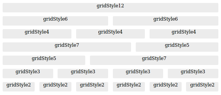
Here the first widget, containing widgets to display on the left part of the page, will take approximately 60% of the page. Here is a diagram to help you design layouts using grids:
Custom Widget Template
The template widget type makes it possible to set a template to use as an include.
Let's have a look at a sample template used to present contributors to a document.
<f:subview xmlns:f="http://java.sun.com/jsf/core"
  xmlns:h="http://java.sun.com/jsf/html"
  xmlns:a4j="http://richfaces.org/a4j"
  xmlns:nxu="http://nuxeo.org/nxweb/util"
  xmlns:nxdir="http://nuxeo.org/nxdirectory"
  xmlns:c="http://java.sun.com/jstl/core"
  xmlns:nxp="http://nuxeo.org/nxweb/pdf"
  id="#{widget.id}">

<div>
    <c:forEach var="username" items="#{field}" varStatus="status">
      <c:if test="#{!status.first}">#{status.last ? andLabel : ', '}</c:if>
      <h:outputText value="#{nxu:userFullName(username)}"
        title="#{username}" onmouseover="tooltip.show(username, 500);"
        onmouseout="tooltip.hide();"/>
    </c:forEach>
  </div>
</f:subview>
This widget presents the contributors of a document with specific links on each on these user identifier information, whatever the widget mode.
Having a widget type just to perform this kind of rendering would be overkill, so using a widget with type "template" can be useful here.
Template widgets should handle the new 'plain' and 'pdf' modes for an accurate rendering of the layout in PDF (content view and document export) and CSV (content view export). CSV export does not need any specific CSV rendering, so the widget rendering in 'plain' mode should be enough.
Some helper methods make it easier to check the widget mode, here is the complete current definition of the contributors widget type in the Nuxeo Platform.
<f:subview xmlns:f="http://java.sun.com/jsf/core"
  xmlns:h="http://java.sun.com/jsf/html"
  xmlns:a4j="http://richfaces.org/a4j"
  xmlns:nxu="http://nuxeo.org/nxweb/util"
  xmlns:nxdir="http://nuxeo.org/nxdirectory"
  xmlns:c="http://java.sun.com/jstl/core"
  xmlns:nxp="http://nuxeo.org/nxweb/pdf"
  id="#{widget.id}">
<c:set var="andLabel" value=" #{messages['label.and']} " scope="page" />
<c:if test="#{nxl:isLikePlainMode(widget.mode)}"><nxu:inputList
  value="#{field}" model="contributorsModel"><h:outputText
  value="#{nxu:userFullName(contributorsModel.rowData)}" /><h:outputText
  rendered="#{contributorsModel.rowIndex != contributorsModel.rowCount -1}"
  value="#{nxu:test(contributorsModel.rowIndex == contributorsModel.rowCount -2, andLabel, ', ')}" /></nxu:inputList></c:if>
<c:if test="#{widget.mode == 'pdf'}">
  <nxp:html>
    <c:forEach var="username" items="#{field}" varStatus="status">
      <c:if test="#{!status.first}">#{status.last ? andLabel : ', '}</c:if>
      <h:outputText value="#{nxu:userFullName(username)}" />
    </c:forEach>
  </nxp:html>
</c:if>
<c:if test="#{nxl:isLikeViewMode(widget.mode)}">

<div>
    <c:forEach var="username" items="#{field}" varStatus="status">
      <c:if test="#{!status.first}">#{status.last ? andLabel : ', '}</c:if>
      <h:outputText value="#{nxu:userFullName(username)}"
        title="#{username}" onmouseover="tooltip.show(username, 500);"
        onmouseout="tooltip.hide();"/>
    </c:forEach>
  </div>
</c:if>
</f:subview>
Note that extra spaces have been removed when rendering in the "plain" mode as these spaces may appear on the final rendering (in CSV columns for instance).
When this template is included in the page, the widget variable is made available. For a complete list of available variables, please refer to the EL expressions documentation.
Some rules must be followed when writing XHTML to be included in templates:
- Use the widget id as identifier: the widget id is computed to be unique within the page, so it should be used instead of fixed id attributes so that another widget using the same template will not introduce duplicated ids in the JSF component tree.
- Use the variable with name following the field_n pattern to reference field values. For instance, binding a JSF component value attribute to
#{field_0}means binding it to the first field definition. The expression#{field}is an alias to#{field_0}.
Built-in Templates to Handle Complex Properties
List Widget Template
The standard widget type "list" is actually a widget of type "template" using a static template path: /widgets/list_widget_template.xhtml. If this default behavior does not suit your needs, you can simply copy this template, make your changes, and use a widget of type "template" with the new template path.
This template assumes that each element of the list will be displayed using subwidgets definitions.
For instance, to handle a list of String elements, you can use the definition:
<widget name="contributors" type="list">
  <fields>
    <field>dc:contributors</field>
  </fields>
  <subWidgets>
    <widget name="contributor" type="text">
      <fields>
        <field></field>
      </fields>
    </widget>
  </subWidgets>
</widget>
The empty field definition in the subwidget is used to specify that each element of the list is itself the element to display.
Lists of Lists
A builtin template has been added to handle sublists: the original "list" widget is equivalent to a widget of type "template" using the file /widgets/list_widget_template.xhtml.
To handle a sublist property, you can use take example on this definition:
<widget name="employees" type="list">
  <fields>
    <field>company:employees</field>
  </fields>
  <subWidgets>
    <widget name="employee" type="complex">
      <labels>
        <label mode="any"></label>
      </labels>
      <!-- subwidgets for complex -->
      <subWidgets>
        <widget name="phoneNumbers" type="list">
          <fields>
            <field>phoneNumbers</field>
          </fields>
          <properties mode="any">
            <property name="listTemplateItem">
              #{nxd:propertyDefaultValue('company:employees/phoneNumbers')}
            </property>
          </properties>
          <subWidgets>
            <widget name="phoneNumber" type="text">
              <label mode="any"></label>
              <fields>
                <field></field>
              </fields>
            </widget>
          </subWidgets>
        </widget>
      </subWidgets>
    </widget>
  </subWidgets>
</widget>