Custom widget types can be added to the standard list thanks to another extension point on the web layout service.
Usually widget types are template widgets that are declared as widget types to make them easily reusable in different layouts, have a clear widget types library, and make them available in Studio.
Simple Widget Type Registration
Here is a sample widget type registration, based on a widget template:
<component name="org.nuxeo.ecm.platform.forms.layout.MyContribution">

  <extension target="org.nuxeo.ecm.platform.forms.layout.WebLayoutManager"
    point="widgettypes">

    <widgetType name="my_widget_type">
      <property name="template">
        /widgets/my_own_widget_template.xhtml
      </property>
    </widgetType>

  </extension>

</component>
Before this contribution, the widgets needing this template were declaring (for instance):
<widget name="my_widget" type="template">
  <labels>
    <label mode="any">My label</label>
  </labels>
  <translated>false</translated>
  <fields>
    <field>dc:description</field>
  </fields>
  <properties widgetMode="any">
    <property name="template">/widgets/my_own_widget_template.xhtml</property>
  </properties>
</widget>
With this configuration, the following widget definition can now be used:
<widget name="my_widget" type="my_widget_type">
  <labels>
    <label mode="any">My label</label>
  </labels>
  <translated>false</translated>
  <fields>
    <field>dc:description</field>
  </fields>
</widget>
Complex Widget Type Registration
Here is a more complex sample widget type registration:
<?xml version="1.0"?>

<component name="org.nuxeo.ecm.platform.forms.layout.MyContribution">

  <extension target="org.nuxeo.ecm.platform.forms.layout.WebLayoutManager"
    point="widgettypes">

    <widgetType name="customtype">
      <handler-class>
        org.myproject.MyCustomWidgetTypeHandler
      </handler-class>
      <property name="foo">bar</property>
    </widgetType>

  </extension>

</component>
The custom widget type class must follow the org.nuxeo.ecm.platform.forms.layout.facelets.WidgetTypeHandler interface.
Additional properties can be added to the type registration so that the same class can be reused with a different behavior given the property value.
The widget type handler is used to generate facelet tag handlers dynamically taking into account the mode and any other properties that can be found on a widget.
The best thing to do before writing a custom widget type handler is to go see how standard widget type handlers are implemented, as some helper methods can be reused to ease implementation of specific behaviors.
Additional Widget Type Configuration
Some additional information can be put on a widget type for several purposes:
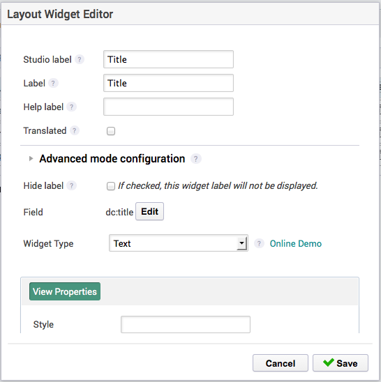
configuration of widgets made available in Studio


documentation of available layouts and widget types on a given Nuxeo instance (see on your Nuxeo instance: http://localhost:nuxeo/site/layout-manager/ or on https://nightly.nuxeo.com/nuxeo/site/layout-manager with login and password
Administrator)

Sample JSON export URLs (with login and password
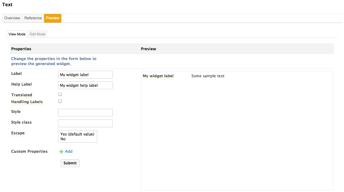
Administrator):http://nightly.nuxeo.com/nuxeo/site/layout-manager/widget-types/widgetTypes/document All widget types with category "document" http://nightly.nuxeo.com/nuxeo/site/layout-manager/widget-types/widgetTypes/document?version=6.0 All widget types with category "document", filtering widget types with a version strictly higher than 6.0 http://nightly.nuxeo.com/nuxeo/site/layout-manager/widget-types/widgetTypes?categories=studio%20document&version=6.0 All widget types with both categories "document" and "studio", filtering widget types with a version strictly higher than 6.0. - documentation and showcase of this widget type (see http://showcase.nuxeo.com/layout):


Here is a sample configuration extract:
<widgetType name="text">
<configuration>
<title>Text</title>
<description>
<p>
The text widget displays an input text in create or edit mode, with
additional message tag for errors, and a regular text output in any
other mode.
</p>
<p>
Widgets using this type can provide properties accepted on a
<h:inputText /> tag in create or edit mode, and properties
accepted on a <h:outputText /> tag in other modes.
</p>
</description>
<demo id="textWidget" previewEnabled="true" />
<supportedModes>
<mode>edit</mode>
<mode>view</mode>
</supportedModes>
<fields>
<list>false</list>
<complex>false</complex>
<supportedTypes>
<type>string</type>
<type>path</type>
</supportedTypes>
<defaultTypes>
<type>string</type>
</defaultTypes>
</fields>
<categories>
<category>document</category>
</categories>
<properties>
<layouts mode="view">
<layout name="text_widget_type_properties_view">
<rows>
<row>
<widget>style</widget>
</row>
<row>
<widget>styleClass</widget>
</row>
[...]
</rows>
<widget name="style" type="text">
<labels>
<label mode="any">Style</label>
</labels>
<fields>
<field>style</field>
</fields>
</widget>
<widget name="styleClass" type="text">
<labels>
<label mode="any">Style class</label>
</labels>
<fields>
<field>styleClass</field>
</fields>
</widget>
[...]
</layout>
</layouts>
<layouts mode="edit">
<layout name="text_widget_type_properties_edit">
<rows>
<row>
<widget>required</widget>
</row>
<row>
<widget>maxlength</widget>
</row>
<row>
<widget>title</widget>
</row>
[...]
</rows>
<widget name="maxlength" type="int">
<labels>
<label mode="any">Max length</label>
</labels>
<fields>
<field>maxlength</field>
</fields>
</widget>
<widget name="required" type="checkbox">
<labels>
<label mode="any">Required</label>
</labels>
<fields>
<field>required</field>
</fields>
</widget>
<widget name="title" type="text">
<labels>
<label mode="any">Title</label>
</labels>
<fields>
<field>title</field>
</fields>
<widgetModes>
<mode value="any">hidden</mode>
<mode value="view_reference">view</mode>
</widgetModes>
</widget>
[...]
</layout>
</layouts>
</properties>
</configuration>
<handler-class>
org.nuxeo.ecm.platform.forms.layout.facelets.plugins.TextWidgetTypeHandler
</handler-class>
<property name="dev_template">/path/to/my/dev/template.xhtml</property>
</widgetType>
The configuration element is optional, but when defined it'll be used to define the following information:
title: the widget type title.description: the widget type description, that accepts HTML content.demo: this refers to this widget type representation in the layout demo (see the online demo, for instance http://layout.demo.nuxeo.org/nuxeo/layoutDemo/textWidget).supportedModes: the list of supported modes (for instance some widget types are read-only). This is useful for Studio configuration: if the edit mode is not available, the corresponding panel for properties configuration will not be shown.fields: this configuration is subject to change, but it is currently used to define what kind of widgets types are available for a given field type.categories: the list of categories for this widget type. This is a marker for display and it can also be used to facilitate exports. The default categories are "document", "summary", "listing" and "dev".properties: the layouts to use to display the available widget properties depending on the mode. This is a standard layout configuration, using the property name as field. Properties hidden in the mode "view_reference" will only be displayed on the reference table, and will not be displayed for configuration in Studio or preview in the Layout showcase.- The widget type property
dev_templatecan also be used to specify a custom template when displaying this widget type in dev mode. The default template for widget type is widget_dev_template.xhtml, a sample custom dev template is action_widget_type_dev_template.xhtml.