A series of widget types for suggestions.
Since 5.7.2, Nuxeo uses select2 for the suggestion widgets:
- the user suggestion and the document suggestion widgets were previously based on the RichFaces suggestion box, and they now use select2;
- a new directory suggestion widget is provided.
Unlike the older JSF suggestion widgets, these select2-based widgets rely upon an automation operation to retrieve suggestions according to the search term typed in the select2 box. The backing operation returns suggestions as an array of JSON objects that select2 is able to manipulate.
As a result, it is quite easy to customize the display of selected/suggested entries.
Also, these suggestion widgets can be used inside lists (older suggestion widgets had limitations).
The Different Types of Widgets
Each widget type is available for single and multiple suggestions.
Directory Suggestion Widget Type
This widget type lets the user select an entry among a list of vocabulary entries, based on the user input. Widget type names are:
- suggestOneDirectory
- suggestManyDirectory
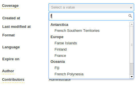

Picture 1: suggestOneDirectory presenting l10ncoverage vocabulary. Countries are grouped by continent.
These new widgets come in addition to the existing selectOneDirectory and selectManyDirectory. The suggestion are provided by the SuggestDirectoryEntries operation.
Suggestion widgets can present multi-level chained vocabulary out of the box. A multi-level chained vocabulary is a vocabulary whose entries have a parent entry such as ln10coverage and ln10subjects. These widgets will be able to group entries by their parents only if the parent is also defined in the vocabulary.
About Label Localization
By default, suggestion widgets assume the vocabulary labels are not localized. In case of need of localization, these widgets support two ways of label localization:
Properties File Translation
The translations are available is message_xx.properties files and the vocabulary only handles the label key. As of Nuxeo 5.8, labels will be translated if the widget is marked as translated in its configuration (but this should be tied to the "localize" property for better consistency so this will likely change in the future, see NXP-13629):
<translated>true</translated>
Column-Based Translation
The vocabulary handles as many label columns as supported locales. Again this is the case for ln10coverage and ln10subjects which have two columns for English and French translations. To support such vocabulary structure, the dbl10n widget property must be set to true:
<property name="dbl10n">true</property>
By convention, the field name associated to these label columns must respect the pattern label_xx where xx is the locale code. However this can be changed with the labelFieldName widget parameter. For instance, the following configuration means that labels are translated using the columns language_en, language_fr, etc. of your vocabulary.
<property name="labelFieldName">language_{lang}</property>
Using column-based translation allows to directly query suggestions in the directory associated to the vocabulary. This is much more efficient than filtering on translations handled by properties file in term of performance.
Check out the layout showcase for more details on available widget properties:
User Suggestion Widget Type
This widget type lets the user select an entry among a list of users or groups based on the user input. Widget type names are:
- singleUserSuggestion
- multipleUsersSuggestion


Picture 2: multipleUsersSuggestion
Previously based on RichFaces suggestion box in Nuxeo Platform 5.6 and earlier versions, these widgets now use select2 to present user suggestions returned by the SuggestUserEntries operation. All previous widget properties are still available.
However, here are noticeable new properties:
groupRestriction
This property allows to specify a group id to restrict the suggested users.
Check out the layout showcase for more details on available widget properties:
Document Suggestion Widget Type
This widget type lets the user select an entry among a list of existing documents of the repository that results from a search query based on the user input. Widget type names are:
- singleDocumentSuggestion
- multipleDocumentsSuggestion
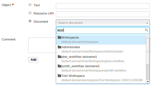

Picture 3: singleDocumentSuggestion
Previously based on RichFaces suggestion box for Nuxeo Platform 5.6 and earlier versions, these suggestion widgets now use select2 to present document suggestions returned by the DocumentPageProviderOperation operation.
Modifying the Way of Suggesting Documents
This operation uses the default_document_suggestion page provider. However, you can specify the NXQL query to be executed via the widget property named query.
<property name="query">
  SELECT * FROM  Document WHERE dc:title LIKE ? AND ecm:mixinType != 'HiddenInNavigation' AND ecm:isVersion = 0 AND ecm:isTrashed = 0
</property>
The specified query must have one parameter (the '?' character in the query above). This parameter will be be valued with the term entered in the select2. Note that a '%' character will be automatically appended to the entered value.
Finally, it is also possible to tell these widgets to use another page provider with the widget property pageProviderName. See the pages Custom Page Providers and Page Providers.
Which Document Properties Are Accessible?
As explained above, the DocumentPageProviderOperation will return documents serialized as JSON objects. By default, the properties of the dublincore and common schemas are serialized. However, you can extend the list of schemas that must be returned in the document JSON serialization with the documentSchemas widget property:
<property name="documentSchemas">dublincore,common</property>
This is useful if you need to customize the display of the suggested/selected entries with specific document properties.
Advanced Suggestion Widget Type
- select2Widget
- select2WidgetMultiple
In case you'd like to build your own advanced suggestion widget, here are additional widget properties.
operationId
Specify the id of an automation operation that will be used to feed the widget with suggestion.
<property name"operationId">your_operation_id</property>
The term entered in select2 will be passed to the specified operation under the parameter searchTerm. Your operation must therefore at least have this parameter:
@Param(name = "searchTerm", required = false)
protected String searchTerm;
The specified operation must return an array of JSON objects which, to be interpreted by select2, must contains the following elements:
id: the value or reference to be submitted (i.e. saved in the bound field). In case of a JSON serialization of a document, it is the document uid. However, you can modify which element of the JSON object must be submitted with theidPropertywidget property.displayLabel: the label to displayed by select2 in the UI. However, if you use custom formatter, it will be ignored.
Custom Display
How to Format the Displayed Entries
Suggestion widget appearance can be customized in a quite flexible way through the use of JavaScript formatters. You can separately tune the formatting of both the suggested and selected entries. All suggestion widgets have the following widget properties:
suggestionFormatterselectionFormatterinlinejs
As explained above, each suggested entries are JSON objects returned by an automation operation. The idea is to define a JavaScript function that will generate the HTML to render this JSON object. For instance, the formatter used to render suggested documents in the above Picture 3 is:
  function myDocFormatter(doc) {
    var markup = "<table><tbody>";
    markup += "<tr><td>";
    if (doc.properties && doc.properties['common:icon']) {
      markup += "<img src='" + window.nxContextPath
          + doc.properties['common:icon'] + "'/>"
    }
    markup += "</td><td>";
    markup += doc.title;
    if (doc.warn_message) {
      markup += "<img src='" + window.nxContextPath
          + "/icons/warning.gif' title='" + doc.warn_message + "'/>"
    }
    if (doc.path) {
      markup += "<span class='displayB detail' style='word-break:break-all;'>" + doc.path + "</span>";
    }
    markup += "</td></tr></tbody></table>"
    return markup;
  }
You can define the JS code of your custom formatters directly in the inlinejs widget property, it will be injected in the rendered HTML page. Alternatively, you can define your formatters as global JavaScript resources by contributing them to the Theme.
Once you have defined a custom formatter, you can tell your widgets to use it:
<property name="suggestionFormatter">myformatter</property>
<property name="selectionFormatter">myformatter</property>
<property name="inlinejs">

      function myformatter(doc) {
        return doc.title;
      }
   ]]>
</property>
The JSON serialization of documents is not flat! Here is how you can access the document properties, for instance, based on the snippet above (line 4):
doc.properties['common:icon']
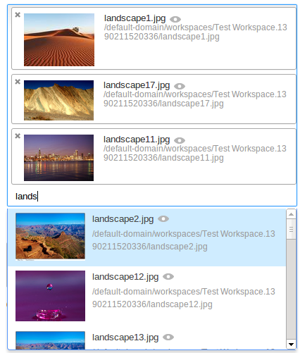

Picture 4: multipleDocumentsSuggestion with custom formatter to suggest documents with "Picture" facet. See this cookbook for more information.
How to Customize CSS Styling
You can finally customize the CSS style of the select2-based widgets through the use of the following widget properties:
containerCssClassdropdownCssClass
The container is the div handling the current selection and the dropdown is the popup box suggesting available entries.
These properties are passed through to select2, that handles these properties as standard select2 parameters. Please refer to the select2 documentation for more details about these parameters.
Finally you can specify the width property, it accepts pixel as well as percentage (i.e. 300px and 100%).
Internationalization
Select2 widgets localization is provided by the select2 library and the control labels are therefore not translated in messages_xx.properties files but directly in select2 resources files. Many locales are provided.
However, if you're a missing a locale, you must create your own select2_locale_xx.js file and add it to your own bundle. This file must be deployed in ${NUXEO_HOME}/nxserver/nuxeo.war/scripts/select2/ directory.