Concept
When you create new document types, you often need to have specific tabs on these document types that display information relevant to your users. A Tabs menu item enables you to create customized tabs on which you can define the elements you want to be displayed: widgets, layouts, content views, actions bars. You can also define the conditions that should be met to display the tab (on which document types the tab will be available, for which users, etc).
Pre-Requisites
Creating a New Tab
To create a new customized tab:
- In the the Listings & Views item of the Studio Modeler tree, click on Tabs and click the New button.
- On the creation form, type the name of the tab. A default grid with two columns is available by default, that you can either fill in or edit. You can now define what will be displayed on your tab and when the tab should be displayed.
Definition Tab
The definition tab is used to set up what should be displayed on your tab.
- Label: Name that will be displayed to the users.
- Category: defaults to "document category". More categories can be added using XML extensions.
- Order: order in which the tabs will be displayed from left to right. The higher the number, the more you move the tab to the right side of the screen. Default tabs number start at 10, so you should add a 2 digits number at least in this field if you expect your custom tab to be placed after the default ones.
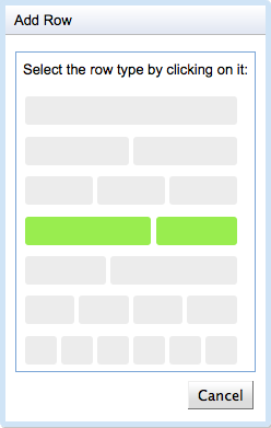
Add grid row: This button helps in defining the grid structure you would like to obtain. Click on Add Grid Row and, in the pop up window, click on the row type that you want to add.
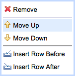
You can reorganize the rows by clicking on the row icon
 and select the wished option in the window that pops up.
Drag and drop widgets from the left box into a cell (see the main widgets below). The widget editor window pops up. Click on Save to save your modifications, both in the widget editor and in the main window.
Enablement Tab
The enablement tab defines when the tab should be available.
In the form, select the conditions that must be met for the tab to be displayed. For instance:
- In the Current user has one of the permissions multi-select box, select the permissions the user must have to be displayed the tab;
- In the Current document has one of the types multi-select box, choose the documents types on which the tab will be displayed;
- In the Current document has facet drop-down list, select the facet that the document must have for the tab to be displayed;
- In the Current document has life cycle text box, type the lifecycle state the document must be in for the tab to be displayed;
- In the Document path starts with text box, type the path the document must be in for the tab to be displayed;
- In the Current document is drop-down list, select the kind of document must be for the tab to be displayed;
- In the Current user is member of text box, select the user group the user must be part of for the tab to be displayed;
- Check the Current user is administrator checkbox if you wish to restrict this tab to administrators group members only;
- In the Custom EL expression text box, type an EL expression that should be evaluated for the tab to be displayed.Keep in mind that requirements are cumulative; the tab will be displayed only if all previous conditions defined are met. You may leave fields blank if you do not wish to apply some of the restrictions available.
Click on Save to save your modifications.
Tab Specific Widget Types
Content View Widget Type
The Content view widget type is available from the menu on the right on the Definition tab. It enables you to display a content view defined in the Listings & Views > Content Views menu item inside the slot in which you drop the widget. You can use any content view previously defined.
When should I use a content view widget ?
This widget type is usually combined with a tab in order to create specific content tabs, showing for example a substring of documents depending on their lifecycle state. As you can add as many content view widgets as you like, you may achieve various display results that would not have been possible using a single NXQL query.
Toggleable Form Widget Type
The Toggleable form widget type enables you to display two layouts alternatively, using a predefined user action to switch from one layout to the other.
When should I use a toggleable form widget ?
Typically, this widget can be displayed to enable users to edit a document without having to go on the Edit tab of the document, but using an Edit button. In that case, the used layouts would be the View and Edit layouts of a document.
- Layout(s): Use the "choose" button to select which form layout you would like to display as first layout.
- Toggled layout(s): Use the "choose" button to select which form layout you would like to display after clicking on the toggle action button.
Form Action(s) Widget Types
Since version 5.7.1, the Form action(s) widget types enable you to display buttons that interact with a layout form (like save/cancel buttons). Actions can be selected using a category on the "Form actions" widget type and using the action name on the "Form action" widget type.
Toolbar Action(s) Widget Types
Since version 5.7.1, the Toolbar action(s) widget types enable you to display buttons that do not interact with a layout form. The main difference with form actions is a finer control over forms and labels. Actions can be selected using a category on the "Form actions" widget type and using the action name on the "Form action" widget type.
Tabs Widget Types
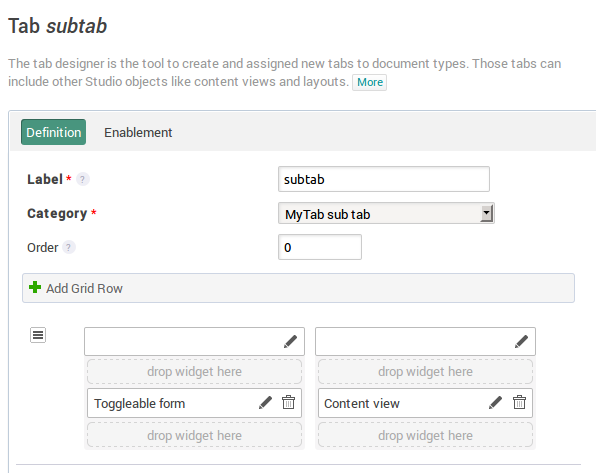
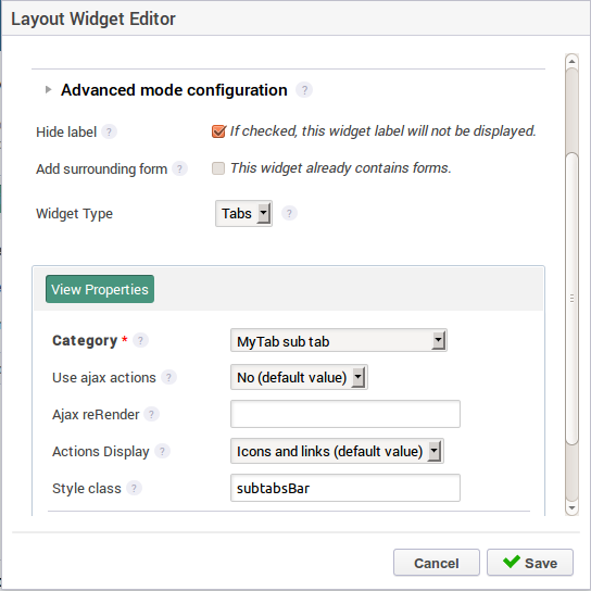
Since version 5.7.3, the tabs widget types enable you to display tabs within your tabs (aka sub tabs). Here is a sample configuration. The parent tab "MyTab" holds a "Tabs" widget type:

The "Tabs" widget type is configured as is (it uses the "MyTab sub tab" category):
Sub tabs can be defined as standard tabs, but using the "MyTab sub tab" category: