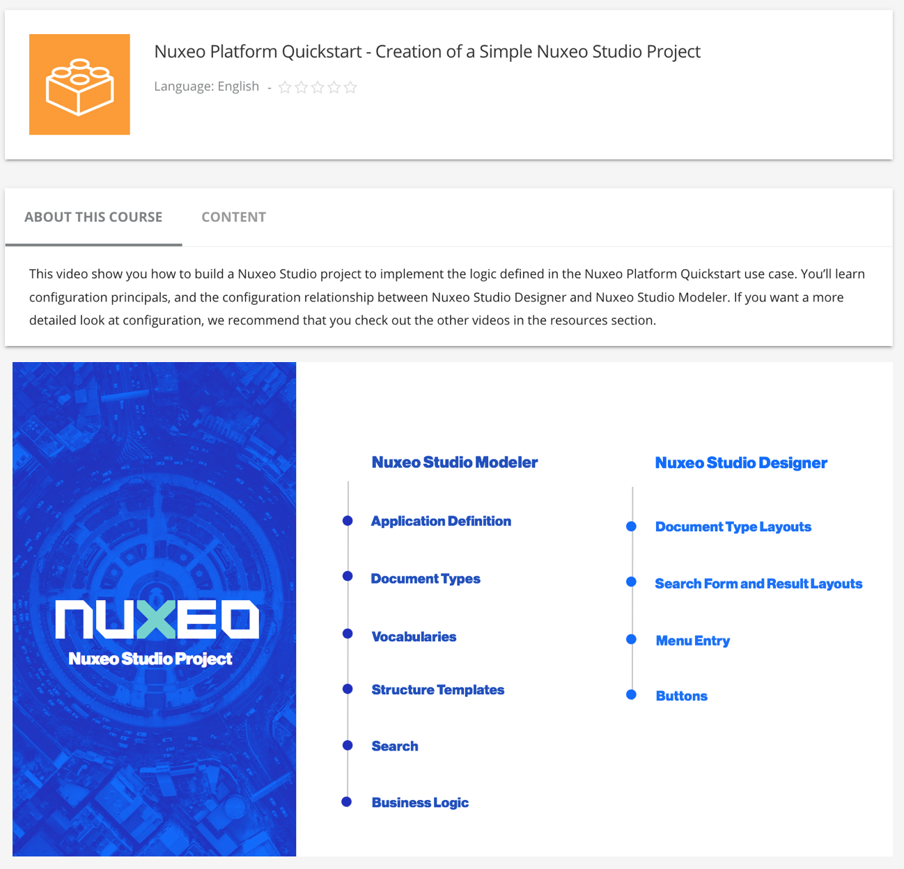
The UI tab gives you access to several elements to customize the UI section that you want, dashboard, menus, themes, default document view, integrate new custom pages, add new buttons, translations, etc.
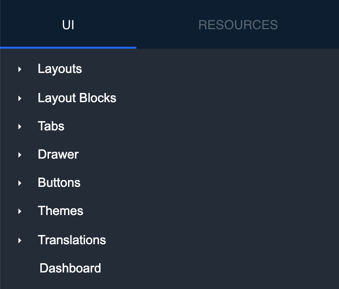
Layouts
Five layouts are available on documents such as local and built-in types to let you customize the creation, edition, import, metadata and the view of your documents. Once customized, layouts are displayed with a bold font.
- Local Types: Lists the document types that you have created.
- Built-in Types: Lists the document types available by default on the platform.
- Workflows: Lists the workflows that you have created.
- Page Providers: Lists the page providers that you have created.
Configuring Multivalued Fields
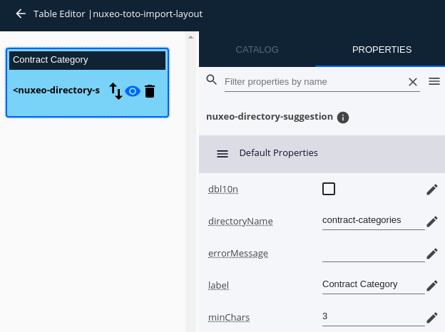
When drag and dropping a multivalued field or a complex multivalued field into a layout, the corresponding element is automatically set to nuxeo-data-table. Clicking on the element, then on the pencil icon will allow you to edit it.
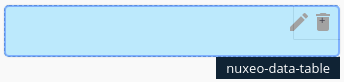
From there, the field (or each sub field in the case of a complex multivalued field) is shown as a table with a column containing the element. Clicking on an element will display its properties on the right side of the screen so that you can configure it.
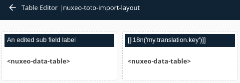
You may edit the field's label directly in the column title. Labels can be translated by entering the [[i18n('your.translation.key')]] pattern.
Finally, when dealing with complex multivalued fields:
- Sub fields can be reordered by drag and dropping them around in the layout.
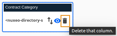
- A sub field can be deleted by hovering on it and clicking the trash icon.
Layout Blocks
Allows you to create reusable components and share them between different documents layouts. Layout blocks are elements of a layout that can be reused in other layouts configuration. In each layout block, you can insert properties along with their configuration.
When creating or editing a form, you can drag and drop properties from any schema. Then, you can configure them individually.
In any of your Layouts, you can drag and drop your Layout Blocks from the catalog.
Tabs
You can add new document tabs and also hide and override default document to display specific information relevant to your users.
A tab is created along with a corresponding element at the top of the main view. A tab can be activated under a set of conditions (for a specific user or document property such as group, type, permissions, etc.) Once activated, selecting the tab will display the corresponding view.
- Page: Uses the document page template to create a tab displaying information that you want and that are related to documents.
- Listing: Uses the element
nuxeo-result-viewin the main view. You can use it to display custom document listings using a page provider.
Drawer
Allows you to create drawer items and drawer menus to customize your drawer menu.
Drawer Items: From generic pages to new search forms or browse pages with determined root path. These will add a new drawer item.
Drawer Menus: You can integrate new custom pages if you need to display specific information, like access to your profile information, the configuration of cloud services or some kind of specific report. Items can be added to Administration or User Menu. Each contribution adds a menu entry to the Administration or User menus and a corresponding element in the main view.
Buttons
Allows you to create and edit buttons and links as elements and display them to any existing category/area, called slots, in Web UI.
- Button: Configure a button and attach an automation operation, an automation chain or a script to it.
- Custom button: Use code to create your custom element and bind it to a button. A typical example is displaying a confirmation dialog that will execute specific logic.
Themes
Allows you to customize your own UI themes that users can select. It is based primarily on CSS custom properties, but can include any type of CSS.
For more information, see Creating Themes with Studio.
Translations
Create and/or Manage your messages.json files from this view to add a new language to your platform.
This file is composed of the keys used in UI following by their value in the corresponding language.
Dashboard
Customize the default Web UI dashboard and edit the default HTML code to include your custom elements.